ISBN-13:978-0-321-96551-6 ISBN-10:
0-321-96551-5
9 8 7 6 5 4 3 2 1 Printed and bound in the United States of America
FirstEdition
Tomyfather,who always wanted me to
writeabook,Mymother,whoalwaysmademefeellikeIcou
ld,
Melanie,whomarriedme—thegreateststrokeofgoodfortuneofmylife,
andmyson,Harry,whowillsurelywritebooksmuchbetterthanthisone
whenever he wantsto.
SecondEdition
Tomy bigbrother,Phil, who was a mensch his wholelife.
ThirdEdition
Toallthepeople—fromallpartsoftheworld—
whohavebeensoniceaboutthisbookforfourteenyears.Yourkindwords—
inperson,inemail,andinyourblogs—havebeenoneofthegreatjoysofmylife.
Especiallythewomanwhosaiditmadeherlaughsohardthatmilkcameout
of hernose.
ContentsPREFACE About this editionINTRODUCTION Read me first
Throat clearing and disclaimers
GUIDING PRINCIPLESCHAPTER 1 Don’t make me think!
Krug’s First Law of Usability
CHAPTER 2 How we really use the Web
Scanning, satisficing, and muddling through
CHAPTER 3 Billboard Design 101
Designing for scanning, not reading
CHAPTER 4 Animal, Vegetable, or Mineral?
Why users like mindless choices
CHAPTER 5 Omit words
The art of not writing for the Web
THINGS YOU NEED TO GET RIGHTCHAPTER 6 Street signs and Breadcrumbs
Designing navigation
CHAPTER 7 The Big Bang Theory of Web Design
The importance of getting people off on the right foot
MAKING SURE YOU GOT THEM RIGHTCHAPTER 8 “The Farmer and the Cowman Should Be Friends”
Why most arguments about usability are a waste of time, and how toavoid them
CHAPTER 9 Usability testing on 10 cents a day
Keeping testing simple—so you do enough of it
LARGER CONCERNS AND OUTSIDE INFLUENCESCHAPTER 10 Mobile: It’s not just a city in Alabama anymore
Welcometo the 21stCentury.Youmay experience a slight senseofvertigo
CHAPTER 11 Usability as common courtesy
Why your Web site should be a mensch
CHAPTER 12 Accessibility and you
Just when you think you’re done, a cat floats by with buttered toaststrapped to its back
CHAPTER 13 Guide for the perplexed
Making usability happen where you live
Acknowledgments I ndex
Preface: About this edition
People come and go so quicklyhere!
—DOROTHYGALE(JUDYGARLAND)INTHEWIZARDOFOZ(1939)
I wrote the first edition ofDon’t Make Me Thinkback in 2000.
By 2002, I began to get a few emails a year from readers asking (very politely) if I’d thought about updating it. Not complaining; just trying to be helpful. “A lot of the examples are out of date” was the usual comment. My standard response was to point out that since I wrote it right around the time the Internet bubble burst, many of the sites I used as examples had already disappeared by the time it was published. But I didn’t think that made the examples any less clear.
Finally, in 2006 I had a strong personal incentive to update it.1But as I reread it to see what I should change, I just kept thinking “This is all still true.” I really couldn’t find much of anything that I thought should be changed.
1 Halfoftheroyaltiesforthebookweregoingtoacompanythatnolongerexisted,anddoinganewedition meant a
new contract—and twice the royalties—forme.
If it was a new edition, though,somethinghad to be different. So I added three chapters that I didn’t have time to finish back in 2000, hit the snooze button, and happily pulled the covers back over my head for another seven years.
2000
2006
(Writing is really hard for me, and I’m always happy to have a reason not to do it. Give me a good old root canal over writing any day.)
So why now, finally, a new edition? Two reasons.
#1. Let’s face it: It’s old
There’s no doubt about it at this point: It feels dated. After all, it’s thirteen years old, which is like a hundred years in Internet time. (See? Nobody even says things like “in Internet time” anymore.) Most of theWebpages I used for examples, like Senator OrrinHatch’scampaign site for the 2000 election, look really old- fashionednow.
Sites these days tend to look a lot more sophisticated, as you might expect.
www.orrinhatch.com2012
RecentlyI’vebeenstartingtoworrythatthebookwouldfinallyreachapoint where it feltsodated that it would stop being effective. I know it hasn’t happened yetbecause
It’sstill selling steadily (thank heavens), without any sign of slowing
down.It’sevenbecomerequiredreadinginalotofcourses,somethingI neverexpected.
New readers from all over the world continue to tweet about things
they’ve learned from it.
I still keep hearing this story: “I gave it to my boss, hoping he’d finally
understand what I’m talking about. He actually read it, and then he bought it for our whole team/department/company!” (I love that story.)
People keep telling me that they got their job thanks in part to reading it
or that it influenced their choice of a career.2
2 I’menormouslypleasedandflattered,butIhavetoadmitthere’salwaysapartofmethat’sthinking“Yikes
!Ihopeshewasn’tmeanttobeabrainsurgeon.WhathaveIdone?”
But I know that eventually the aging effect is going to keep people from reading it, for the same reason that it was so hard to get my son to watch black and white movies when he was young, no matter how good they were.
Clearly, it’s time for new examples.
#2. The world has changed
To say that computers and the Internet and the way we use them have changed a lot lately is putting it mildly. Very mildly.
The landscape has changed in three ways:
Technologygot its hands on some steroids.In 2000, we were using
theWebon relatively large screens, with a mouse or touchpad and a keyboard. And we were sitting down, often at a desk, when we did. Now we use tiny computers that we carry around with us all the time, with stilland video cameras, magical maps that know exactly where we are, and our entire libraries of books and music built in. And are always
connected to the Internet. Oh, and they’re phones, too. Heck, I can use my “phone” to
…book a restaurant reservation in seconds
…adjust the heat in my house from anywhere
…or deposit a check without going to an ATM
It’s no flying car (which, come to think of it, we were promised we’d have by now), but it’s pretty impressive.
TheWebitself kept improving.Even when I’m using my desktop
computer to do all the things I’ve always done on theWeb(buying stuff, making travel plans, connecting with friends, reading the news, and settling bar bets), the sites I use tend to be much more powerful and useful than their predecessors. We’vecome to expect things like autosuggest and autocorrect, and we’re annoyed when wecan’tpay a parking ticket or renew a driver’s license online.
Usability went mainstream.In 2000, not that many people understood
the importance of usability. Now, thanks in large part to Steve Jobs (and Jonathan Ive), almost everyone understands that it’s important, even if they’re still not entirely sure what it is. Except now they usually call it User Experience Design (UXD or just UX), an umbrella term for any activity or profession that contributes to a better experience for the user. It’s great that there’s now so much more emphasis on designing for the user, but all the new job descriptions, subspecialties, and tools that have come along with this evolution have left a lot of people confused about what they should actuallydoabout it.
I’ll be talking about all three of these changes throughout the book.
Don’t get me wrong… This edition has new examples, some new principles, and a few things I’ve learned along theway,butit’sstill the same book, with the same purpose:It’sstill a book about designing great, usableWebsites.
And it’s also still a book about designing anything that people need to interact with, whether it’s a microwave oven, a mobile app, or an ATM.
The basic principles are the same even if the landscape has changed, because usability is about people and how they understand and use things, not abouttechnology.And while technology often changesquickly,people change veryslowly.3
3 There’sawonderfulNorwegianvideo(withsubtitles)aboutthisthatshowsamonkgettinghelpashestrugglestousethe
newfangled“book.”(Searchfor“medievalhelpdesk”onYouTube.)
Or as Jakob Nielsen so aptly put it:
The human brain’s capacity doesn’t change from one year to the next, so the insights from studying human behavior have a very long shelf life. What was difficult for users twenty years ago continues to be difficult today.
I hope you enjoy the new edition. And don’t forget to wave in a few years when you pass me in your flying car. STEVE KRUG NOVEMBER 2013
Introduction: Read me firstTHROAT CLEARING AND DISCLAIMERS
Ican’ttellyouanythingyoudon’talreadyknow.ButI’dliketoclarifyafew
things.
—JOEFERRARA,AHIGHSCHOOLFRIENDOFMINE
I have a great job. I’m a usability consultant. Here’s what I do:
People (“clients”) send me something they’re working on.
It could be designs for a newWebsite they’re building, or the URL of a site that they’re redesigning, or a prototype of an app.
I try using what they send me, doing the things that their users would
need or want to do with it. I note the places where people are likely to get stuck and the things that I think will confuse them (an “expert usability review”). Sometimes I get other people to try using it while I watch to see where theyget stuck and confused (“usability testing”).
I have a meeting with the client’s team to describe the problems I found
that are likely to cause users grief (“usability issues”) and help them decide which ones are most important to fix and how best to fix them.
Sometimes we work by the phone…
…and sometimes in person
I used to write what I called the “big honking report” detailing my findings, but I finally realized that it wasn’t worth the time and effort. A live presentation allows people to ask me questions and voice their concerns—something a written report doesn’t do. And for teams doing Agile or Lean development, there’s no time for written reports anyway.
They pay me.
Being a consultant, I get to work on interesting projects with a lot of nice, smart people. I get to work at home most of the time and I don’t have to sit in mind-numbing meetings every day or deal with office politics. I get to say what I think, and people usually appreciate it. And I get paid well. On top of all that, I get a lot of job satisfaction, because when we’re finished, the things they’re building are almost always much better than when we started.1
1 Almostalways.Evenwhenpeopleknowaboutusabilityproblems,theycan’talwaysfixthemcompletely, as
I’ll explain inChapter
9 .
The bad news: You probably don’t have a usability professional
Almosteverydevelopmentteamcouldusesomebodylikemetohelpthem buildusabilityintotheirproducts.Unfortunately,thevastmajorityofthem can’t afford to hire a usabilityprofessional. And even if they could, there aren’t enough to go around. At last count there were umpteen billion Web sites (and umpteen billion apps for the iPhone alone2) and only about 10,000 usability consultants worldwide. You do the math.
2 I’mnotquitesurewhyApplebragsaboutthis.Havingthousandsofgoodappsforaplatformisareallygood thing.
Having millions of mediocre apps just meansit’sreallyhardto find the good ones.
And even if you do have a professional on your team, that person can’t possibly look at everything the team produces. In the last few years, making things more usable has become almost everybody’s responsibility. Visual designers and developers now often find themselves doing things like interaction design (deciding what happens next when the user clicks, taps, or swipes) and information architecture (figuring out how everything should be organized). I wrote this book mainly for people who can’t afford to hire (or rent) someone like me.
If it’s short, it’s more likely to actually be used.4I’m writing for the
people who are in the trenches—the designers, the developers, the site producers, the project managers, the marketing people, and the people who sign the checks—and for the one-man-bands who are doing it all themselves.
4 There’sagoodusabilityprinciplerightthere:Ifsomethingrequiresalargeinvestmentoftime—orlooks like itwill
—it’sless likely to beused.
Usability isn’t your life’s work, and you don’t have time for a long book.
Youdon’t need to know everything.As with any field,there’sa lot
youcouldlearn aboutusability.But unless you’re a usability professional,there’sa limit to how much isusefulfor you to learn.5
5 I’ve always liked the passage inA Study in ScarletwhereDr.Watsonis shocked to learn
thatSherlockHolmesdoesn’tknowthattheearthtravelsaroundthesun.Giventhefinitecapacityof thehumanbrain,Holmesexplains,hecan’taffordtohaveuselessfactselbowingouttheuseful ones:
“Whatthedeuceisittome? Yousaythatwegoroundthesun.Ifwewentroundthemoonitwouldnotmakeapennyworthofdifferencetome ortomywork.”
I find that the most valuable contributions I make to each project always come from keeping just a few key usability principles in mind. I think there’s a lot more leverage for most people in understanding these principles than in another laundry list of specific do’s and don’ts. I’ve tried to boil down the few things I think everybody involved in design should know about usability.
Not present at time of photo Just so you don’t waste your time looking for them, here are a few things you
won’t find in this book:
Hard and fast usability rules.I’ve been at this for a long time, long
enough to know that there is no one “right” answer to most usability questions. Design is a complicated process and the real answer to most of the questions people ask me is “It depends.” But I do think that there are a few useful guiding principles it always helps to have in mind, and those are what I’m trying to convey.
Predictions about the future of technology and theWeb.Honestly,your guess is as good as mine. The only thing I’m sure of is that (a) most of the predictions I hear are almost certainly wrong, and (b) the things that will turn out to be important will come as a surprise, even though in hindsight they’ll seem perfectly obvious.
Bad-mouthingofpoorlydesignedsitesandapps.Ifyouenjoypeople
pokingfunatthingswithobviousflaws,you’rereadingthewrongbook. Designing, building, and maintaining a greatWebsite or app isn’teasy. It’slike golf: a handful of ways to get the ball in the hole, a million waysnotto.Anyonewhogetsitevenhalfrighthasmyadmiration. As a result, you’ll find that the examples I use tend to be from excellent products with minor flaws. I think you can learn more from looking at good designs than bad ones.
Now with Mobile!
One of the dilemmas I faced when updating this book was that it’s always been a book about designing usable Web sites. Even though the principles apply to the design of anything people have to interact with (including things like election ballots and voting booths, and even PowerPoint presentations), its focus was clearly on Web design, and all the examples were from Web sites. Until recently, that’s what most people were working on. But now there are a lot of people designing mobile apps, and even the people working on Web sites have to create versions of them that work well on mobile devices. I know they’re very interested in how all of this applies to them.
So I did three things:
Included mobile examples wherever it made sense Added a new chapter about some mobile-specific usability issues And the most important one: Added “and Mobile” to the subtitle on the
cover
And as you’ll see, in some places where it made thingsclearer,instead of“Website” I’ve written“Website or mobile app.” In most cases, though, I used theWeb-centricwording to keep things from getting cumbersome and distracting.
One last thing, before we begin One crucial thing, really: My definition of usability.
You’llfind a lot of different definitions ofusability,often breaking it down into attributes like
Useful:Does it do something people need done? Learnable:Can people figure out how to use it? Memorable:Do they have to relearn it each time they use it? Effective:Does it get the job done? Efficient:Does it do it with a reasonable amount of time and effort? Desirable:Do people want it?
and recently even
Delightful:Is using it enjoyable, or even fun?
I’ll talk about these later. But to me, the important part of the definition is pretty simple. If something is usable—whether it’s a Web site, a remote control, or a revolving door—it means that
A person of average (or even below average) ability and experience can figure out how to use the thing to accomplish something without it being more trouble than it’s worth.
Take my word for it: It’s really that simple.
I hope this book will help you build better products and—if it lets you skip a few of the endless arguments about design—maybe even get home in time for dinner once in a while.
Guiding Principles
Not ThinkingChapter 1. Don’t make me think!KRUG’S FIRST LAW OF USABILITY
Michael, why are the drapes open?
People often ask me:
—KAYCORLEONE INTHEGODFATHER,PARTII
“What’s the most important thing I should do if I want to make sure my site or app is easy to use?”
The answer is simple. It’s not “Nothing important should ever be more than two clicks away” or “Speak the user’s language” or “Be consistent.”
It’s…
“Don’t make me think!”
For as long I can remember, I’ve been telling people that this is my first law of usability. It’s the overriding principle—the ultimate tie breaker when deciding whether a design works or it doesn’t. If you have room in your head for only one usability rule, make this the one. For instance, it means that as far as is humanly possible, when I look at aWebpage it should be self-evident. Obvious. Self-explanatory. I should be able to “get it”—what it is and how to use it—without expending any effort thinking about it.
Just how self-evident are we talking about?
Well,self-evidentenough,forinstance,thatyournextdoorneighbor,whohas no interest in the subject of your site and who barely knows how to use the Back button, could look at your Home page andsay,“Oh,it’sa .”(Withany luck, she’llsay,“Oh,it’sa . Great!” Butthat’sanothersubject.)
Think of it this way:
When I’m looking at a page that doesn’t make me think, all the thought balloons over my head say things like “OK,there’sthe . Andthat’sa
. Andthere’sthe thing that Iwant.”
Thinking
But when I’m looking at a page that makes me think, all the thought balloons over my head have question marks in them.
When you’re creating a site, your job is to get rid of the question marks.
Things that make us think
All kinds of things on a Web page can make us stop and think unnecessarily. Take names, for example. Typical culprits are cute or clever names, marketing-induced names, company-specific names, and unfamiliar technical names.
For instance, suppose a friend tells me that XYZ Corp is looking to hire someone with my exact qualifications, so I head off to their Web site. As I scan the page for something to click, the name they’ve chosen for their job listings section makes a difference.
Note that these things are always on a continuum somewhere between “Obvious to everybody” and “Truly obscure,” and there are always tradeoffs involved. For instance, “Jobs” may sound too undignified for XYZ Corp, or they may be locked into “Job-o-Rama” because of some complicated internal politics or because that’s what it’s always been called in their company newsletter.1My main point is that the tradeoffs should usually be skewed further in the direction of “Obvious” than we think.
1 There’salmostalwaysaplausiblerationale—andagood,ifmisguided,intention—behindeveryusabilityflaw.
Another needless source of question marks over people’s heads is links and buttons that aren’t obviously clickable. As a user, I should never have to devote a millisecond of thought to whether things are clickable—or not.
Youmay be thinking,“Well,it really doesn’t matter that much. If you click or tap it and nothing happens,what’sthe big deal?”
The point is that every question mark adds to our cognitive workload,
distracting our attention from the task at hand. The distractions may be slight but they add up, especially if it’s something we do all the time like deciding what to click on. And as a rule, people don’tliketo puzzle over how to do things. They enjoy puzzles in their place—when they want to be entertained or diverted or challenged—but not when they’re trying to find out what time their dry cleaner closes. The fact that the people who built the site didn’t care enough to make things obvious—and easy—can erode our confidence in the site and the organization behind it.
Another example from a common task: booking a flight.
Granted, most of this “mental chatter” takes place in a fraction of a second, butyoucanseethatit’saprettynoisyprocess,withalotofquestionmarks.
And
thenthere’sa puzzling error at theend.
Another site just takes what I type and gives me choices that make sense, so
it’s hard to go wrong.
No question marks. No mental chatter. And no errors.
I could list dozens of things that users shouldn’t spend their time thinking about, like
Where am I? Where should I begin? Where didtheyput ? What are the most important things on this page? Why did they call it that? Is that an ad or part of the site?
But the last thing you need is another checklist to add to your stack of design checklists. The most important thing you can do is to understand the basic principle of eliminating question marks. When you do, you’ll begin to notice all the things that makeyouthink in the sites and appsyouuse. And eventually you’ll learn to recognize and avoid them in the things you’re building.
You can’t make everything self-evident
Yourgoalshouldbeforeachpageorscreentobeself-evident,sothatjustby lookingatittheaverageuser2willknowwhatitisandhowtouseit.Inother words, they’ll “get it” without having to think aboutit.
2 The actualAverageUser is kept in a hermetically sealed vault at the International Bureau
ofStandardsinGeneva.We’llgetaroundtotalkingaboutthebestwaytothinkaboutthe“average user”eventually.
Sometimes, though, particularly if you’re doing something original or groundbreaking or something that’s inherently complicated, you have to settle forself-explanatory. On a self-explanatory page, it takes alittlethought to “get it”—but only a little. The appearance of things (like size, color, and layout), their well-chosen names, and thesmallamounts of carefully crafted text should all work together to create a sense of nearly effortless understanding. Here’sthe rule: If you can’t make something self-evident, you at least need to make it self-explanatory.
Why is all of this so important? Oddly enough, not for the reason people usually cite:
It’s true that there’s a lot of competition out there. Especially in things like mobile apps, where there are often many readily available (and equally attractive) alternatives, and the cost of changing horses is usually negligible (99 cents or even “Free”).
But it’s notalwaystrue that people are fickle. For instance:
Theymayhavenochoicebuttostickwithit,ifit’stheironlyoption
(e.g.,acompanyintranet,ortheirbank’smobileapp,ortheonlysite that sells the rattan they’re lookingfor).
You’dbe surprised at how long some people will tough it out on sites
thatfrustratethem,oftenblamingthemselvesandnotthesite.There’salsothe“I ’vewaitedtenminutesforthisbusalready,soImayaswell hang in a little longer”phenomenon.
Besides, who’s to say that the competition will be any less frustrating?
So why, then?
Making every page or screen self-evident is like having good lighting in a store: it just makes everything seem better. Using a site that doesn’t make us think about unimportant things feels effortless, whereas puzzling over things that don’t matter to us tends to sap our energy and enthusiasm—and time. But as you’ll see in the next chapter when we examine how we really use the Web, the main reason why it’s important not to make me think is that most people are going to spend far less time looking at the pages we design than we’d like to imagine. Asaresult,ifWebpagesaregoingtobeeffective,theyhavetoworkmostof theirmagicataglance.Andthebestwaytodothisistocreatepagesthatare self-evident, or at leastself-explanatory.
Chapter 2. How wereallyuse the WebSCANNING, SATISFICING, AND MUDDLING THROUGH
Whyarethingsalwaysinthelastplaceyoulookforthem?Becauseyoustop
looking when you findthem!
—CHILDREN’SR I D D L E
In all the time I’ve spent watching people use theWeb,the thing that has struck me most is the difference between how we think people useWebsites and how they actually use them. When we’re creating sites, we act as though people are going to pore over eachpage,readingallofourcarefullycraftedtext,figuringouthowwe’ve organizedthings,andweighingtheiroptionsbeforedecidingwhichlinkto click. What they actually do most of the time (if we’re lucky) isglanceat each new page, scansomeof the text, and click on the first link that catches their interest or vaguely resembles the thing they’re looking for. There are almost always large parts of the page that they don’t even look at. We’rethinking “great literature” (or at least “product brochure”), while the user’s reality is much closer to “billboard going by at 60 miles anhour.”
As you might imagine, it’s a little more complicated than this, and it depends on the kind of page, what the user is trying to do, how much of a hurry she’s in, and so on. But this simplistic view is much closer to reality than most of us imagine.
It makes sense that we picture a more rational, attentive user when we’re designing pages.It’sonly natural to assume that everyone uses theWebthe same way we do, and—like everyone else—we tend to think that our own behavior is much more orderly and sensible than it really is.
If you want to design effectiveWebpages, though, you have to learn to live with three facts about real-worldWebuse.
FACT OF LIFE #1:We don’t read pages. We scan them.
One of the very few well-documented facts aboutWebuse is that people tend to spend very little timereadingmostWebpages. Instead, we scan (or skim) them, looking for words or phrases that catch our eye. The exception, of course, is pages that contain documents like news stories, reports, or product descriptions, where people will revert to reading—but even then, they’re often alternating between reading and scanning.
Why do we scan?
We’reusually on a mission.MostWebuse involves trying to get
something done, and usually donequickly.As a result,Webusers tend to act like sharks: They have to keep moving, or they’ll die.Wejust don’t have the time to read any more thannecessary.
We know we don’tneedto read everything.On most pages, we’re
really only interested in a fraction of what’s on the page. We’re just looking for the bits that match our interests or the task at hand, and the rest of it is irrelevant. Scanning is how we find the relevant bits.
We’re good at it.It’s a basic skill: When you learn to read, you also
learn to scan. We’ve been scanning newspapers, magazines, and books —or if you’re under 25, probably reddit, Tumblr, or Facebook—all our lives to find the parts we’re interested in, and we know that it works.
The net effect is a lot like GaryLarson’sclassic Far Side cartoon about the difference between what we say to dogs and what theyhear.In the cartoon, thedog(namedGinger)appearstobelisteningintentlyasherownergivesher a serious talking-to about staying out of the garbage. But from thedog’spoint ofview,allhe’ssaying is “blah blah GINGER blah blah blah blah GINGER blah blahblah.” What we see when we look at a page depends on what we have in mind, and it’s usually just a fraction of what’s there.
Like Ginger, we tend to focus on words and phrases that seem to match (a) the task at hand or (b) our current or ongoing personal interests. And of course, (c) the trigger words that are hardwired into our nervous systems, like “Free,” “Sale,” and “Sex,” and our own name.
FACT OF LIFE #2:We don’t make optimal choices. We satisfice. When we’re designing pages, we tend to assume that users will scan the page, consider all of the available options, and choose the best one. In reality, though, most of the time wedon’tchoose the best option—we choose thefirst reasonable option, a strategy known as satisficing.1As soon as we find a link that seems like it might lead to what we’re looking for, there’s a very good chance that we’ll click it.
1 EconomistHerbertSimoncoinedtheterm(acrossbetweensatisfyingandsufficing)inModelsof Man: Social and
Rational(Wiley,1957).
I’d observed this behavior for years, but its significance wasn’t really clear to me until I read Gary Klein’s bookSources of Power: How People MakeDecisions.
Klein spent many years studying naturalistic decision making: how people like firefighters, pilots, chessmasters, and nuclear power plant operators make high-stakes decisions in real situations with time pressure, vague goals, limited information, and changing conditions.
Klein’s team of observers went into their first study (of field commanders at fire scenes) with the generally accepted model of rational decision making: Faced with a problem, a person gathers information, identifies the possible solutions, and chooses the best one. They started with the hypothesis that because of the high stakes and extreme time pressure, fire captains would be able to compare only two options, an assumption they thought was conservative. As it turned out, the fire commanders didn’t compareanyoptions. They took the first reasonable plan that came to mind and did a quick mental test for possible problems. If they didn’t find any, they had their plan of action.
So why don’t Web users look for the best choice?
We’reusually in ahurry.And as Klein points out, “Optimizing is hard,
and it takes a long time. Satisficing is more efficient.”
There’s not much of a penalty for guessing wrong.Unlike
firefighting, the penalty for guessing wrong on a Web site is usually only a click or two of the Back button, making satisficing an effective strategy. (Back is the most-used button in Web browsers.)
Weighingoptions may not improve our chances.On poorly designed
sites, putting effort into making the best choice doesn’t really help. You’reusually just as well off going with your first guess and using the Back button if it doesn’t work out.
Guessing is more fun.It’s less work than weighing options, and if you
guess right, it’s faster. And it introduces an element of chance—the pleasant possibility of running into something surprising and good.
Ofcourse,thisisnottosaythatusersneverweighoptionsbeforetheyclick. Itdependsonthingsliketheirframeofmind,howpressedtheyarefortime, and how much confidence they have in thesite.
FACTOF LIFE #3:Wedon’t figure out how things work.Wemuddle through. One of the things that becomes obvious as soon as you do any usability testing—whetheryou’retestingWebsites,software,orhouseholdappliances —is the extent to which people use things all the time without understanding howtheywork,orwithcompletelywrong-headedideasabouthowtheywork. Faced with any sort of technology, very few people take the time to read instructions. Instead, we forge ahead and muddle through, making up our own vaguely plausible stories about what we’re doing and why it works. It often reminds me of the scene at the end ofThe Prince and the Pauperwhere the real prince discovers that the look-alike pauper has been using the Great Seal of England as a nutcracker in his absence. (It makes perfect sense
—to him, the seal is just this great big, heavy chunk of metal.)
The Prince and the Pauper(Classics Illustrated)
Andthefactis,wegetthingsdonethatway.I’veseenlotsofpeopleuse software,Websites, and consumer products effectively in ways that are nothing like what the designersintended. TaketheWebbrowser, for instance—a crucial part of Internet use.Topeople who buildWebsites,it’san application that you use to viewWebpages. But if you ask users what a browser is, a surprisingly large percentage will say something like“It’swhat I use to search…to find things” or“It’sthe search engine.”Tryit yourself: ask some family members what aWebbrowser is.
You may be surprised.
Many people use the Web extensively without knowing that they’re using a browser. What they know is you type something in a box and stuff appears.2But it doesn’t matter to them: They’re muddling through and using the thing successfully.
2 Usuallyaboxwiththeword“Google”nexttoit.AlotofpeoplethinkGoogleistheInternet.
And muddling through is not limited to beginners. Even technically savvy users often have surprising gaps in their understanding of how things work. (I wouldn’t be surprised if even Mark Zuckerberg and Sergey Brin have some
bitsoftechnologyintheirlivesthattheyusebymuddlingthrough.) Why does thishappen?
It’snotimportanttous.Formostofus,itdoesn’tmattertouswhether
weunderstandhowthingswork,aslongaswecanusethem.It’snotfor lackofintelligence,butforlackofcaring.It’sjustnotimportanttous.3
3 Webdevelopersoftenhaveaparticularlyhardtimeunderstanding—orevenbelieving—
thatpeoplemightfeelthisway,sincetheythemselvesareusuallykeenlyinterestedinhowthingswork.
If we find something that works, we stick to it.Once we find
something that works—no matter how badly—we tend not to look for a better way. We’ll use a better way if we stumble across one, but we seldom look for one.
It’salways interesting to watch designers and developers observe their first usability test. The first time they see a user click on something completely inappropriate, they’re surprised. (For instance, when the user ignores a nice big fat “Software” button in the navigationbar,saying something like,“Well,I’m looking for software, so I guess I’d click here on ‘Cheap Stuff’ because cheap is always good.”) The user may even find whathe’slooking foreventually,but by then the people watching don’t know whether to be happy or not. The second time it happens, they’re yelling “Just click on ‘Software’!” The third time, you can see them thinking: “Why are we even bothering?” And it’s a good question: If people manage to muddle through so much, does it really matter whether they “get it”? The answer is that it matters a great deal because while muddling through may work sometimes, it tends to be inefficient and error-prone.
On the other hand, if users “get it”:
There’sa much better chance that they’ll find what they’re
lookingfor,which is good for them and for you.
There’s a better chance that they’ll understand the full range of what
your site has to offer—not just the parts that they stumble across.
Youhave a better chance of steering them to the parts of your site that
you want them to see.
They’ll feel smarter and more in control when they’re using your site,
which will bring them back. You can get away with a site that people muddle through only until someone builds one down the street that makes them feel smart.
If life gives you lemons…
By now you may be thinking (given this less than rosy picture of your audience and how they use theWeb),“Why don’t I just get a job at the local 7-Eleven? At least there my effortsmightbe appreciated.”
So, what’s a girl to do?
I think the answer is simple: If your audience is going to act like you’re designing billboards, then design great billboards.
Chapter 3. Billboard Design 101DESIGNING FOR SCANNING, NOT READING
Ifyou/Don’tknow/Whosesigns/TheseareYoucan’thave/Drivenveryfar
/Burma-Shave!
—SEQUENCEOFROADSIDEBILLBOARDSPROMOTINGSHAVINGCREAM,CIRCA1935
Faced with the fact that your users are whizzingby,there are some important thingsyoucandotomakesuretheyseeandunderstandasmuchofwhatthey need to know—and of what youwantthem to know—aspossible:
Takeadvantage of conventions Create effective visualhierarchies Break pages up into clearly defined areas Make it obvious what’s clickable Eliminate distractions Format content to support scanning
Conventions are your friends
One of the best ways to make almost anything easier to grasp in a hurry is to follow the existing conventions—the widely used or standardized design patterns. For example:
Stop signs.Given how crucial it is that drivers see and recognize them
at a glance, at a distance, in all kinds of weather and lighting conditions, it’s a really good thing that all stop signs look the same. (Some of the specifics may vary from country to country, but overall they’re remarkably consistent around the world.)
The convention includes a distinctive shape, the word for “Stop,” a highly visible color that contrasts with most natural surroundings, and standardized size, height, and location.
Controls in cars.Imagine trying to drive a rental car if the gas pedal
wasn’t always to the right of the brake pedal, or the horn wasn’t always on the steering wheel.
In the past twenty years, many conventions forWebpages have evolved. As users, we’ve come to have a lot of expectations about
Where things will be located on a page.For example, users expect the
logo identifying the site to be in the top-left corner (at least in countries where reading is left-to-right) and the primary navigation to be across the top or down the left side.
How things work.For example, almost all sites that sell products use
the metaphor of a shopping cart and a very similar series of forms for specifying things like your method of payment, your shipping address, and so on.
How things look.Many elements have a standardized appearance, like
the icon that tells you it’s a link to a video, the search icon, and the social networking sharing options.
Conventions have also evolved for differentkindsof sites—commerce, colleges, blogs, restaurants, movies, and many more—since all the sites in each category have to solve the same set of problems.
SomeSlightlyIrregular.com
cityislandmovie.com
These conventions didn’t just come out of thin air: They all started life as somebody’s bright idea. If an idea works well enough, other sites imitate it and eventually enough people have seen it in enough places that it needs no explanation. When applied well,Webconventions make life easier for users because they don’thavetoconstantlyfigureoutwhatthingsareandhowthey’resupposed to work as they go from site tosite.
Want proof that conventions help? See how much you know about this page
—even if you can’t understand a word of it—just because it follows some
conventions.
One problem with conventions, though: Designers are often reluctant to take advantage of them. Faced with the prospect of following a convention, there’s a great temptation for designers to try reinventing the wheel instead, largely because they feel (not incorrectly) that they’ve been hired to do something new and different, not the same old thing. Not to mention the fact that praise from peers, awards, and high-profile job offers are rarely based on criteria like “best use of conventions.”
Occasionally, time spent reinventing the wheel results in a revolutionary new rolling device. But usually it just amounts to time spent reinventing the wheel. If you’re going to innovate, you have to understand the value of what you’re replacing (or as Dylan put it, “To live outside the law, you must be honest”), and it’s easy to underestimate just how much value conventions provide. The classic example is custom scrollbars. Whenever a designer decides to create scrollbars from scratch—usually to make them prettier—the results almost always make it obvious that the designer never thought about how many hundreds or thousands of hours of fine tuning went into the evolution of the standard operating system scrollbars. If you’re not going to use an existingWebconvention, you need to be sure that what you’re replacing it with either (a) is so clear and self-explanatory thatthere’sno learning curve—soit’sas good as the convention, or (b) adds so much value thatit’sworth a small learning curve. My recommendation: Innovate when youknowyou have a better idea, but take advantage of conventions when you don’t. Don’t get me wrong: I’m not in any way trying to discouragecreativity.I love innovative and originalWebdesign. One of my favorite examples is Harlem.org. The whole site is built around Art Kane’s famous photo of 57 jazz musicians, taken on the steps of a
brownstone in Harlem in August 1957. Instead of text links or menus, you use the photo to navigate the site.
Not only is it innovative and fun, but it’s easy to understand and use. And the creators were smart enough to understand that the fun might wear off after a while so they also included a more conventional category-based navigation.
You can also browse the musicians by name, instrument, or jazz style.
The rule of thumb is that you can—andshould—be as creative and innovative as you want, and add as much aesthetic appeal as you can,as long as youmake sure it’s still usable. And finally, a word about consistency.
Youoften hear consistency cited as an absolute good. People win a lot of design arguments just by saying“Wecan’t do that. It wouldn’t be consistent.” Consistencyisalways a good thing to strive for within your site or app. If your navigation is always in the same place, for instance, I don’t have to think about it or waste time looking for it. But there will be cases where things will be clearer if you make themslightlyinconsistent.
Here’s the rule to keep in mind:
CLARITY TRUMPS CONSISTENCY
If you can make somethingsignificantly clearer by making itslightly
inconsistent, choose in favor of clarity.
Create effective visual hierarchies
Anotherimportantwaytomakepageseasytograspinahurryistomakesure that the appearance of the things on the page—all of the visual cues— accurately portray the relationships between the things on the page: which things are most important, which things aresimilar,and which things are part of other things. In other words, each page should have a clear visualhierarchy.
Pages with a clear visual hierarchy have three traits:
The more important something is, the more prominent it is.The
most important elements are eitherlarger,bolder, in a distinctivecolor,set off by more white space, or nearer the top of the page—or some combination of the above.
Things that are related logically are related visually.For instance,
you can show that things are similar by grouping them together under a heading, displaying them in the same visual style, or putting them all in a clearly defined area.
Things are “nested” visually to show what’s part of what.For
instance, a site section name (“Computer Books”) would appear above the titles of the individual books, reflecting the fact that the books are part of the section. And each book title in turn would span all the elements that make up the description of that book.
There’s nothing new about visual hierarchies. Every newspaper page, for instance, uses prominence, grouping, and nesting to give us useful information about the contents of the page before we read a word.Thispicture goes withthisstory because they’re both spanned by this headline.Thisstory is the most important because it has the biggest headline and a prominent position on the page.
Weall parse visual hierarchies everyday,but it happens so quickly that the only time we’re even vaguely aware that we’re doing it is when wecan’tdo it
—when the visual cues (or absence of them) force us to think.
A good visual hierarchy saves us work by preprocessing the page for us, organizing and prioritizing its contents in a way that we can grasp almost instantly. But when a page doesn’t have a clear visual hierarchy—if everything looks equally important, for instance—we’re reduced to the much slower process of scanning the page for revealing words and phrases and then trying to form our own sense of what’s important and how things are organized. It’s a lot more work. Parsing a page with a visual hierarchy that’s even slightly flawed—where a heading spans things that aren’t part of it, for instance—is like reading a carelessly constructed sentence (“Bill put the cat on the table for a minute because it was a little wobbly”).
This flawed visual hierarchy suggests that all the major sections of the site are
part of the Computer Books subsection.
Putting the heading where it belongs makes the relationship clearer.
Even though we can usually figure out what the sentence is supposed to mean,itstillthrowsusmomentarilyandforcesustothinkwhenweshouldn’t haveto.
Break up pages into clearly defined areas
Ideally, on any well-designed Web page users can play a variation of the old TV game show$25,000 Pyramid.1Glancing around, they should be able to point at the different areas of the page and say, “Things I can do on this site!” “Links to today’s top stories!” “Products this company sells!” “Things they’re eager to sell me!” “Navigation to get to the rest of the site!”
1 Contestantshadtogettheirpartnerstoguessacategorylike“Thingsaplumberuses”bygivingthem examples
(“a wrench, a pipecutter,pants thatwon’tstayup…”).
Dividing the page into clearly defined areas is important because it allows users to decide quickly which areas of the page to focus on and which areas they can safely ignore. Eye-tracking studies of Web page scanning suggest that users decide very quickly in their initial glances which parts of the page are likely to have useful information and then rarely look at the other parts— almost as though they weren’t there. (Banner blindness—the ability of users to completely ignore areas they think will contain ads—is just the extreme case.)
Make it obvious what’s clickable
Since a large part of what people are doing on theWebis looking for the next thing to click,it’simportant to make it easy to tellwhat’sclickable. As we scan a page, we’re looking for a variety of visual cues that identify things as clickable (or “tappable” on touch screens)—things like shape (buttons, tabs, etc.), location (in a menu bar, for instance), and formatting (color and underlining).2
2 PeoplealsorelyonthefactthatthecursorinaWebbrowserchangesfromanarrowtoahand
whenyoupointitatalink,butthisrequiresdeliberatelymovingthecursoraround,arelativelyslowprocess.Also,itd oesn’tworkontouchscreensbecausetheydon’thaveacursor.
This process of looking for clues in the appearance of things that tell us how tousethemisn’tlimitedtoWebpages.AsDonNormanexplainssoenjoyably inhisrecentlyupdatedusabilityclassicTheDesignofEverydayThings,we’re constantlyparsingourenvironment(likethehandlesondoors)fortheseclues (to decide whether to pull or push). Read it.You’llnever look at doors the same wayagain.
Easily identifying what’s clickable on a page has waxed and waned as a problem since the beginning of the Web.
It’s currently resurfacing as an issue in mobile design, though, as you’ll see inChapter 10. In general, you’ll be fine if you just stick to one color for all text links or make sure that their shape and location identify them as clickable. Just don’t make silly mistakes like using the same color for links and nonclickable headings.
Keep the noise down to a dull roar One of the great enemies of easy-to-grasp pages is visual noise.
Users have varying tolerances for complexity and distractions; some people have no problem with noisy pages, but many find them downright annoying. Users have even been known to put Post-its on their screen to cover up animation that’s distracting them while they’re trying to read.
There are really three different kinds of noise:
Shouting.When everything on the page is clamoring for your attention,
the effect can be overwhelming: Lots of invitations to buy! Lots of exclamation points, different typefaces, and bright colors! Automated slideshows, animation, pop-ups, and the never-ending array of new attention-grabbing ad formats! Thetruthis,everythingcan’tbeimportant.Shoutingisusuallytheresult of a failure to make tough decisions about which elements are really the most important and then create a visual hierarchy that guides users to themfirst.
Disorganization.Somepageslooklikearoomthat’sbeenransacked, with
things strewn everywhere. This is a sure sign that the designer doesn’tunderstandtheimportanceofusinggridstoaligntheelements on apage.
Clutter.We’veall seen pages—especially Home pages—that just have
too muchstuff.The net effect is the same as when your email inbox is flooded with things like newsletters from sites that have decided that your one contact with them has made you lifelong friends:It’shard to find and focus on the messages you actually care about.Youend up with what engineers call a low signal-to-noise ratio: Lots of noise, not much information, and the noise obscures the useful stuff. When you’re editing your Web pages, it’s probably a good idea to start with the assumption thateverythingis visual noise (the “presumed guilty until proven innocent” approach) and get rid of anything that’s not making a real contribution. In the face of limited time and attention, everything that’s not part of the solution must go.
Format text to support scanning
Much of the time—perhaps most of the time—that users spend on yourWebpages is spent scanning the text in search of something.
The way your text is formatted can do a lot to make it easier for them.
Which one would you rather scan?
Here are the most important things you can do to make your pages scan- friendly:
Use plenty of headings.Well-written, thoughtful headings interspersed
in the text act as an informal outline or table of contents for a page. They tell you what each section is about or, if they’re less literal, they intrigue you. Either way they help you decide which parts to read, scan,
or skip. In general, you’ll want to use more headings than you’d think and put more time into writing them.
Also, be sure to format headingscorrectly.Twovery important things about the styling of headings that people often overlook: If you’re using more than one level of heading, make sure there’s an obvious, impossible-to-miss visual distinction between them. You can do this by making each higher level larger or by leaving more space above it.
BadBetter
Even more important: Don’t let your headings float. Make sure they’re closer to the section they introduce than to the section they follow. This makes a huge difference.
BadBetterKeep paragraphs short.Long paragraphs confront the reader with
what Caroline Jarrett and Ginny Redish call a “wall of words.” They’re daunting, they make it harder for readers to keep their place, and they’re harder to scan than a series of shorter paragraphs. Youmayhavebeentaughtthateachparagraphhastohaveatopic sentence, detail sentences, and a conclusion, but reading online is different. Even single-sentence paragraphs arefine. Ifyouexaminealongparagraph,you’llalmostalwaysfindthatthere’sareasona bleplacetobreakitintwo.Getinthehabitofdoingit.
Usebulletedlists.Thinkofitthisway:Almostanythingthatcanbea
bulletedlistprobablyshouldbe.Justlookatyourparagraphsforany
series of items separated by commas or semicolons and you’ll find likely candidates. And for optimal readability, there should be a small amount of additional space between the items in the list.
BadBetterHighlight key terms.Much page scanning consists of looking for key
words and phrases. Formatting the most important ones in bold where they first appear in the text makes them easier to find. (If they’re already text links, you obviously don’t have to.) Don’t highlight too many things, though, or the technique will lose its effectiveness.
If you really want to learn about making content scannable (or about anything related to writing for screens in general), run, do not walk, to an Internet- connected device and order Ginny Redish’s bookLetting Go of the Words. And while you’re at it, order a copy for anyone you know who writes, edits, or has anything to do with creating digital content. They’ll end up eternally
indebted to you.
Chapter 4. Animal, Vegetable, or Mineral?WHY USERS LIKE MINDLESS CHOICES
Itdoesn’tmatterhowmanytimesIhavetoclick,aslongaseachclickisa
mindless, unambiguouschoice.
—KRUG’SSECONDLAWOFUSABILITY
Web designers and usability professionals have spent a lot of time over the years debating how many times you can expect users to click (or tap) to get what they want without getting too frustrated. Some sites even have design rules stating that it should never take more than a specified number of clicks (usually three, four, or five) to get to any page in the site. On the face of it, “number of clicks to get anywhere” seems like a useful metric. But over time I’ve come to think that what really counts is not the number of clicks it takes me to get to what I want (although there are limits), but rather howhardeach click is—the amount of thought required and the amount of uncertainty about whether I’m making the right choice.
In general, I thinkit’ssafe to say that users don’t mind a lot of clicksas longas each click is painless and they have continued confidence thatthey’reon the right track—followingwhat’soften called the “scent of information.”1Links that clearly and unambiguously identify their target give off a strong scent that assures users that clicking them will bring them nearer to their“prey.”Ambiguous or poorly worded links do not.
1 ThistermcomesfromPeterPirolliandStuartCard’s“informationforaging”researchatXeroxPARCinwhicht
heydrewparallelsbetweenpeopleseekinginformation(“informavores”)and animals following the scent of theirprey.
I think the rule of thumb might be something like “three mindless, unambiguous clicks equal one click that requires thought.”2
2 Ofcourse,thereareexceptions.Forinstance,ifI’mgoingtohavetodrilldownthroughthesamepath in a
siterepeatedly,or if the pagesaregoing to take a long time to load, then the value of fewer clicksincreases.
The classic first question in the word game Twenty Questions —“Animal,vegetable, or mineral?”—is a wonderful example of a mindless choice. As long as you accept the premise that anything that’s not a plant or an animal— including things as diverse as pianos, limericks, and cheesecake, for instance —falls under “mineral,” it requires almost no thought to answer the question correctly.3
3 Incaseyou’veforgottenthegame,there’sanexcellentversionthatyoucanplayagainstat
www.20q.net. Created by Robin Burgener, it uses a neural net algorithm and plays a mean game.
Unfortunately, many choices on the Web aren’t as clear.
For example, as recently as a few years ago when I was trying to buy a product or service to use in my home office (like a printer, for instance), most of the manufacturers’ sites asked me to make a top-level choice like this:
Which one was me? I had to think about it, and even when I made my choice I wasn’t very confident it was the right one. In fact, what I had to look forward to when the target page finally loaded was evenmorethinking to figure out whether I was in the right place. It was the feeling I get when I’m standing in front of two mailboxes labeled Stamped Mail and Metered Mail with a business reply card in my hand. What dotheythink it is—stamped or metered? And what happens if I drop it in the wrong box?
Here’s another example:
I’m trying to read an article online. The page I arrive at gives me all these options:
Now I’ve got to scan all this text and work out whether I’m a subscriber but not a member, or a member, or neither one. And then I’ll have to dig up the account number or the password that I used or decide whether it’s worth joining. At this point, the question I’m asking myself is probably changing from “How do I answer this question?” to “Just how interested am I in this article?” The New York Timesmakes the same kind of choice seem much easier by not confronting you with all the details at once. Making an initial selection (to log in or to see your options for subscribing) takes you to another screen where you see only the relevant questions or information for that selection.
This problem of giving the user difficult choices and questions that are hard to answer happens all the time in forms. Caroline Jarrett has an entire chapter about it (“Making Questions Easy to Answer”) in her bookForms that Work:Designing Web Forms for Usability.
As with GinnyRedish’sbook about writing for theWeb,anyone who works on forms should have a well-worn copy sitting on their desk.
Some assistance may be required Life is complicated, though, and some choices really aren’t simple.
When you can’t avoid giving me a difficult choice, you need to go out of your way to give me as much guidance as I need—but no more.
This guidance works best when it’s
Brief:The smallest amount of information that will help meTimely:Placed so I encounter it exactly when I need itUnavoidable:Formatted in a way that ensures that I’ll notice it
Examples are tips adjacent to form fields, “What’s this?” links, and even tool tips. My favorite example of this kind of just-in-time guidance is found on street corners throughout London. It’s brief (“LOOK RIGHT” and an arrow pointing right), timely (you see it at the instant you need to be reminded), and unavoidable (you almost always glance down when you’re stepping off a curb).
Ihavetothinkit’ssavedthelivesofalotoftouristswhoexpecttraffictobe coming from the other direction. (I know it saved mineonce.) Whether you need to offer some help or not, the point is that we face choices allthetimeontheWebandmakingthosechoicesmindlessisoneofthemost important things you can do to make a site easy touse.
Chapter 5. Omit
words
THE ART OF NOT WRITING FOR THE WEB
Getridofhalfthewordsoneachpage,thengetridofhalfofwhat’sleft.
—KRUG’STHIRDLAWOFUSABILITY
Of the five or six things that I learned in college, the one that has stuck with me the longest—and benefited me the most—is E. B. White’s seventeenth rule inThe Elements of Style:
17. Omit needless words. Vigorous writing is concise. A sentence should contain no unnecessary words, a paragraph no unnecessary sentences, for the same reason that a drawing should have no unnecessary lines and a machine no unnecessary parts.1
1William Strunk, Jr., and E. B. White,The Elements of Style(Allyn and Bacon, 1979).
When I look at mostWebpages, I’m struck by the fact that most of the words I see are just taking up space, because no one is ever going to read them. And just by being there, all the extra words suggest that you may actuallyneedto read them to understandwhat’sgoing on, which often makes pages seem more daunting than they actually are. My Third Law probably sounds excessive, because it’s meant to. Removing half of the words is actually a realistic goal; I find I have no trouble getting rid of half the words on most Web pages without losing anything of value. But the idea of removing half of what’s left is just my way of trying to encourage people to be ruthless about it. Getting rid of all those words that no one is going to read has several beneficial effects:
It reduces the noise level of the page. It makes the useful content more prominent. It makes the pages shorter, allowing users to see more of each page at a
glance without scrolling.
I’m not suggesting that the articles at WebMD.com or the stories on NYTimes.com should be shorter than they are. But certain kinds of writing tend to be particularly prone to excess.
Happy talk must die
We all know happy talk when we see it: It’s the introductory text that’s supposed to welcome us to the site and tell us how great it is or to tell us what we’re about to see in the section we’ve just entered. If you’re not sure whether something is happy talk,there’sone sure-fire test: Ifyoulistenverycloselywhileyou’rereadingit,youcanactuallyhearatiny voice in the back of your head saying, “Blah blah blah blahblah….” A lot of happy talk is the kind of self-congratulatory promotional writing that you find in badly written brochures. Unlike good promotional copy, it conveys no useful information, and it focuses on saying how great we are, as opposed to explaining what makes us great. Although happy talk is sometimes found on Home pages—usually in paragraphs that start with the words“Welcometo…”—its favored habitat is the front pages of the sections of a site (“section fronts”). Since these pages are often just a list of links to the pages in the section with no real content of their own,there’sa temptation to fill them with happy talk. Unfortunately, the effect is as if a book publisher felt obligated to add a paragraph to the table of contents page saying, “This book contains many interesting chapters about
, ,and .Wehope you enjoythem.”
Happy talk is like small talk—content-free, basically just a way to be sociable. But mostWebusers don’t have time for small talk; they want to get right to the point.Youcan—and should—eliminate as much happy talk as possible.
Instructions must die
Another major source of needless words is instructions. The main thing you need to know about instructions is that no one is going to read them—at least not until after repeated attempts at “muddling through” have failed. And even then, if the instructions are wordy, the odds of users finding the information they need are pretty low. Yourobjective should always be to eliminate instructions entirely by making everything self-explanatory, or as close to it as possible. When instructions are absolutelynecessary,cut them back to the bare minimum. For example, here are the instructions I found at the beginning of a site survey:
I think some aggressive pruning makes them much more useful:
Before: 103 Words
After: 34 Words Please help us improve the site by taking 2-3 minutes to complete this survey. NOTE: If you have comments or concerns that require a response, don’t use this form. Instead, please contact Customer Service.
And now for something completely different
In these first few chapters, I’ve been trying to convey some guiding principles that I think are good to have in mind when you’re building a Web site. Now we’re heading into two chapters that look at how these principles apply to two of the biggest and most important challenges in Web design: navigation and the Home page.
You might want to pack a lunch. They’re very long chapters.
Things You Need to Get Right
Chapter 6. Street signs and BreadcrumbsDESIGNING NAVIGATION
Andyoumayfindyourself|inabeautifulhouse|withabeautifulwifeAnd
you may ask yourself |Well…| How did I gethere?!
—TALKINGHEADS,“ONCEINALIFETIME”
It’s a fact:
People won’t use your Web site if they can’t find their way around it.
You know this from your own experience as a Web user. If you go to a site and can’t find what you’re looking for or figure out how the site is organized, you’re not likely to stay long—or come back. So how do you create the proverbial “clear, simple, and consistent” navigation?
Scene from a mall
Picture this: It’s Saturday afternoon and you’re headed for the mall to buy a chainsaw. As you walk through the door at Sears, you’re thinking, “Hmmm. Where do they keep chainsaws?” As soon as you’re inside, you start looking at the department names, high up on the walls. (They’re big enough that you can read them from all the way across the store.)
“Hmmm,” you think,“Tools?Or Lawn and Garden?” It could be either one, but you’ve got to start somewhere so you head in the direction ofTools. When you reach the Tools department, you start looking at the signs at the end of each aisle.
When you think you’ve got the right aisle, you start looking at the individual products.
If it turns out you’ve guessed wrong, you try another aisle, or you may back up and start over again in the Lawn and Garden department. By the time you’re done, the process looks something like this:
Basically,you use thestore’snavigation systems (the signs and the organizing hierarchy that the signs embody) and your ability to scan shelves full of
products to find what you’re looking for.
Of course, the actual process is a little more complex. For one thing, as you walk in the door you usually devote a few microseconds to a crucial decision: Are you going to start by looking for chainsaws on your own or are you going to ask someone where they are? It’sadecisionbasedonanumberofvariables—howfamiliaryouarewiththe store, how much you trust their ability to organize thingssensibly,how much of a hurry you’re in, and even how sociable youare.
When we factor this decision in, the process looks something like this:
Notethatevenifyoustartlookingonyourown,ifthingsdon’tpanoutthere’sagoodchanc ethateventuallyyou’llendupaskingsomeonefordirections
anyway.
Web Navigation 101 In many ways, you go through the same process when you enter a Web site.
You’reusually trying to find something.In the “real” world it might
betheemergencyroomorafamily- sizebottleofketchup.OntheWeb,itmightbeapairofheadphonesorthenameoft heactorinCasablanca who played the headwaiter atRick’s.1
1 S.Z.“Cuddles”Sakall,bornEugeneSakallinBudapestin1884.Ironically,mostofthecharacteractorswhoplayedt
heNazi-hatingdenizensofRick’sCaféwereactuallyfamousEuropeanstage andscreenactors who landed in Hollywood after fleeing theNazis.
Youdecide whether to ask first or browse first.The difference is that
on aWebsitethere’sno one standing around who can tell you where things are. TheWebequivalent of asking directions is searching— typing a description of what you’re looking for in a search box and getting back a list of links to places where itmightbe.
Some people (Jakob Nielsen calls them “search-dominant” users) will almost always look for a search box as soon as they enter a site. (These may be the same people who look for the nearest clerk as soon as they enter a store.) Other people (Nielsen’s “link-dominant” users) will almost always browse first, searching only when they’ve run out of likely links to click or when they have gotten sufficiently frustrated by the site. For everyone else, the decision whether to start by browsing or searching depends on their current frame of mind, how much of a hurry they’re in, and
whether the site appears to have decent browsable navigation.
If you choose to browse, you make your way through ahierarchy,using signs to guide you.Typically,you’ll look around on the Home page for a list of thesite’smain sections (like thestore’sdepartment signs) and click on the one that seems right.
Then you’ll choose from the list of subsections.
With any luck, after another click or two you’ll end up with a list of the kind of thing you’re looking for. Then you can click on the individual links to examine them in detail, the same way you’d take products off the shelf and read the labels.
Eventually, if you can’t find what you’re looking for, you’ll leave.This is as true on a Web site as it is at Sears. You’ll leave when you’re convinced they haven’t got it or when you’re just too frustrated to keep looking.
Here’s what the process looks like:
The unbearable lightness of browsing
Looking for things on a Web site and looking for them in the “real” world have a lot of similarities. When we’re exploring the Web, in some ways it evenfeelslike we’re moving around in a physical space. Think of the words we use to describe the experience—like “cruising,” “browsing,” and “surfing.” And clicking a link doesn’t “load” or “display” another page—it “takes you to” a page. But theWebexperience is missing many of the cues we’ve relied on all our lives to negotiate spaces. Consider these oddities ofWebspace:
No sense of scale.Even after we’ve used a Web site extensively, unless
it’s a very small site we tend to have very little sense of how big it is (50 pages? 1,000? 17,000?).2For all we know, there could be huge corners we’ve never explored. Compare this to a magazine, a museum, or a department store, where you always have at least a rough sense of the
seen/unseen ratio.
2 EventhepeoplewhomanageWebsitesoftenhaveverylittleideahowbigtheirsitesreallyare.
The practical result is that it’s very hard to know whether you’ve seen everything of interest to you in a site, which means it’s hard to know when to stop looking.3
3 Thisisonereasonwhyit’susefulforlinksthatwe’vealreadyclickedontodisplayinadifferentcolor.Itgivesussom
esmallsenseofhowmuchgroundwe’vecovered.
No sense of direction.In aWebsite,there’sno left and right, no up and
down.Wemay talk about moving up and down, but we mean up and down in the hierarchy—to a more general or more specific level.
No sense of location.In physical spaces, as we move around we
accumulate knowledge about the space. We develop a sense of where things are and can take shortcuts to get to them. We may get to the chainsaws the first time by following the signs, but the next time we’re just as likely to think,
“Chainsaws? Oh, yeah, I remember where they were: right rear corner,
near the refrigerators.”
And then head straight to them.
But on theWeb,your feet never touch the ground; instead, you make your wayaroundbyclickingonlinks.Clickon“PowerTools”andyou’resuddenly teleported to the PowerToolsaisle with no traversal of space, no glancing at things along theway. When we want to return to something on aWebsite, instead of relying on aphysicalsense of where it is we have to remember where it is in the conceptual hierarchy and retrace our steps. This is one reason why bookmarks—stored personal shortcuts—are so important, and why the Back button is the most used button inWebbrowsers.
It also explains why the concept of Home pages is so important. Home pages are—comparatively—fixed places. When you’re in a site, the Home page is like the North Star. Being able to click Home gives you a fresh start. This lack of physicality is both good and bad. On the plus side, the sense of weightlessness can be exhilarating and partly explains why it’s so easy to lose track of time on the Web—the same as when we’re “lost” in a good book. On the negative side, I think it explains why we use the term“Webnavigation”eventhoughwenevertalkabout“departmentstorenavigation”or “library navigation.” If you look up navigation in adictionary,it’sabout doing two things: getting from one place to another, and figuring out where youare. I think we talk aboutWebnavigation because “figuring out where you are” is a much more pervasive problem on theWebthan in physical spaces.We’reinherently lost when we’re on theWeb,and we can’t peek over the aisles to see where we are.Webnavigation compensates for this missing sense of place by embodying thesite’shierarchy,creating a sense of “there.” Navigation isn’t just afeatureof a Web site; it is the Web site, in the same way that the building, the shelves, and the cash registers are Sears. Without it, there’s no there there.
The moral?Webnavigation had better begood.
The overlooked purposes ofnavigation
Twoof the purposes of navigation are fairly obvious: to help us find whatever it is we’re looking for and to tell us where we are. But navigation has some other equally important—and easily overlooked— functions:
It tells us what’s here.By making the hierarchy visible, navigation
tells us what the site contains. Navigation reveals content! And revealing the site may be even more important than guiding or situating us.
It tells us how to use the site.If the navigation is doing its job, it tells
youimplicitlywhere to begin and what your options are. Done correctly, it should be all the instructions you need. (Which is good, since most users will ignore any other instructions anyway.)
It gives us confidence in the people who built it.Every moment we’re
in a Web site, we’re keeping a mental running tally: “Do these guys know what they’re doing?” It’s one of the main factors we use in deciding whether to bail out and deciding whether to ever come back.
Clear, well-thought-out navigation is one of the best opportunities a site has to create a good impression.
Web navigation conventions
Physical spaces like cities and buildings (and even information spaces like books and magazines) have their own navigation systems, with conventions that have evolved over time like street signs, page numbers, and chapter titles. The conventions specify (loosely) the appearance and location of the navigation elements so we know what to look for and where to look when we need them. Putting them in a standard place lets us locate themquickly,with a minimum of effort; standardizing their appearance makes it easy to distinguish them from everything else. For instance, we expect to find street signs at street corners, we expect to find them by looking up (not down), and we expect them to look like street signs (horizontal, not vertical).
Wealso take it for granted that the name of a building will be above or next to its frontdoor.In a grocery store, we expect to find signs near the ends of each aisle. In a magazine, we know there will be a table of contents somewhere in the first few pages and page numbers somewhere in the margin of each page
—and that they’ll look like a table of contents and page numbers.
Think of how frustrating it is when one of these conventions is broken (when magazines don’t put page numbers on advertising pages, for instance). Although their appearance can vary significantly, these are the basic navigation conventions for the Web:
Don’t look now, but I think it’s following us Webdesigners use the termpersistent navigation(orglobal navigation)to describe the set of navigation elements that appear on every page of a site.
Done right, persistent navigation should say—preferably in a calm,
comforting voice:
“The navigation is overhere.Some parts will change a littledepending onwhereyouare,but it will always behere,and it will always work the sameway.”
Just having the navigation appear in the same place on every page with a consistent look gives you instant confirmation that you’re still in the same site —which is more important than you might think. And keeping it the same throughout the site means that (hopefully) you only have to figure out how it works once. Persistent navigation should include the four elements you most need to have on hand at all times:
We’ll look at each of them in a minute. But first…
Did I say every page? I lied. There is one exception to the “follow me everywhere” rule: forms.
On pages where a form needs to be filled in, the persistent navigation can sometimes be an unnecessary distraction. For instance, when I’m paying for my purchases on an e-commerce site, you don’t really want me to do anything but finish filling in the forms. The same is true when I’m registering, subscribing, giving feedback, or checking off personalization preferences. For these pages, it’s useful to have a minimal version of the persistent navigation with just the Site ID, a link to Home, and any Utilities that might help me fill out the form.
Now I know we’re not in Kansas
The Site ID or logo is like the building name for aWebsite. At Sears, I really only need to see the name on my way in; once I’m inside, I know I’m still in Sears until I leave. But on theWeb—wheremy primary mode of travel is teleportation—I need to see it on every page.
In the same way that we expect to see the name of a building over the front entrance, we expect to see the Site ID at the top of the page—usually in (or at least near) the upper left corner.4
4 …onWebpages written for left-to-right readinglanguages.
Why? Because the Site ID represents the whole site, which means it’s the highest thing in the logical hierarchy of the site.
This site
Sections of this site
Subsections Sub-subsections, etc. This page Areas of this page Items on this page
And there are two ways to get this primacy across in the visual hierarchy of the page: either make it the most prominent thing on the page, or make it frame everything else. Since you don’t want the ID to be the most prominent element on the page (except, perhaps, on the Home page), the best place for it—the place that is least likely to make me think—is at the top, where it frames the entire page.
And in addition to being where we would expect it to be, the Site ID also needs tolooklike a Site ID. This means it should have the attributes we would expect to see in a brand logo or the sign outside a store: a distinctive typeface and a graphic that’s recognizable at any size from a button to a billboard.
The Sections
The Sections—sometimes called theprimary navigation—are the links to the main sections of the site: the top level of the site’s hierarchy.
In some designs the persistent navigation will also include space to display thesecondarynavigation: the list of subsections in the current section.
In others, pointing at a section name or clicking on it reveals a dropdown menu. And in others, clicking takes you to the front page of the section, where you’ll find the secondary navigation.
The Utilities
Utilities are the links to important elements of the site that aren’t really part of the content hierarchy.
These are things that either can help me use the site (like Sign in/Register, Help, a Site Map, or a Shopping Cart) or provide information about its publisher (like About Us and Contact Us). Like the signs for the facilities in a store, the Utilities list should be slightly less prominent than the Sections.
Utilities will vary for different types of sites. For a corporate or e-commerce site, for example, they might include any of the following:
About Us Archives Checkout Company Info Contact Us Customer Service DiscussionBoards Downloads Directory Forums FAQs HelpHom e InvestorRelations How to Shop Jobs My News
OrderTracking Press Releases Privacy Policy Register Search Shopping Cart Signin Site Map Store Locator Your Account
As a rule, the persistent navigation can accommodate only four or five Utilities —the ones users are likely to need most often. If you try to squeeze in more than that, they tend to get lost in the crowd. The less frequently used leftovers belong in the footer: the small text links at the bottom of each page.
Just click your heels three times and say, “There’s no place like home”
One of the most crucial items in the persistent navigation is a button or link that takes me to the site’s Home page. Having a Home button in sight at all times offers reassurance that no matter how lost I may get, I can always start over, like pressing a Reset button or using a “Get out of Jail Free” card.
AlmostallWebusersexpecttheSiteIDtobeabuttonthatcantakeyoutothe Home page. I thinkit’salso a good idea to include Home with the main sections of thesite.
A way tosearch
Given the power of searching and the number of people who prefer searching to browsing, unless a site is very small and very well organized, every page should have either a search box or a link to a search page. And unless there’s very little reason to search your site, it should be a search box. Keep in mind that for a large percentage of users their first official act when they reach a new site will be to scan the page for something that matches one of these three patterns:
It’s a simple formula: a box, a button, and either the word “Search” or the universally recognized magnifying glass icon. Don’t make it hard for them— stick to the formula. In particular, avoid
Fancy wording.They’ll be looking for the word “Search,” so use the
word Search, not Find, Quick Find, Quick Search, or Keyword Search. (If you use “Search” as the label for the box, use the word “Go” as the button name.)
Instructions.If you stick to the formula, anyone who has used the Web
for more than a few days will know what to do. Adding “Type a keyword” is like saying, “Leave a message at the beep” on your voice mail message: There was a time when it was necessary, but now it just makes you sound clueless.
Options.If there is any possibility of confusion about thescopeof the
search (what’s being searched: the site, part of the site, or the whole Web), by all means spell it out.
But think very carefully before giving me options to limit the scope (to search just the current section of the site, for instance). And also be wary of providing options for how I specify what I’m searching for (search by title or by author, for instance, or search by part number or by product name). I seldom see a case where the potential payoff for adding options to the persistent search box is worth the cost of making me figure out what the options are and whether I need to use them (i.e., making me think). If you want to give me the option to scope the search, give it to me whenit’suseful—whenIgettothesearchresultspageanddiscoverthat searching everything turned up far too many hits, so Ineedto limit the scope.
Secondary, tertiary, and whatever comes after tertiary
It’s happened so often I’ve come to expect it: When designers I haven’t worked with before send me preliminary page designs so I can check for usability issues, I almost inevitably get a flowchart that shows a site four levels deep…
…and sample pages for the Home page and the toptwolevels.
Home
Second-level page
Subsection page
I keep flipping the pages looking for more, or at least for the place where they’ve scrawled “Some magic happens here,” but I never find even that. I think this is one of the most common problems in Web design (especially in larger sites): failing to give the lower-level navigation the same attention as the top. In so many sites, as soon as you get past the second level, the navigation breaks down and becomesad hoc. The problem is so common that it’s actually hard to find good examples of third-level navigation.
Why does this happen? Partly, I think, because good multi-level navigation is just plain hard to design
—given the limited amount of space on the page and the number of elements that have to be squeezed in. Partly because designers usually don’t even have enough time to figure out the first two levels. Partly because it just doesn’t seem that important. (After all, how important can it be?It’snotprimary.It’snot evensecondary.)Andthere’sa tendencyto think that by the time people get that far into the site, they’l understand how it works. And then there’s the problem of getting sample content and hierarchy examples for lower-level pages. Even if designers ask, they probably won’t get them, because the people responsible for the content usually haven’t thought things through that far, either. But the reality is that users usually end up spending as much time on lower- level pages as they do at the top. And unless you’ve worked out top-to-bottom navigation from the beginning, it’s very hard to graft it on later and come up with something consistent. The moral? It’s vital to have sample pages that show the navigation for all the potential levels of the site before you start arguing about the color scheme.
Page names, or Why I love to drive in L.A.
If you’ve ever spent time in Los Angeles, you understand that it’s not just a song lyric—L.A. reallyisa great big freeway. And because people in L.A. take driving seriously, they have the best street signs I’ve ever seen. In L.A.,
Street signs are big.When you’re stopped at an intersection, you can
read the sign for the next cross street.
They’re in the right place—hanging over the street you’re driving on,
so all you have to do is glance up.
Now, I’ll admit I’m a sucker for this kind of treatment because I come from Boston, where you consider yourself lucky if you can manage to read the street sign while there’s still time to make the turn.
The result? When I’m driving in L.A., I devote less energy and attention to dealing with where I am and more to traffic, conversation, and listening toAllThings Considered. I love driving in L.A. Page names are the street signs of the Web. Just as with street signs, when things are going well I may not notice page names at all. But as soon as I start to sense that I may not be headed in the right direction, I need to be able to spot the page name effortlessly so I can get my bearings.
There are four things you need to know about page names:
Every page needs a name.Just as every corner should have a street
sign, every page should have a name.
Designers sometimes think, “Well, we’ve highlighted the page name in
the navigation.That’sgood enough.”It’sa tempting idea because it can save space, andit’sone less element to work into the page layout, butit’snot enough.Youneed a page name, too.
The name needs to be in the right place.In the visual hierarchy of the
page, the page name should appear to be framing the content that is unique to this page. (After all, that’s what it’s naming—not the navigation or the ads, which are just the infrastructure.)
The name needs to be prominent.You want the combination of
position, size, color, and typeface to make the name say “This is the heading for the entire page.” In most cases, it will be the largest text on the page.
The name needs to match what I clicked.Even though nobody ever
mentions it, every site makes an implicit social contract with its visitors:
The name of the page will match the words I clicked to get there.
In other words, if I click on a link or button that says “Hot mashed potatoes,” the site will take me to a page named “Hot mashed potatoes.” It may seem trivial, but it’s actually a crucial agreement. Each time a site violates it, I’m forced to think, even if only for milliseconds, “Why are those two things different?” And if there’s a major discrepancy between the link name and the page name or a lot of minor discrepancies, my trust in the site— and the competence of the people who publish it—will be diminished.
Of course, sometimes you have to compromise, usually because of space limitations. If the words I click on and the page name don’t match exactly, the important thing is that (a) they match as closely as possible, and (b) the reason
The most common failing of “You are here” indicators is that they’re too subtle. They need to stand out; if they don’t, they lose their value as visual cues and end up just adding more noise to the page. One way to ensure that they stand out is to apply more than one visual distinction—for instance, a different colorandbold text. Too-subtlevisualcuesareactuallyaverycommonproblem.Designerslove subtlecues,becausesubtletyisoneofthetraitsofsophisticateddesign.ButWebusersare generallyinsuchahurrythattheyroutinelymisssubtlecues. In general, if you’re a designer and you think a visual cue is sticking out like a sore thumb, it probably means you need to make it twice asprominent.
Breadcrumbs Like “You are here” indicators, Breadcrumbs show you where you are.
They’re called Breadcrumbs because they’re reminiscent of the trail of crumbs Hansel dropped in the woods so he and Gretel could find their way back home.5
5 Intheoriginalstory,H&G’sstepmotherpersuadestheirfathertolosethemintheforestduringlean times so the
whole familywon’thave to starve. The suspicious andresourcefulH spoils the plotbydroppingpebblesonthewayinandfollowingthemhome.Butthenexttime(!)Hisforcedtousebreadcrumbsi nstead,whichprovetobealess-than-suitablesubstitutesincebirdseatthem before H & G can retrace their steps. Eventually the tale devolves into attempted cannibalism, grandlarceny,andimmolation,butbasicallyit’sastoryabouthowunpleasantitistobelost.
Breadcrumbs show you the path from the Home page to where you are and make it easy to move back up to higher levels in the hierarchy of a site. For a long time, Breadcrumbs were an oddity, found only in sites that were really just enormous databases with very deep hierarchies. But these days they show up in more and more sites, sometimes in lieu of well-thought-out navigation. Doneright,Breadcrumbsareself-explanatory,theydon’ttakeupmuchroom, and they provide a convenient, consistent way to do two of the things you need to do most often: back up a level or go Home. They’re most useful in a large site with a deephierarchy.
Here are a few best practices for implementing them:
Put them at the top.Breadcrumbs seem to work best if they’re at the
top of the page. I think this is probably because it literally marginalizes them—making them seem like an accessory, like page numbers in a book or magazine.
Use > between levels.Trial and error seems to have shown that the best
separator between levels is the “greater than” character (>), probably because it visually suggests forward motion down through the levels.
Boldface the last item.The last item in the list should be the name of
the current page, and making it bold gives it the prominence it deserves. And because it’s the page that you’re on, naturally it’s not a link.
Three reasons why Istilllove tabs
I haven’t been able to prove it (yet), but I strongly suspect that Leonardo da Vinci invented tab dividers sometime in the late 15th century. As interface devices go, they’re clearly a product of genius. Tabs are one of the very few cases where using a physical metaphor in a user interface actually works. Like the tab dividers in a three-ring binder or tabs on folders in a file drawer, they divide whatever they’re sticking out of into sections. And they make it easy to open a section by reaching for its tab (or, in the case of the Web, clicking on it). I think they’re an excellent and underused navigation choice. Here’s why I like them:
They’re self-evident.I’ve never seen anyone—no matter how
“computer illiterate”—look at a tabbed interface and say, “Hmmm. I wonder whatthosedo?”
They’re hard to miss.When I do usability tests, I’m surprised at how
often people can overlook horizontal navigation bars at the top of a Web page. But tabs are so visually distinctive that they’re hard to overlook. And because they’re hard to mistake for anythingbutnavigation, they create the kind of obvious-at-a-glance division you want between navigation and content.
They’reslick.Webdesignersarealwaysstrugglingtomakepages
morevisuallyinteresting.Ifdonecorrectly,tabscanaddpolishand serve a usefulpurpose.
If you’re going to use tabs, though, you have to do them right.
For tabs to work to full effect, the graphics have to create the visual illusion that the active tab is in front of the other tabs. This is the main thing that makes them feel like tabs—even more than the distinctive tab shape. To create this illusion, the active tab needs to be a different color or contrasting shade, and it has to physically connect with the space below it. This is what makes the active tab “pop” to the front.
Try the trunk test
Now that you have a feeling for all of the moving parts, you’re ready to try my acid test for good Web navigation. Here’s how it goes: Imagine that you’ve been blindfolded and locked in the trunk of a car, then driven around for a while and dumped on a page somewhere deep in the bowels of a Web site. If the page is well designed, when your vision clears you should be able to answer these questions without hesitation:
What site is this? (Site ID) What page am I on? (Page name) What are the major sections of this site? (Sections) What are my options at this level? (Local navigation) Where am I in the scheme of things? (“You are here” indicators)
How can I search?
Why theGoodfellasmotif? Because it’s so easy to forget that the Web experience is often more like being abducted than following a garden path. When you’re designing pages, it’s tempting to think that people will reach them by starting at the Home page and following the nice, neat paths you’ve laid out. But the reality is that we’re often dropped down in the middle of a site with no idea where we are because we’ve followed a link from a search engine, a social networking site, or email from a friend, and we’ve never seen this site’s navigation scheme before. And the blindfold?Youwant your vision to be slightlyblurry,because the true test isn’t whether you can figure it out given enough time and closescrutiny.The standard needs to be that these elements pop off the page so clearly that it doesn’t matter whether you’re looking closely or not.Youwant to be relying solely on the overall appearance of things, not the details.
Here’s how you perform the trunk test:
Step 1:Choose a page anywhere in the site at random, and print it. Step 2:Hold it at arm’s length or squint so you can’t really study it
closely.
Step 3:As quickly as possible, try to find and circle each of these items:
Site ID Page name Sections (Primary navigation) Local navigation “You are here” indicator(s) Search
Try it on your own site and see how well it works. Then ask some friends to try it, too. You may be surprised by the results.
Chapter 7. The Big Bang Theory of Web DesignTHEIMPORTANCEOF GETTING PEOPLE OFF ON THE RIGHT FOOT
Lucy,you got some’splainin’todo.
—DESIARNAZ,ASRICKYRICARDO
DesigningaHomepageoftenremindsmeoftheclassicTVgameshowBeattheClock. EachcontestantwouldlistenpatientlywhileemceeBudCollyerexplainedthe “stunt”shehadtoperform.Forinstance,“Youhave45secondstotossfiveof these water balloons into the colander strapped to yourhead.”
The stunt always looked tricky, but doable with a little luck.
Butthenjustasthecontestantwasreadytobegin,Budwouldalwaysadd, “Oh,there’sjust one more thing: you have to do it…blindfolded.” Or “… underwater.”Or “…in the fifthdimension.”
Bud Collyer offers words of encouragement to a plucky contestant
It’sthatwaywiththeHomepage.Justwhenyouthinkyou’vecoveredallthe bases,there’salways justone…more…thing.
Think about all the things the Home page has to accommodate:
Siteidentityandmission.Rightoffthebat,theHomepagehastotell
mewhatsitethisisandwhatit’sfor—andifpossible,whyIshouldbe here and not at some othersite.
Sitehierarchy.The Home page has to give an overview of what the
sitehastooffer—bothcontent(“WhatcanIfindhere?”)andfeatures
(“What can I do here?”)—and how it’s all organized. This is usually handled by the persistent navigation.
Search.Most sites need to have a prominently displayed search box on
the Home page.
Teases.Like the cover of a magazine, the Home page needs to entice
me with hints of the “good stuff” inside.
Content promosspotlight the newest, best, or most popular pieces of
content, like top stories and hot deals.
Feature promosinvite me to explore additional sections of the site or
try out features.
Timely content.If thesite’ssuccess depends on my coming back often,
the Home page probably needs to have some content that gets updatedfrequently.And even a site that doesn’t need regular visitors needs some signs of life—even if only a link to a recent press release— to signal to me thatit’snot abandoned or hopelessly outdated.
Deals.Home page space needs to be allocated for whatever advertising,
cross-promotion, and co-branding deals have been made.
Shortcuts.The most frequently requested pieces of content (software
updates, for instance) may deserve their own links on the Home page so that people don’t have to hunt for them.
Registration.Ifthesiteusesregistration,theHomepageneedslinksor
textboxesfornewuserstoregisterandolduserstosigninandawayto let me know that I’m signed in(“Welcomeback, SteveKrug”).
Inadditiontotheseconcreteneeds,theHomepagealsohastomeetafew abstractobjectives:
Show me what I’m looking for.The Home page needs to make it
obvious how to get to whatever I want—assuming it’s somewhere on the site.
…and what I’mnotlooking for.At the same time, the Home page
needs to expose me to some of the wonderful things the site has to offer that I might be interested in—even though I’m not actively looking for them.
Show me where to start.There’s nothing worse than encountering a
new Home page and having no idea where to begin.
Establish credibility and trust.For some visitors, the Home page will
be the only chance your site gets to create a good impression.
And you have to do it…blindfolded
As if that wasn’t daunting enough, it all has to be done under adverse conditions. Some of the usual constraints:
Everybody wants a piece of it.Since it’s likely to be the page seen by
more visitors than any other—and the only page some visitors will see —things that are prominently promoted on the Home page tend to get significantly greater traffic. As a result, the Home page is the waterfront property of theWeb:It’sthe most desirable real estate, andthere’sa very limitedsupply. Everybody who has a stake in the site wants a promo or a link to their section on the Home page, and the turf battles for Home page visibility can be fierce. Sometimes when I look at a Home page, I feel like the boy inThe Sixth Sense: “I see stakeholders.”
“University Website” | xkcd.com
The result of design by stakeholders.
TheVenndiagram isn’t entirely accurate: Some university sites don’t have the
full name of the school on the Home page.
And given the tendency of most users to scan down the page just far enough to find an interesting link, the comparatively small amount of space “above the fold” on the Home page is thechoicewaterfront property, even more fiercely fought over.
Toomany cooks.Because the Home page is so important,it’sthe one
page that everybody (even the CEO) has an opinion about.
One size fits all.Unlike lower-level pages, the Home page has to
appealtoeveryonewhovisitsthesite,nomatterhowdiversetheir interests.
The First Casualty of War
Given everything the Home page has to accomplish, if a site is at all complex even the best Home page design can’t do it all. Designing a Home page inevitably involves compromise. And as the compromises are worked out and the pressure mounts to squeeze in just one more thing, some things inevitably get lost in the shuffle.
The one thing you can’t afford to lose in the shuffle—and the thing that most
often gets lost—isconveying the big picture. Whenever someone hands me a Home page design to look at, there’s one thing I can almost always count on: They haven’t made it clear enoughwhat the site is.
As quickly and clearly as possible, the Home page needs to answer the four questions I have in my head when I enter a new site for the first time:
I need to be able to answer these questions at a glance, correctly and unambiguously, with very little effort. If it’s not clear to me what I’m looking at in the first few seconds, interpreting everything else on the page is harder, and the chances are greater that I’ll misinterpret something and get frustrated. ButifIdo“getit,”I’mmuchmorelikelytocorrectlyinterpreteverythingI seeonthepage,whichgreatlyimprovesmychancesofhavingasatisfying, successfulexperience. This is what I call the Big Bang Theory ofWebDesign. LiketheBig BangTheory,it’sbasedontheideathatthefirstfewsecondsyouspendonanewWebs ite orWebpage arecritical. We know now from a very elegant experiment (search for “Attention Web Designers: You Have 50 Milliseconds to Make a Good First Impression!”) that a lot happens as soon as you open a page. For instance, you take a quick look around (in milliseconds) and form a number of general impressions: Does it look good? Is there a lot of content or a little? Are there clear regions of the page? Which ones attract you? The most interesting thing about the experiment was that they showed that these initial impressions tended to be very similar to the impressions people had after they actually had a chance to spend time on the page. In other words,wemakesnapjudgments,buttheytendtobeaprettyreliablepredictor of our more reasonedassessments.
This is not to say that our initial understanding of things is always right. In
fact, one of the things I’ve seen most often in usability tests is that people form ideas about what things are and how they work which are just wrong. Then they use these first bits of “knowledge” to help interpret everything they see. Iftheirfirstassumptionsarewrong(“Thisisasitefor ”), they beginto try to force-fit that explanation on to everything theyencounter.And ifit’swrong, they’ll end up creating more misinterpretations. If people are lost when they start out, they usually just keepgetting…loster. This is whyit’sso crucial that you get them off on the right foot, making sure that they’re clear on the big picture. Don’t get me wrong: Everything elseisimportant. Youdoneed to impress me, entice me, direct me, and expose me to your deals. But these things won’t slip through the cracks; there will always be plenty of people—inside and outside the development team—seeing to it that they get done. All too often, though, no one has a vested interest in getting the main point across.
TheTopFour Plausible Excuses for not Spelling Out the Big Picture on the Home PageBut…theHomepage? Really? I know what some of you are thinking:
“Nobody enters a site through the Home page anymore. That’s so 2004.”
And you’re right, of course. Compared to the early days of the Web, the Home page has lost its preeminence. Now people are just as likely—or more likely—to enter your site by clicking on a link in an email, a blog, or something from a social network that takes them directly to a page deep in your site. Because of this, every page of your site should do as much as it can to orient them properly: to give them the right idea about who you are, what you do, and what your site has to offer. The problem is, though, there’s not much space on most pages to do that well. As a result, many users have formed a new behavior. People will teleport into the depths of a site and look at the page the link took them to.Veryoften, though, the next thing they’ll do is visit the Home page to get their bearings. (I like to think of it as divers bobbing up to the surface to see where they are.) If the page they went to was interesting, they want to see what else is on the site. If it contained information they need to rely on, they may want to find out who publishes it, and how credible it is. The Home page is still the place where this happens, and you need to do it well.
How to get the message across
Everything on the Home page can contribute to our understanding of what the site is. But there are three important places on the page where we expect to find explicit statements of what the site is about.
The tagline.One of the most valuable bits of real estate is the space
right next to the Site ID. When we see a phrase that’s visually connected to the ID, we know it’s meant to be a tagline, and so we read it as a description of the whole site. We’ll look at taglines in detail in the next section.
The Welcome blurb.The Welcome blurb is a terse description of the
site, displayed in a prominent block on the Home page, usually at the top left or center of the content space so it’s the first thing that catches your eye.
The “Learn more.”Innovative products and business models tend to
require a fair amount of explanation, often more than most people have the patience for. But people have become accustomed to watching short videos on their computers and mobile devices. As a result, people have now come to expect a short explanatory video on most sites and are often willing to watch them.
The point isn’t that everyone will use these three elements—or even that everyone will notice them. Most users will probably try to guess what the site is first from the overall content of the Home page. But if they can’t guess, you want to have someplace on the page where they can go to find out.
Here are a few guidelines for getting the message across:
Use as much space as necessary.The temptation is to not want to use
any space because (a) you can’t imagine that anybody doesn’t know what this site is, and (b) everyone’s clamoring to use the Home page space for other purposes. TakeKickstarter.com, for example. Because of their novel proposition, Kickstarter has a lot of’splainin’to do, so they wisely use a lot of Home page space to do it. Almost every element on the page helps explain or reinforce what the site is about.
Kickstarter may not have a tagline (unless it’s “Bring creativity to life”) but
they do put an admirable amount of effort into making sure people understand
what they do and how it works.
“What is Kickstarter?” is clearly the most prominent item in the primary
navigation.
…but don’t use any more space than necessary.For most sites,
there’s no need to use a lot of space to convey the basic proposition, and messages that take up the entire Home page are usually too much for people to bother absorbing anyway. Keep it short—just long enough to get the point across, and no longer. Don’t feel compelled to mention every great feature, just a few of the most important ones.
Don’t use a mission statement as a Welcome blurb.Many sites fill
their Home page with their corporate mission statement that sounds like it was written by a Miss America finalist. “XYZCorp offers world-class solutions in the burgeoning field of blah blah blah blah blah….” Nobody reads them.
It’s one of the most important things to test.You can’t trust your own
judgment about this.Youneed to show the Home page to people from outside your organization to tell you whether the design is getting this job done because the “main point” is the one thing nobody inside the organization will notice is missing.
Nothing beats a good tagline!™
A tagline is a pithy phrase that characterizes the whole enterprise, summing up what it is and what makes it great. Taglines have been around for a long time in advertising, entertainment, and publishing: “Thousands of cars at impossibly low prices,” “More stars than there are in the heavens,”1and “All the News That’s Fit to Print,”2for example.
1 Metro-Goldwyn-Mayerstudios,inthe1930sand’40s. 2 TheNewYorkTimes.IhavetoconfessapersonalpreferencefortheMadmagazineparodyversion,
though: “All the News That Fits,WePrint.”
On a Web site, the tagline appears right below, above, or next to the Site ID.
Taglines are a very efficient way to get your message across, because they’re the one place on the page where users most expect to find a concise statement of the site’s purpose.
Some attributes to look for when choosing a tagline:
Good taglines areclearandinformativeand explain exactly what your
site or your organization does.
Good taglines arejust long enough, but not too long. Six to eight
words seem to be long enough to convey a full thought, but short enough to absorb easily.
Good taglinesconvey differentiationand a clear benefit. Jakob Nielsen
has suggested that a really good tagline is one that no one else in the world could use except you, and I think it’s an excellent way to look at it.
Bad taglines soundgeneric.
NationalGrid can probably get away with using a motto instead of a
differentiating tagline, because they’re a public utility with a captive
audience, so differentiation isn’t an issue.
Don’t confuse a tagline with a motto, like “We bring good things to life,” “You’re in good hands,” or “To protect and to serve.” A motto expresses a guiding principle, a goal, or an ideal, but a tagline conveys a value proposition. Mottoes are lofty and reassuring, but if I don’t know what the thing is, a motto isn’t going to tell me.
Good taglines arepersonable, lively,andsometimes clever. Clever is
good, but only if the cleverness helps convey—not obscure—the benefit.
Tagline? We don’t need no stinking tagline Some sites can get by without a tagline. For instance:
The relative handful of sites that have already achieved household word
status.
Sites that are very well known from their offline origins.
Personally, though, I’d argue that eventhesesites would benefit from a tagline. After all, no matter how well known you are, why pass up an unobtrusive chance to tell people why they’re better off at your site? And even if a site comes from a strong offline brand, the mission online is never exactly the same and it’s important to explain the difference.
The fifth question
Once I know what I’m looking at, there’s still one more important question that the Home page has to answer for me:
When I enter a new site, after a quick look around the Home page I should be able to say with confidence:
Here’s where to start if I want to search. Here’s where to start if I want to browse. Here’s where to start if I want to sample their best stuff.
On sites that are built around a step-by-step process (applying for a mortgage, for instance), the entry point for the process should leap out at me. And on sites where I have to register if I’m a new user or sign in if I’m a returning user, the places where I register or sign in should be prominent. Unfortunately, the need to promoteeverything(or at least everything that supports this week’s business model) sometimes obscures these entry points. It can be hard to find them when the page is full of promos yelling “Start here!” and “No, clickmefirst!” The best way to keep this from happening is to make the entry points look like entry points (i.e., make the search box look like a search box and the list of sections look like a list of sections). It also helps to label themclearly,with labels like “Search,” “Browse byCategory,”“Sign in,” and “Start here” (for a step-by-step process).
Why Golden Geese make such tempting targets
There’s something about the Home page that seems to inspire shortsighted behavior. When I sit in on meetings about Home page design, I often find the
phrase “killing the golden goose” running through my head.3
3 Ialways thought that the phrase camefromthe story of Jack and the Beanstalk. In
fact,Jack’sGiantdidhaveagoosethatlaidgoldeneggs,butnobodytriedtokillit.Thesenselessslaughter occursinoneofAesop’sfables,andthere’snotmuchtoit,plot- wise:Manfindsgoose,mangetsgreedy,mankillsgoose,mangetsnomoreeggs.Moral:“Greedoftenoverreac hesitself.”
The worst of these behaviors, of course, is the tendency to try to promote everything. The problem with promoting things on the Home page is that it works too well. Anything with a prominent Home page link is virtually guaranteed to get more traffic—usually a great deal more—leading all of the site’s stakeholders to think, “Why don’t I have one?” The problem is, the rewards and the costs of adding more things to the Home page aren’t sharedequally.The sectionthat’sbeing promoted gets a huge gain in traffic, while the overall loss in effectiveness of the Home page as it gets more cluttered is shared by all sections.
It’s a perfect example of the tragedy of the commons.4The premise is simple:
4 Theconcept,originatedbynineteenth-
centuryamateurmathematicianWilliamForsterLloyd,waspopularizedinaclassicessayonoverpopulationbybiologis tGarrettHardin(“TheTragedyofthe Commons,”Science,December1968).
Any shared resource (a “commons”) will inevitably be destroyed by overuse.
Take a town pasture, for example. For each animal a herdsman adds to the common pasture, he receives all proceeds from the sale of the animal—a positive benefit of +1. But the negative impact of adding an animal—its contribution to overgrazing—is shared by all, so the impact on the individual herdsman is less than –1. The only sensible course for each herdsman is to add another animal to the herd. And another, and another—preferably before someone else does. And since each rational herdsman will reach the same conclusion, the commons is doomed. Preserving the Home page from promotional overload requires constant vigilance, since it usually happens gradually, with the slow, inexorable addition of just…one…more…thing. All the stakeholders need to be educated about the danger of overgrazing the Home page and offered other methods of driving traffic, like cross-promoting from other popular pages or taking turns using the same space on the Home page.
MakingSureYouGot themR i g h t
Chapter 8. “The Farmer and the Cowman Should Be Friends”WHYMOSTARGUMENTSABOUTUSABILITYAREAWASTEOF TIME, AND HOWTOAVOIDTHEM
OnemanlikestopushaploughTheotherlikestochaseacowButthat’sno
reasonwhy theycan’tbefriends!
—OKLAHOMA!,OSCAR HAMMERSTEINII
Left to their own devices,Webteams aren’t notoriously successful at making decisions about usability questions. Most teams end up spending a lot of precious time rehashing the same issues over andover.
Consider this scene:
I usually call these endless discussions “religious debates,” because they have a lot in common with most discussions of religion and politics: They consist largely of people expressing strongly held personal beliefs about things that can’t be proven—supposedly in the interest of agreeing on the best way to do something important (whether it’s attaining eternal peace, governing effectively, or just designing Web pages). And, like most religious debates, they rarely result in anyone involved changing his or her point of view. Besides wasting time, these arguments create tension and erode respect among team members and can often prevent the team from making critical decisions. Unfortunately,thereareseveralforcesatworkinmostWebteamsthatmake thesedebatesalmostinevitable.Inthischapter,I’lldescribetheseforcesand explain what I think is the bestantidote.
“Everybodylikes .”
All of us who work onWebsites have one thing in common—we’re alsoWebusers. And like allWebusers, we tend to have strong feelings about what we like and don’t like aboutWebsites. Asindividuals,welovepageswithmainmenusacrossthetopandsubmenus down the left side because they’re familiar and easy to use, or we hate them because they’re so boring.Welove pages with large evocative images becausethey’reengaging,orwehatethembecausewejustwanttogettothe content.Wereally enjoy usingsiteswith , orwefind to be a royalpain. And when we’re working on aWebteam, it turns out to be very hard to check those feelings at thedoor. The result is usually a room full of individuals with strong personal convictions about what makes for a good Web site. And given the strength of these convictions—and human nature—there’s a natural tendency to project these likes and dislikes onto users in general: to think that most users like the same things we like.Wetend to think that most users are like us.
It’snot that we think thateveryoneis like us.Weknow there aresomepeople out there who hate the things we love—after all, there are even some of them on our ownWebteam. But notsensiblepeople. And there aren’t many of them.
Farmers vs. cowmen On top of this layer of personal passion, there’s another layer: professional
passion.LikethefarmersandthecowmeninOklahoma!,theplayersonaWebteamh aveverydifferentperspectivesonwhatconstitutesgoodWebdesign based on what they do for aliving.1
1 Intheplay,thethrifty,God-fearing,family-
orientedfarmersarealwaysatoddswiththefreewheeling,loose- livingcowmen.Farmerslovefences,cowmenlovetheopenrange.
The ideal Web page as seen by someone whose job is…
It’s always seemed to me that these people probably have the jobs they do because of who theyare. Designers, for instance, probably became designers because they enjoy pleasant visual experiences. They get visceral pleasure from looking at pages full of elegant type and subtle visual cues. There are endorphins involved. Anddeveloperstendtolikecomplexity.Theyenjoyfiguringouthowthings work,reverseengineeringthemintheirhead,andlookingforideastheycan use. Again, there are endorphins atwork. And because these reactions are happening at a brain-chemical level, it’s very difficult for them to imagine that everybody doesn’t feel exactly the same way. The result is that designers want to build sites that look great, and developers want to build sites with interesting, original, ingenious features. I’m not sure who’s the farmer and who’s the cowman in this picture, but I do know that their differences in perspective often lead to conflict—and hard feelings— when it comes time to establish design priorities. At the same time, designers and developers often find themselves siding together in another, larger clash between what Art Kleiner describes as the cultures of hype and craft.2
2 See“CorporateCultureinInternetTime”instrategy+businessmagazineatstrategy- business.com/press/article/10374.
While the hype culture (upper management, marketing, and business development) is focused on making whatever promises are necessary to attract venture capital, revenue-generating deals, and users to the site, the burden of delivering on those promises lands on the shoulders of the craft culture artisans like the designers and developers.
This modern high-tech version of the perennial struggle between art and commerce (or perhaps farmers and cowmen vs. the railroad barons) adds another level of complexity to any discussions of usability issues—often in the form of apparently arbitrary edicts handed down from the hype side of the fence.3
3 IoncesawaparticularlypuzzlingfeatureontheHomepageofaprominent—andotherwisesensiblydesigned—
site.WhenIaskedaboutit,Iwastold,“Oh,that.ItcametoourCEOina dream, so we had to add it.”Truestory.
The myth of the Average User
The belief that mostWebusers are like us is enough to produce gridlock in the averageWebdesign meeting. But behind that belief lies another one, even more insidious: the belief that mostWebusers are likeanything. As soon as the clash of personal and professional opinions results in a stalemate, the conversation usually turns to finding some way (whetherit’sthe opinion of an outside expert, published research, asurvey,or focus groups) to determine whatmostusers like or don’t like—to figure out what theAverageWebUser is really like. The only problem is, there is noAverage User. In fact, all of the time I’ve spent watching people use theWebhas led me to the opposite conclusion:
ALL WEB USERS ARE UNIQUE AND ALL WEB USE ISBASICALLY
IDIOSYNCRATIC
The more you watch users carefully and listen to them articulate their intentions, motivations, and thought processes, the more you realize that their individual reactions to Web pages are based on so many variables that attempts to describe users in terms of one-dimensional likes and dislikes are futile—and counter-productive.
And the worst thing about the myth of the Average User is that it reinforces the idea that good Web design is largely a matter of figuring out what people like. It’s an attractive notion: Either pull-downs are good (because most people like them), or they’re bad (because most people don’t). Stories should be on a single long page or they should be broken up into many shorter pages. Home page carousels, mega menus, rollovers, etc. are either good or bad, black or white. The problem is thereareno simple “right” answers for most Web design questions (at least not for the important ones). What works is good, integrated design that fills a need—carefully thought out, well executed, and tested. That’snot to say that there aren’t some things you shouldneverdo, and some things you shouldrarelydo. There are some ways to designWebpages that are clearly wrong.It’sjust that they aren’t the things thatWebteams usually argue about.
The antidote for religious debates
The point is, it’s not productive to ask questions like “Do most people like pull-down menus?” The right kind of question to ask is “Doesthispull-down, withtheseitems andthiswording inthiscontext onthispage create a good experience for most people who are likely to usethissite?” And there’s really only one way to answer that kind of question: testing. You have to use the collective skill, experience, creativity, and common sense of the team to build some version of the thing (even a crude version), then watch some people carefully as they try to figure out what it is and how to use it.
There’s no substitute for it.
Where debates about what people like waste time and drain the team’s energy, usability testing tends to defuse most arguments and break impasses by moving the discussion away from the realm of what’s right or wrong and what people like or dislike and into the realm of what works or doesn’t work. And by opening our eyes to just how varied users’ motivations, perceptions, and responses are, testing makes it hard to keep thinking that all users are like us. Can you tell that I think usability testing is a good thing? The next chapter explains how to test your own site.
Chapter 9. Usability testing on 10 cents a dayKEEPING TESTING SIMPLE—SO YOU DO ENOUGH OF IT
Whydidn’twe do thissooner?
—WHATEVERYONESAYSATSOMEPOINTDURINGTHEFIRSTUSABILITYTESTOF
THEIRWEBSITE
I used to get a lot of phone calls like this:
As soon as I’d hear “launching in two weeks” (or even “two months”) and “usability testing” in the same sentence, I’d start to get that old fireman- headed-into-the-burning-chemical-factory feeling, because I had a pretty good idea of what was going on. If it was two weeks, then it was almost certainly a request for a disaster check. The launch was fast approaching and everyone was getting nervous, and someone had finally said, “Maybe we better do some usabilitytesting.” If it was two months, then odds were that what they wanted was to settle some ongoing internal debates—usually about something like aesthetics. Opinion around the office was split between two different designs; some people liked the sexy one, some liked the elegant one. Finally someone with enough clout to authorize the expense got tired of the arguing and said, “All right, let’s get some testing done to settle this.” And while usability testing will sometimes settle these arguments, the main thing it usually ends up doing is revealing that the things they were arguing aboutweren’t all that important. People often test to decide which color drapes are best, only to learn that they forgot to put windows in the room. For instance, they might discover that it doesn’t make much difference whether you go with cascading menus or mega menus if nobody understands the value
proposition of your site.
I don’t get nearly as many of these calls these days, which I take as a good sign that there’s more awareness of the need to make usability part of every project right from the beginning. Sadly, though, this is still how a lot of usability testing gets done: too little, too late, and for all the wrong reasons.
Repeat after me: Focus groups are not usability tests. Sometimes that initial phone call is even scarier:
When the last-minute request is for a focus group, it’s usually a sign that the request originated in Marketing. If the Marketing people feel that the site is headed in the wrong direction as the launch date approaches, they may feel that their only hope of averting potential disaster is to appeal to a higher authority: market research. And one of the types of research they know best is focus groups.I’ve often had to work very hard to make clients understand that what they need is usability testing, not focus groups—so often that I finally made a short animated video about just how hard it can be (someslightlyirregular.com/ 2011/08/you-say-potato).
Here’s the difference in a nutshell:
In afocus group, a small group of people (usually 5 to 10) sit around a
table and talk about things, like their opinions about products, their past experiences with them, or their reactions to new concepts. Focus groups are good for quickly getting a sampling of users’ feelings and opinions about things.
Usability testsare about watching one person at a time try to use
something (whether it’s a Web site, a prototype, or some sketches of a new design) to do typical tasks so you can detect and fix the things that confuse or frustrate them.
The main difference is that in usability tests, you watch people actuallyuse things, instead of just listening to them talk about them.
Focus groups can be great for determining what your audience wants, needs, and likes—in the abstract. They’re good for testing whether the idea behind your site makes sense and your value proposition is attractive, to learn more about how people currently solve the problems your site will help them with, and to find out how they feel about you and your competitors. But they’renotgood for learning about whether your site works and how to improve it. The kinds of things you learn from focus groups—like whether you’re building the right product—are things you should knowbeforeyou begin designing or building anything, so focus groups are best used in the planning stages of a project. Usability tests, on the other hand, should be used through the entire process.
Several true things about usability testing Here are the main things I know about usability tests:
If you want a great site, you’ve got to test.After you’ve worked on a
site for even a few weeks, you can’t see it freshly anymore. You know too much. The only way to find out if it really works is to watch other people try to use it. Testing reminds you that not everyone thinks the way you do, knows what you know, and uses the Web the way you do. I used to say that the best way to think about testing is that it’s like travel: a broadening experience. It reminds you how different—and the same—people are and gives you a fresh perspective on things.1
1 AstheLeanStartupfolkswouldsay,itgetsyououtofthebuilding.
But I finally realized that testing is really more like having friends visiting from out of town. Inevitably, as you make the rounds of the local tourist sites with them, you see things about your hometown that you usually don’t notice because you’re so used to them. And at the same time, you realize that a lot of things that you take for granted aren’t obvious to everybody.
Testing one user is 100 percent better than testing none.Testing
always works, and even the worst test with the wrong user will show you important things you can do to improve your site. WhenIteachworkshops,Imakeapointofalwaysdoingaliveusability test at the beginning so that people can see thatit’svery easy to do and it always produces valuableinsights. I ask for a volunteer to try to perform a task on a site belonging to one of the other attendees. These tests last less than fifteen minutes, but in that time the person whose site is being tested usually scribbles several pages of notes. And they always ask if they can have the recording of the test to show to their team back home. (One person told me that after his team saw the recording, they made one change to their site which they later calculated had resulted in $100,000 in savings.)
Testing one user early in the project is better than testing 50 near the end.Most people assume that testing needs to be a big deal. But if you make it into a big deal, you won’t do it early enough or often enough to get the most out of it. A simple test early—while you still have time to use what you learn from it—is almost always more valuable than an elaborate test later.
Part of the conventional wisdom aboutWebdevelopment is thatit’svery easy to go in and make changes. The truth is,it’soften not that easy to make changes—especially major changes—to a site onceit’sin use.Somepercentageofuserswillresistalmostanykindofchange,and even apparently simple changes often turn out to have far-reaching effects. Any mistakes you can correct early in the process will save you trouble down theline.
Do-it-yourself usability testing
Usabilitytestinghasbeenaroundforalongtime,andthebasicideaispretty simple:Ifyouwanttoknowwhethersomethingiseasyenoughtouse,watch somepeoplewhiletheytrytouseitandnotewheretheyrunintoproblems. In the beginning, though, usability testing was a very expensive proposition. You had to have a usability lab with an observation room behind a one-way mirror and video cameras to record the users’ reactions and the screen. You had to pay a usability professional to plan and facilitate the tests for you. And you had to recruit a lot of participants2so you could get results that were statistically significant. It was Science. It cost $20,000 to $50,000 a shot. It didn’t happen very often.
2 Wecallthemparticipantsratherthan“testsubjects”tomakeitclearthatwe’renottestingthem;we’retesting
thesite.
Then in 1989 Jakob Nielsen wrote a paper titled “Usability Engineering at a Discount” and pointed out that it didn’t have to be thatway.Youdidn’t need a usability lab, and you could achieve the same results with far fewer participants. The price tag dropped to $5,000 to $10,000 per round of testing. The idea of discount usability testing was a huge step forward. The only problem is that everyWebsite (and app) needs testing and $5,000 to $10,000 is still a lot ofmoney,so it doesn’t happen nearly often enough. What I’m going to commend to you in this chapter is something even simpler (and a lot less expensive): Do-it-yourself usability testing. I’m going to explain how you can do your own testing when you have no time and no money. Don’t get me wrong: If you can afford to hire a professional to do your testing, do it. Odds are they’ll be able to do a better job than you can. But if you can’t hire someone, do it yourself.
I believe in the value of this kind of testing so much that I wrote an entire (short) book about how to do it.It’scalledRocket Surgery Made Easy: TheDo-It-YourselfGuide to Finding and Fixing Usability Problems.
It covers the topics in this chapter in a lot more detail and gives you step-by- step directions for the whole process.
How often should you test?
I think every Web development team should spend one morning a month doing usability testing. In a morning, you can test three users, then debrief over lunch. That’s it. When you leave the debriefing, the team will have decided what you’re going to fix before the next round of testing, and you’ll be done with testing for the month.3
3 Ifyou’redoingAgiledevelopment,you’llbedoingtestingmorefrequently,buttheprinciplesare
stillthesame.Forinstance,youmightbetestingwithtwouserseverytwoweeks.Creatingafixedschedule and sticking to it iswhat’simportant.
Why a morning a month?
It keeps it simple so you’ll keep doing it.A morning a month is about
as much time as most teams can afford to spend doing testing. If it’s too complicated or time-consuming, it’s much more likely that you won’t make time for it when things get busy.
It gives you what you need.Watching three participants, you’ll
identify enough problems to keep you busy fixing things for the next month.
It frees you from deciding when to test.You should pick a day of the
month—like the third Thursday—and make that your designated testing day. This is much better than basing your test schedule on milestones and deliverables (“We’ll test when the beta’s ready to release”) because schedules often slip and testing slips along with them. Don’t worry, there will always besomethingyou can test each month.
It makes it more likely that people will attend.Doing it all in a
morning on a predictable schedule greatly increases the chances that team members will make time to come and watch at least some of the sessions, which is highly desirable.
How many users do you need?
I think the ideal number of participants for each round of do-it-yourself testing is three. Some people will complain that three aren’t enough. They’ll say thatit’stoo small a sample to prove anything and that it won’t uncover all of the problems. Both of these are true but they just don’tmatter,andhere’swhy:
The purpose of this kind of testing isn’t toproveanything.Proving
things requiresquantitativetesting, with a large sample size, a clearly defined and rigorously followed test protocol, and lots of data gathering and analysis. Do-it-yourself tests are a qualitative method whose purpose is toimprove what you’re building by identifying and fixing usability problems. The process isn’t rigorous at all: You give them tasks to do, you observe, and you learn. The result is actionable insights, not proof.
You don’t need to find all of the problems.In fact,
you’llneverfindallof the problems in anything you test. And it wouldn’t help if you did, because of this fact:
You can find more problems in half a day than you can fix in a month.
You’llalways find more problems than you have the resources to fix, soit’svery important that you focus on fixing the most serious ones first. And three users are very likely to encounter many of the most significant problems related to the tasks that you’re testing.
Problems you can find with just a few test participants
Also, you’re going to be doing another round each month. It’s much more important to do more rounds of testing than to wring everything you can out of each round.
How do you choose the participants? When people decide to test, they often spend a lot of time trying to recruit
users who they think will precisely reflect their target audience—for instance, “male accountants between the ages of 25 and 30 with one to three years of computer experience who have recently purchased expensive shoes.” It’s good to do your testing with participants who are like the people who will use your site, but the truth is that recruiting people who are from your target audience isn’t quite as important as it may seem. For many sites, you can do a lot of your testing with almost anybody. And if you’re just starting to do testing, your site probably has a number of usability flaws that will cause real problems for almost anyone you recruit. Recruiting people who fit a narrow profile usually requires more work (to find them) and often more money (for their stipend). If you have plenty of time to spend on recruiting or you can afford to hire someone to do it for you, then by all means be as specific as you want. But if finding the ideal users means you’re going to do less testing, I recommend a different approach:
RECRUIT LOOSELY AND GRADE ON A CURVE
In other words, try to find users who reflect your audience, but don’t get hung up about it. Instead, loosen up your requirements and then make allowances for the differences between your participants and your audience. When somebody has a problem, ask yourself“Wouldour users have that problem, or was it only a problem because they didn’t know what our users know?” If using your site requires specific domain knowledge (e.g., a currency exchange site for money management professionals), then you’ll need to recruitsomepeople with that knowledge. But they don’t all have to have it, since many of the most serious usability problems are things that anybody will encounter. In fact, I’m in favor of always using some participants whoaren’tfrom your target audience, for three reasons:
It’s usually not a good idea to design a site so that only your targetaudience can use it.Domain knowledge is a tricky thing, and if you design a site for money managers using terminology that you think all money managers will understand, what you’ll discover is that a small but not insignificantnumber of them won’t know what you’re talking about. And in most cases, you need to be supporting novices as well as experts anyway.
We’reall beginners under the skin.Scratch an expert and you’ll often
find someonewho’smuddling through—just at a higher level.
Experts are rarely insulted by something that is clear enough for beginners.Everybody appreciatesclarity.(Trueclarity,that is, and not
just something that’s been “dumbed down.”) If “almost anybody” can use it, your experts will be able to use it, too.
How do you find participants?
There are many places and ways to recruit test participants, like user groups, trade shows, Craigslist, Facebook, Twitter, customer forums, a pop-up on your site, or even asking friends and neighbors.
If you’re going to do your own recruiting, I recommend that you download the Nielsen Norman Group’s free 147-page reportHow to RecruitParticipants for Usability Studies.4You don’t have to read it all, but it’s an excellent source of advice.
4 …atnngroup.com/reports/tips/recruiting.It’sfrom2003,butifyoufactorin20%inflationforthedollar
amounts,it’sall still valid. And did I mention thatit’sfree?
Typical participant incentives for a one-hour test session range from $50 to $100 for “average”Webusers to several hundred dollars forbusy,highly paid professionals, like cardiologists for instance.
I like to offer people a little more than the going rate, since it makes it clear that I value their time and improves the chances that they’ll show up. Remember that even if the session is only an hour, people usually have to spend another hour traveling.
Where do you test?
To conduct the test, you need a quiet space where you won’t be interrupted (usually either an office or a conference room) with a table or desk and two chairs. And you’ll need a computer with Internet access, a mouse, a keyboard, and a microphone. You’ll be using screen sharing software (like GoToMeeting or WebEx) to allow the team members, stakeholders, and anyone else who’s interested to observe the tests from another room.
You should also run screen recording software (like Camtasia from Techsmith) to capture a record of what happens on the screen and what the facilitator and the participant say. You may never refer to it, but it’s good to have in case you want to check something or use a few brief clips as part of a presentation.
Who should do the testing?
The person who sits with the participant and leads them through the test is called the facilitator. Almost anyone can facilitate a usability test; all it really takes is the courage to try it, and with a little practice, most people can get quite good at it. I’m assuming that you’re going to facilitate the tests yourself, but if you’re not, try to choose someone who tends to be patient, calm, empathetic, and a goodlistener.Don’t choose someone whom you would describe as “definitely not a people person” or “the office crank.” Other than keeping the participants comfortable and focused on doing the tasks,thefacilitator’smainjobistoencouragethemtothinkoutloudasmuch as possible. The combination of watching what the participants do and hearingwhatthey’rethinkingwhiletheydoitiswhatenablestheobserversto seethesitethroughsomeoneelse’seyesandunderstandwhysomethingsthat are obvious to them are confusing or frustrating tousers.
Who should observe? As many people as possible!
One of the most valuable things about doing usability testing is the effect it can have on the observers. For many people, it’s a transformative experience
that dramatically changes the way they think about users: They suddenly “get it” that users aren’t all like them. You should try to do whatever you can to encourage everyone—team members, stakeholders, managers, and even executives—to come and watch the test sessions. In fact, if you have any money for testing, I recommend using it to buy the best snacks you can to lure people in. (Chocolate croissants seem to work particularly well.)
You’ll need an observation room (usually a conference room), a computer with Internet access and screen sharing software, and a large screen monitor or projector and a pair of external speakers so everyone can see and hear what’s happening in the test room. During the break after each test session, observers need to write down the three most serious usability problems they noticed during that session so they can share them in the debriefing.Youcan download a form I created for this purpose from myWebsite. They can take as many notes as they want, butit’simportant that they make this short list because, as you’ll see, the purpose of the debriefing is to identify the most serious problems so they get fixed first.
What do you test, and when do you test it?
As any usability professional will tell you, it’s important to start testing as early as possible and to keep testing through the entire development process. In fact, it’s nevertooearly to start. Even before you begin designing your site, for instance, it’s a good idea to do a test of competitive sites. They may be
actual competitors, or they may just be sites that have the same style, organization, or features that you plan on using. Bring in three participants and watch them try to do some typical tasks on one or two competitive sites and you’ll learn a lot about what works and doesn’t work without having to design or build anything. If you’re redesigning an existing site, you’ll also want to test it before you start, so you’ll know what’s not working (and needs to be changed) and what is working (so you don’t break it). Then throughout the project, continue to test everything the team produces, beginning with your first rough sketches and continuing on with wireframes, page comps, prototypes, and finally actual pages.
How do you choose the tasks to test?
For each round of testing, you need to come up with tasks: the things the participants will try to do. The tasks you test in a given round will depend partly on what you have available to test. If all you have is a rough sketch, for instance, the task may consist of simply asking them to look at it and tell you what they think it is. If you have more than a sketch to show them, though, start by making a list of the tasks people need to be able to do with whatever you’re testing. For instance, if you’re testing a prototype of a login process, the tasks might be
Create an account Log in using an existing username and password Retrieve a forgotten password Retrieve a forgotten username Change answer to a security question
Choose enough tasks to fill the available time (about 35 minutes in a one-hour test), keeping in mind that some people will finish them faster than you expect. Then word each task carefully, so the participants will understand exactly what you want them to do. Include any information that they’ll need but won’t have, like login information if you’re having them use a demo account. For example:
You have an existing account with the username delphi21 and the password correcthorsebatterystaple. You’ve always used the same answers to security questions on every site, and you just read that this
is a bad idea. Change your answer for this account.
You can often get more revealing results if you allow the participants to choose some of the details of the task. It’s much better, for instance, to say “Find a book you want to buy, or a book you bought recently” than “Find a cookbook for under $14.” It increases their emotional investment and allows them to use more of their personal knowledge of the content.
What happens during the test?
You can download the script that I use for testing Web sites (or the slightly different version for testing apps) atrocketsurgerymadeeasy.com. I recommend that you read your “lines” exactly as written, since the wording has been carefully chosen.
A typical one-hour test would be broken down something likethis:
Welcome(4 minutes).Youbegin by explaining how the test will work
so the participant knows what to expect.
The questions(2 minutes). Next you ask the participant a few
questions about themselves. This helps put them at ease and gives you an idea of how computer-savvy and Web-savvy they are.
The Home page tour(3 minutes). Then you open the Home page of
thesiteyou’retestingandasktheparticipanttolookaroundandtellyou what they make of it. This will give you an idea of how easy it is to understand your Home page and how much the participant already knows yourdomain.
The tasks(35 minutes). This is the heart of the test: watching the
participant try to perform a series of tasks (or in some cases, just one long task). Again, your job is to make sure the participant stays focused on the tasks and keeps thinking aloud. If the participant stops saying what they’re thinking, prompt them by saying—wait for it—“What are you thinking?” (For variety, you can also say things like “What are you looking at?” and “What are you doing now?”) During this part of the test, it’s crucial that you let them work on their own and don’t do or say anything to influence them. Don’t ask them leading questions, and don’t give them any clues or assistance unless they’re hopelessly stuck or extremely frustrated. If they ask for help, just say something like “What would you do if I wasn’t here?”
Probing(5 minutes). After the tasks, you can ask the participant
questions about anything that happened during the test and any
questions that the people in the observation room would like you to ask.
Wrapping up(5 minutes). Finally, you thank them for their help, pay
them, and show them to the door.
A sample test session
Here’s an annotated excerpt from a typical—but imaginary—test session. The participant’s name is Janice, and she’s about 25 years old.
Introduction
Hi, Janice. My name is Steve Krug, and I’m going to be walking you through this session. Before we begin, I have some information for you, and I’m going to read it to make sure I cover everything. Youprobably already have a good idea of why we’ve asked you to come heretoday,but let me go over it againbriefly.We’retesting aWebsite that we’re working on so we can see whatit’slike for people to use it. The session should take about anhour. I want to make it clear right away that we’re testing thesite, not you. You can’t do anything wrong here. In fact, this is probably the one place today where you don’t have to worry about making mistakes. Wewant to hear exactly what you think, so please don’t worry that you’re going to hurt our feelings.Wewant to improve it, so we need to know honestly what you think. As we go along, I’m going to ask you to think out loud, to tell me what’s going through your mind. This will help us.
I’m reading from the script that I use when I do usability tests. You can download this script atrocketsurgerymadeeasy.com.
If you have questions, just ask. I may not be able to answer them right away, since we’re interested in how people do when they don’t have someone sitting next to them to help, but I will try to answer any questions you still have when we’re done.
And if you need to take a break at any point, just let me know.
It’s important to mention this, because it will seem rude not to answer their questions as you go along. You have to make it clear before you start that (a) it’s nothing personal and (b) you’ll try to answer them at the end if they still want to know.
At this point, most people will say something like, “I’m not going to end up onamerica’sFunniest HomeVideos,amI?”
Give them the recording permission form to sign. You’ll find a sample form and some other useful forms and checklists atrocketsurgerymadeeasy.com.
You may have noticed the microphone. With your permission, we’re going to record what happens on the screen and what you say. The recording will be used only to help us figure out how to improve the site, and it won’t be seen by anyone except the people working on the project. It also helps me, because I don’t have to take as many notes. Also, there are a few people from the Web design team observing the session in another room. (They can’t see us, just the screen.)
If you would, I’m going to ask you to sign a simple permission form for us. It just says that we have your permission to record you, but that it will only be seen by the people working on the project. Do you have any questions before we begin?
No. I don’t think so.
Background Questions
Before we look at the site, I’d like to ask you just a few quick questions.First,what’syouroccupation?Whatdoyoudoallday?
I’m a router.
I’ve never heard of that before. What does a router do, exactly?
Itakeordersastheycomeinandsendthemtotherightoffice.We’rea
big
multinationalcompany,sothere’sa lot to sortout.
OK.Now,roughlyhowmanyhoursaweekwouldyousayyouspend usingtheInternet,includingWebbrowsingandemail?Justaballpark estimate.
I find it’s good to start with a few questions to get a feel for who they are and how they use the Internet. It gives them a chance to loosen up a little and gives you a chance to show that you’re going to be listening attentively to what they say—and
The Home Page Tour
that there are no wrong or right answers.
Don’t hesitate to admit your ignorance about anything.Yourrole here is not to come across as an expert, but as a goodlistener.
Oh, I don’t know. Probably four hours a day at work, and maybe eight hours a week at home. Mostly that’s on the weekend. I’m too tired at night to bother. But I like playing games sometimes.
What’s the split between email and browsing—a rough percentage?
Well,at the office I spend most of my time checking email. I get a lot of email, and a lot ofit’sjunk but I have to go through itanyway.Maybe two-thirds of my time is on email and one-third is browsing.
Notice that she’s not sure how much time she really spends on the Internet. Most people aren’t. Don’t worry. Accurate answers aren’t important here. The main point here is just to get her talking and thinking about how she uses the Internet and to give you a chance to gauge what kind of user she is.
What kinds of sites are you looking at when you browse the Web?
At work, mostly our corporate intranet. And some competitors’ sites. At home, game sites and some shopping.
Do you have any favorite Web sites?
Well, Google, of course. I use it all the time. And something called Snakes.com, because I have a pet snake.
Really? What kind of snake?
A python.He’sabout four feet long, but he should get to be eight or nine whenhe’sfully grown.
OK, great.We’redone with the questions, and we can start looking at things.
OK, I guess.
Don’t be afraid to digress and find out a little more about the user, as long as you come back to the topic before long.
Untilnow,the browser has been opened to Google sothere’snothing distracting to look at. At this point, I reach over and open a tab with the site we’re testing and give the mouse to the participant.
First, I’m just going to ask you to look at this page and tell me what you make of it: what strikes you about it, whose site you think it is, what you can do here, and whatit’s for.Just look around and do a little narrative. You can scroll if you want to, but don’t click on anything yet.
Well,IguessthefirstthingInoticeisthatIlikethecolor.Ilikethe shadeoforange,andIlikethelittlepictureofthesun[atthetopof the page, in the eLancelogo].
In an average test, it’s just as likely that the next user will say that she hates this shade of orange and that the drawing is too simplistic. Don’t get too excited by individual reactions to site aesthetics.
Let’s see. [Reads.] “The global services market.” “Where the world competes to get your job done.”
I don’t know what that means. I have no idea. “Animate your logo: free.” [Looking at the Cool Stuff section on the left.] “Graphic design marketplace.” “View the RFP marketplace.” “eLance marketplaces.”
There’s a lot going on here. But I have no idea what any of it is.
If you had to take a guess, what do you think it might be?
Well, it seems to have something to do with buying and selling… something. [Looksaroundthepageagain.]NowthatIlookatthelistdownhere [the category list halfway down the page], I guess maybe it must be services.Legal,financial,creative…theyallsoundlikeservices.
Thisuserhasbeendoingagoodjobofthinkingoutloudonher
own. If she wasn’t, this is where I’d start asking her, “What are you thinking?”
The Tasks OK, now we’re going to try doing some specific tasks. And again, as much as possible, it will help us if you can try to think out loud as you go along. Can you think of some service that you need that you could use this site to get help with? Hmm. Let me think. I think I saw “Home Improvement” there somewhere. We’re thinking of building a deck. Maybe I could find somebody to do that. So if you were going to look for somebody to build your deck, what would you do first? I guess I’d click on one of the categories down here. I think I saw home improvement. [Looks.] There it is, under “Family and Household.” So what would you do?
So I guess that’s what it is. Buying and selling services.
OK. Now, if you were at home, what would you click on first?
I guess I’d click on that graphic design thing. I’m interested in graphic design.
Now I give her a task to perform so we can see whether she can use the site for its intended purpose. Whenever possible, it’s good to let the user have some say in choosing the task.
As it turns out, she’s mistaken. Fixed-price (in this case) means services available for a fixed hourly rate, while an RFP (or Request for Proposal) is actually the choice that will get her the kind of quote she’s looking for. This is the kind of misunderstanding that often surprises the people who built the site.
From here on, I just watch while she tries to post a project, letting her continue until either (a) she finishes the task, (b) she gets really frustrated, or (c) we’re not learning anything new by watching her try to muddle through. I’d give her three or four more tasks to do, which should take not more than 45 minutes altogether.
Probing Now that we’re done with the tasks, I have a few questions.
Well, I’d click…. [Hesitates, looking at the two links under “Family and Household.”]
Well, now I’m not sure what to do. I can’t click on Home Improvement, so it looks like I have to click on either “RFPs” or “Fixed-Price.” But I don’t know what the difference is. Fixed-price I sort of understand; they’ll give me a quote, and then they have to stick to it. But I’m not sure what RFPs is.
Well, which one do you think you’d click on?
Fixed-price, I guess.
Why don’t you go ahead and do it?
What about these pictures near the top of the page—the ones with the numbers? What did you make of them?
I noticed them, but I really didn’t try to figure them out. I guess I thought they were telling me what the steps in the process would be. Any reason why you didn’t pay much attention to them? No. I guess I just wasn’t ready to start the process yet. I didn’t know if I wanted to use it yet. I just wanted to look around first. OK. Great.
In this case, I ask this question because the site’s designers think most users are going to start by clicking on the pictures of the five steps and that everyone will at least look at them.
While the participant is doing the tasks, I’m careful not to ask leading questions because I don’t want to bias her. But I always save some time at the end specifically to ask probing questions so I can understand more about what happened and why it happened.
That’s really all there is to it.
If you’d like to see a more complete test, you’ll find a twenty-minute video on my site. Just go torocketsurgerymadeeasy.comand click on “Demo test video.”
Typical problems Here are some of the types of problems you’re going to see mostoften:
Usersareunclearontheconcept.Theyjustdon’tgetit.Theylookat
thesiteorapageandeithertheydon’tknowwhattomakeofitorthey think they do but they’rewrong.
Thewordsthey’relookingforaren’tthere.Thisusuallymeansthat
eitheryoufailedtoanticipatewhatthey’dbelookingfororthewords
you’re using to describe things aren’t the words they’d use.
There’s too much going on.Sometimes what they’re looking for is
right there on the page, but they’re just not seeing it. In this case, you need to either reduce the overall noise on the page or turn up the volume on the things they need to see so they “pop” out of the visual hierarchy more.
The debriefing: Deciding what to fix
After each round of tests, you should make time as soon as possible for the teamtosharetheirobservationsanddecidewhichproblemstofixandwhat you’re going to do to fixthem.
I recommend that you debrief over lunch right after you do the tests, while everythingisstillfreshintheobservers’minds.(Orderthereallygoodpizza from the expensive pizza place to encourageattendance.)
Wheneveryoutest,you’realmostalwaysgoingtofindsomeserioususability problems.Unfortunately,theyaren’talwaystheonesthatgetfixed.Often,for instance, people willsay,“Yes,that’sa real problem. But that functionality is all going to change soon, and we can live with it until then.” Or faced with a choice between trying to fix one serious problem or a lot of simple problems, they opt for the low-hangingfruit. This is one reason why you can so often run into serious usability problems even on large, well-funded Web sites, and it’s why one of my maxims inRocket Surgeryis
FOCUSRUTHLESSLYON FIXING THE MOST SERIOUS PROBLEMS
FIRST
Here’s the method I like to use to make sure this happens, but you can do it any way that works for your team:
Make a collective list.Go around the room giving everyone a chance
to say what they thought were the three most serious problems they observed (of the nine they wrote down; three for each session).Writethemdownonawhiteboardorsheetsofeaselpadpaper.Typicall y,alot ofpeoplewillsay“Me,too”tosomeofthem,whichyoucankeeptrack of by addingcheckmarks. There’snodiscussionatthispoint;you’rejustlistingtheproblems.And theyhavetobeobservedproblems;thingsthatactuallyhappenedduring one of the testsessions.
Choosethetenmostseriousproblems.Youcandoinformalvoting,
butyoucanusuallystartwiththeonesthatgotthemostcheckmarks.
Rate them.Number them from 1 to 10, 1 being the worst. Then copy
them to a new list with the worst at the top, leaving some room between them.
Createanorderedlist.Startingatthetop,writedownaroughideaof
howyou’regoingtofixeachoneinthenextmonth,who’sgoingtodo it, and any resources it willrequire. Youdon’t have to fix each problem perfectly orcompletely.Youjust havetodosomething—oftenjustatweak—thatwilltakeitoutofthe category of “seriousproblem.” When you feel like you’ve allocated all of the time and resources you have available in the next month for fixing usability problems,STOP.You’vegot what you camefor.The group has now decided what needs to be fixed and made a commitment to fixing it.
Here are some tips about deciding what to fix—and what not to.
Keep a separate list of low-hanging fruit.You can also keep a list of
things that aren’t serious problems but are very easy to fix. And by very easy, I mean things that one person can fix in less than an hour,withoutgetting permission from anyone who isn’t at the debriefing.
Resist the impulse to add things.When it’s obvious in testing that
users aren’t getting something, the team’s first reaction is usually to add something, like an explanation or some instructions. But very often the right solution is to take something (or somethings) away that are obscuring the meaning, rather than adding yet another distraction.
Take “new feature” requests with a grain of salt.Participants will
often say, “I’d like it better if it could do x.” It pays to be suspicious of these requests for new features. I find that if you ask them to describe how that feature would work—during the probing time at the end of the test—it almost always turns out that by the time they finish describing it they say something like “But now that I think of it, I probably wouldn’t use that.” Participants aren’t designers. They may occasionally come up with a great idea, but when they do you’ll know it immediately, because your first thought will be “Why didn’t we think of that?!”
Ignore “kayak” problems.In any test, you’re likely to see several
cases where users will go astray momentarily but manage to get back on track almost immediately without any help. It’s kind of like rolling over in a kayak; as long as the kayak rights itself quickly enough, it’s all part of the so-called fun. In basketball terms, no harm, no foul. As long as (a) everyone who has the problem notices that they’re no
longer headed in the right direction quickly, and (b) they manage to recover without help, and (c) it doesn’t seem to faze them, you can ignore the problem. In general, if the user’s second guess about where to find things is always right, that’s good enough.
Alternative lifestyles Here are two other ways to do testing that have distinct advantages:
Remote testing.The difference here is that instead of coming to your
office, participants do the test from the comfort of their own home or office, using screen sharing. Eliminating the need to travel can make it much easier to recruit busy people and, even more significantly, it expands your recruiting pool from “people who live near your office” to “almost anyone.” All they need is high-speed Internet access and a microphone.
Unmoderatedremotetesting.ServiceslikeUserTesting.comprovide people who
will record themselves doing a usability test.Yousimply sendinyourtasksandalinktoyoursite,prototype,ormobileapp. Within an hour (on average), you can watch a video of someone doing your tasks while thinking aloud.5You don’t get to interact with the participant in real time, but it’s relatively inexpensive and requires almost no effort (especially recruiting) on your part. All you have to do is watch the video.
5 Fulldisclosure:IreceivesomecompensationfromUserTesting.comforlettingthemusemyname.But I only do that
because I’ve always thought they have a great product—which is why I’m mentioning themhere.
Try it, you’ll like it
Whatever method you use, try doing it. I can almost guarantee that if you do, you’ll want to keep doing it. Here are some suggestions for fending off any objections you might encounter:
The Top Five Plausible Reasons for not Testing Web Sites
.,
We don’t have the time.
We don’t have the money.
,
We don’t have the expertise.
We don’t have a usability lab.
We wouldn’t know how to interpret
the results.
It’struethatmostWebdevelopmentschedulesseemtobebasedonthepunchli
nefromaDifbertcartoon.Iftestingis
goingtoaddtoeverybody'stodotist,thenitwo
n’tgetdone.That’swhyyouhavetomaketestingassimpleaspossible. Done right, it will save time because you won’thaveto
(a)argueendlesslyand(b)redothingsattheend.
The least-known fact about usability
testingisthatit's
incrediblyeasytodo.Yes,somepeoplewilbebeteratitth
anothers,butlierarelyseenausabilitytestfailtoproduce
usefulresults,nomatte
rhowpoorlyitwasconducted.
Larger Concerns and Outside Influences
Chapter 10. Mobile: It’s not just a city in Alabama anymoreWELCOMETOTHE 21STCENTURY— YOUMAYEXPERIENCE A SLIGHT SENSE OFVERTIGO
[shouting] PHENOMENAL COSMIC POWERS! [softly] Itty-bitty living
space!
—ROBINWILLIAMSASTHEGENIEINALADDIN,COMMENTINGONTHEUPSIDEAND
DOWNSIDEOFTHEGENIELIFESTYLE
Ahh, the smartphone.
Phones had been getting gradually smarter for years, gathering in desk drawers and plotting amongst themselves. But it wasn’t until the Great Leap Forward1that they finally achieved consciousness.
1 Introduction of the iPhone June2007.
I, for one, was glad to welcome our tiny, time-wasting overlords. I know there was a time when I didn’t have a powerful touch screen computer with Internet access in my pocket, but it’s getting harder and harder to remember what life was like then. And of course it was about this same time that the MobileWebfinally came into its own. TherehadbeenWebbrowsers on phones before, but they—to use the technical term—sucked. The problem had always been—as the Genie aptly put it—the itty-bitty living space. Mobile devices meant cramped devices, squeezing Web pages the size of a sheet of paper into a screen the size of a postage stamp. There were various attempts at solutions, even some profoundly debased “mobile” versions of sites (remember pressing numbers to select numbered menu items?) and, as usual, the early adopters and the people who really needed the data muddled through. But Apple married more computer horsepower (in an emotionally pleasing, thin, aesthetic package—why are thin watches so desirable?) with a carefully wrought browser interface. One of Apple’s great inventions was the ability to scroll (swiping up and down) and zoom in and out (pinching and… unpinching) very quickly. (It was thevery quicklypart—the responsiveness of the hardware—that finally made it useful.) For the first time, theWebwas fun to use on a device that you could carry with you at all times.Witha battery that lasted allday.Youcould look up
anything anywhere anytime. It’s hard to overestimate what a sea change this was.
Of course, it wasn’t only about the Web. Just consider how many things the smartphone allowed you to carry in your pocket or purse at all times: a camera (stillandvideo, and, for many people, the best one they’d ever owned), a GPS with maps of the whole world, a watch, an alarm clock, all of your photos and music, etc., etc.
It’s true: The best camera really is the one you have with you.
And think about the fact that for most people in emerging countries, in the same way they bypassed landlines and went straight to cellphones, the smartphone is their first—and only—computer. There’s not much denying that mobile devices are the wave of the future, except for things where you need enormous horsepower (professional video editing, for example, at least for now) or a big playing surface (Photoshop or CAD).
What’s the difference?
So, what’s different about usability when you’re designing for use on a mobile device? In one sense, the answer is: Not much. The basic principles are still the same. If anything, people are moving faster and reading even less on small screens. But there aresomesignificant differences about mobile that make for challenging new usability problems. As I write this,Weband app design for mobile devices is still in its formative“WildWest”days in many ways.It’sgoing to take another few years for things to shake out, probably just in time for innovations that will force the whole cycle to start over again.
I’m not going to talk very much about specific best practices because many of the bright interface design ideas that will eventually become the prevailing conventions probably haven’t emerged yet. And of course the technology is going to keep changing under our feet faster than we can run.
“App” | xkcd.com
WhatIwilldoistellyouafewthingsthatI’msurewillcontinuetobetrue. And the first oneis…
It’s all about tradeoffs
Onewaytolookatdesign—anykindofdesign—isthatit’sessentiallyabout constraints(thingsyouhavetodoandthingsyoucan’tdo)andtradeoffs(the less-than- ideal choices you make to live within theconstraints).
To paraphrase Lincoln, the best you can do is please some of the people some
of the time.2
2 …if,infact,heeveractuallysaid“Youcanfoolsomeofthepeopleallofthetime,andallofthe
peoplesomeofthetime,butyoucannotfoolallofthepeopleallofthetime.”Oneofthethings I’velearnedfromtheInternetisthatwhenitcomestomemorablesayingsattributedtofamous people,92%ofthetimetheyneversaidthem.Seeen.wikiquote.org/wiki/Abraham_Lincoln.
There’s a well-established meme that suggests that rather than being the negative force that they often feel like, constraints actually make design easier and foster innovation. And it’s true that constraints are often helpful. If a sofa has to fit inthisspace and matchthiscolor scheme, it’s sometimes easier to find one than if you just go shopping for any sofa. Havingsomethingpinned down can have a focusing effect, where a blank canvas with its unlimited options—while it sounds liberating—can have a paralyzing effect. Youmay not buy the idea that constraints are a positive influence, but it really doesn’t matter: Whenever you’re designing, you’re dealing with constraints.
And where there are constraints, there are tradeoffs to be made.
In my experience, many—if not most—serious usability problems are the result of a poor decision about a tradeoff.
For example, I don’t use CBS News on my iPhone.
I’ve learned over time that their stories are broken up into too-small (for me) chunks, and each one takes a long time to load. (If the pages loaded faster, I might not mind.) And to add insult to injury, on each new page you have to scroll down past the same photo to get to the next tiny morsel of text.
Here’s what the experience looks like:
Tap to open the story, then wait. And wait. And wait.
When the page finally loads, swipe to scroll down past the photo.
Read the two paragraphs of text, then tap Next and wait. And wait.
Repeat 8 times to read the whole story.
It’sso annoying that when I’m scanning Google News (which I do several timesaday)andnoticethatthestoryI’mabouttotapislinkedtoCBSNews, IalwaysclickonGoogle’s“Morestories”linktochooseanothersource. When I run into a problem like this, I know that it’s not there because the people who designed it didn’t think about it. In fact, I’m sure it was the subject of some intense debate that resulted in a compromise. I don’t know what constraints were at work in this particular tradeoff. Since there are ads on the pages, it may have been a need to generate more page views. Or it could have something to do with the way the content is segmented for other purposes in their content management system. I have no idea. All I do know is that the choice they made didn’t place enough weight on creating a good experience for the user.
Most of the challenges in creating good mobile usability boil down to making good tradeoffs.
The tyranny of the itty-bitty living space
The most obvious thing about mobile screens is that they’re small. For decades, we’ve been designing for screens which, while they may have felt small to Web designers at the time, were luxurious by today’s standards. And even then, designers were working overtime trying to squeeze everything into view. But if you thought Home page real estate was precious before, try accomplishing the same things on a mobile site. So there are definitely many new tradeoffs to be made. Onewaytodealwithasmallerlivingspaceistoleavethingsout:Createa mobilesitethatisasubsetofthefullsite.Which,ofcourse,raisesatricky question: Which parts do you leaveout? One approach was Mobile First. Instead of designing a full-featured (and perhaps bloated) version of your Web site first and then paring it down to create the mobile version, you design the mobile version first based on the features and content that are most important to your users. Then you add on more features and content to create the desktop/full version. It was a great idea. For one thing, Mobile First meant that you would work hard to determine what was really essential, what people needed most.
Always a good thing to do.
But some people interpreted it to mean that you should choose what to include based on what people want to do when they’re mobile. This assumed that when people accessed the mobile version they were “on the move,” not sittingattheirdesk,sothey’donlyneedthekindsoffeaturesyou’duseonthe move. For example, you might want to check your bank balances while out shopping, but you wouldn’t be likely to reconcile your checkbook or set up a newaccount. Ofcourse,itturnedoutthiswaswrong.Peoplearejustaslikelytobeusing theirmobiledeviceswhilesittingonthecouchathome,andtheywant(and expect)tobeabletodoeverything.Oratleast,everybodywantstodosomethings, and if you add them all up it amounts toeverything. Ifyou’regoingtoincludeeverything,youhavetopayevenmoreattentionto prioritizing. Things I want to use in a hurry or frequently should be close at hand. Everythingelsecanbeafewtapsaway,butthereshouldbeanobviouspath
to get to them.
In some cases, the lack of space on each screen means that mobile sites become much deeper than their full-size cousins, so you might have to tap down three, four, or five “levels” to get to some features or content. This means that people will be tapping more, butthat’sOK.Withsmall screensit’sinevitable:Tosee the same amount of information, you’re going to be either tapping or scrolling a lot more. As long as the user continues to feel confidentthat what they want is further down the screen or behind that link or button, they’ll keep going.
Here’s the main thing to remember, though:
MANAGING REALESTATECHALLENGES SHOULDN’T BE
DONEATTHE COST OF USABILITY3
3 Thanks to Manikandan Baluchamy for thismaxim.
Breeding chameleons
The siren song of one-design-fits-all-screen-sizes has a long history of bright hopes, broken promises, and weary designers and developers. If there are two things I can tell you about scalable design (a/k/a dynamic layout, fluid design, adaptive design, and responsive design), they’re these:
It tends to be a lot of work. It’s very hard to do it well.
In the past, scalable design—creating one version of a site that would look good on many different size screens—was optional. Itseemedlike a good idea, but very few people actually cared about it. Now that small screens are taking over, everybody cares: If you have a Web site, you have to make it usable on any size screen. Developers learned long ago that trying to create separate versions of anything—keeping two sets of books, so to speak—is a surefire path to
madness. It doubles the effort (at least) and guarantees that either things won’t be updated as frequently or the versions will be out of sync. It’s still getting sorted out. This time, the problem has real revenue implications, so there will be technical solutions, but it will take time.
In the meantime, here are three suggestions:
Allow zooming.If you don’t have the resources to “mobilize” your site
at all and you’re not using responsive design, you should at least make sure that your site doesn’tresistefforts to view it on a mobile device. There are few things more annoying than opening up a site on your phone and discovering that you can’t zoom in on the tiny text at all. (Well,all right. Actually there are a lot of things more annoying. Butit’spretty annoying.)
Don’t leave me standing at the frontdoor.Another real
nuisance:Youtaponalinkinanemailorasocialmediasiteandinsteadoftaking you to the article in question it takes you to the mobile Home page, leaving you to hunt for the thingyourself.
Always provide a link to the “full” Web site. No matter how fabulous
and complete your mobile site is, you do need to give users the option of viewing the non-mobile version, especially if it has features and information that aren’t available in your mobile version. (The current convention is to put a Mobile Site/Full Site toggle at the bottom of every page.) There are many situations where people will be willing to zoom in and out through the small viewport of a mobile device in return for access on the go to features they’ve become accustomed to using or need at that moment. Also, some people will prefer to see the desktop pages when using 7″ tablets with high-resolution screens in landscape mode.
Don’t hide your affordances under a bushel Affordances are visual clues in an object’s design that suggest how we can
use it. (I mentioned them back inChapter 3. Remember the doorknobs and the book by Don Norman? He popularized the term in the first edition ofTheDesign of Everyday Thingsin 1988 and the design world quickly adopted it.4)
4 Unfortunately, the way they used itwasn’texactly what he intended.He’sclarified it in the
newedition ofEveryday Thingsby proposing to call the clues “signifiers” instead, but it may be toolate to put that genie back in the bottle.Withapologies to Don, I’m going to keep calling them affordancesherebecause(a)it’sstilltheprevailingusage,and(b)itmakesmyheadhurttoomuch otherwise.
Affordances are the meat and potatoes of a visual user interface. For instance, the three-dimensional style of some buttons makes it clear they’re meant to be clicked. The same as with the scent of information for links, the clearer the visual cues, the more unambiguous the signal.
Inthesameway,arectangularboxwithaborderarounditsuggeststhatyou can click in it and type something. If you had an editable text box without a border,theusercouldstillclickonitandtypeinitifheknewitwasthere.
But it’s the affordance—the border—that makes its function clear.
For affordances to work, they need to be noticeable, and some characteristics of mobile devices have made them less noticeable or, worse, invisible. And by definition, affordances are thelastthing you should hide. Thisisnottosaythatallaffordancesneedtohityouintheface.Theyjust have to be visible enough that people can notice the ones they need to get their tasksdone.
No cursor = no hover = no clue
Before touch screens arrived, Web design had come to rely heavily on a feature called hover—the ability of screen elements to change in some way when the user points the cursor at them without clicking. But a capacitive touch screen (used on almost all mobile devices) can’t accurately sense that a finger is hovering above the glass, only when the finger has touched it. This is why they don’t have a cursor.5
5 Didyouevernoticethatthecursorwasmissing?IhavetoadmitthatIusedmyfirstiPhoneforseveral months
before it dawned on me thattherewas nocursor.
As a result, many useful interface features that depended on hover are no longer available, like tool tips, buttons that change shape or color to indicate that they’re clickable, and menus that drop down to reveal their contents without forcing you to make a choice. As a designer, you need to be aware that these elements don’t exist for mobile users and try to find ways to replace them.
Flat design: Friend or foe?
Affordances require visual distinctions. But the recent trend in interface design (which may have waned by the time you read this) has moved in exactly the opposite direction: removing visual distinctions and “flattening” the appearance of interface elements. It looks darned good (to some people, anyway), and it can make screens less cluttered-looking. But at what price? Inthiscasethetradeoffisbetweenaclean,unclutteredlookononehandand providingsufficientvisualinformationsopeoplecanperceiveaffordanceson theother. Unfortunately, Flat design has a tendency to take along with it not just the potentially distracting decoration but also the useful information that the more textured elements were conveying.
The distinctions required to draw attention to an affordance often need to be multi- dimensional:It’sthepositionofsomething(e.g.,inthenavigationbar)anditsformatting( e.g.,reversedtype,allcaps)thattellyouit’samenuitem. Byremovinganumberofthesedistinctionsfromthedesignpalette,Flat design makes it harder to differentiatethings. Flat design has sucked the air out of the room. It reminds me of the pre-color worldinmyfavoriteCalvinandHobbescartoon/comic/comicstrip.(Therest of the cartoon is at the end ofChapter
13
.)
Asaresult,I’veformedanewhabit:WhenanAPalertarrives,Iimmediately openthe NewYorkTimessite or Google News to see if they’ve picked up the storyyet.
We’reall used to very fast connections nowadays, but we have to remember thatmobiledownloadspeedsareunreliable.Ifpeopleareathomeorsittingat Starbucks, download speeds are probably good, but once they leave the comfort ofWi-Fiand revert to 4G or 3G or worse, performance can varywidely.
Becarefulthatyourresponsivedesignsolutionsaren’tloadinguppageswith hugeamountsofcodeandimagesthatarelargerthannecessaryfortheuser’s screen.
Mobile apps, usability attributes of
Youmay remember that way back onpage 9I mentioned that I’d talk later about attributes that some people include in their definitions of usability: useful, learnable, memorable, effective, efficient, desirable, and delightful.Well,that time has arrived. Personally, my focus has always been on the three that are central to my definition of usability:
A person of average (or even below average) ability and experience
can figure out how to use the thing [i.e., it’slearnable]to accomplish something [effective] without it being more trouble than it’s worth [efficient].
I don’t spend much time thinking about whether things areusefulbecause it strikes me as more of a marketing question, something that should be established before any project starts, using methods like interviews, focus groups, and surveys. Whether something isdesirableseems like a marketing question too, and I’ll have more to say about that in the final chapter.
For nowlet’stalk aboutdelight,learnability,andmemorabilityand how they apply to mobile apps.
Delightful is the new black What is this “delight” stuff, anyway?
Delight is a bit hard to pin down; it’s more one of those “I’ll know it when I feel it” kind of things. Rather than a definition, it’s probably easier to identify some of the words people use when describing delightful products: fun, surprising, impressive, captivating, clever, and even magical.6
6 Mypersonalstandardforadelightfulapptendstobe“doessomethingyouwouldhavebeenburned at the
stake for a few hundred yearsago.”
Delightful apps usually come from marrying an idea about something people would really enjoy being able to do, but don’t imagine is possible, with a bright idea about how to use some new technology to accomplish it.
SoundHound is a perfect example.
Not only can it identify that song that you hear playing wherever you happen to be, but it can display the lyrics and scroll them in sync with the song.
And Paper is not your average drawing app. Instead of dozens of tools with thousands of options, you get five tools with no options. And each one is optimized to create things that look good.
Building delight into mobile apps has become increasingly important because the app market is so competitive. Just doing something well isn’t good enough to create a hit; you have to do something incredibly well. Delight is sort of like the extra credit assignment of user experience design. Making your app delightful is a fine objective. Just don’t focus so much attention on it that you forget to make it usable, too.
Apps need to be learnable
One of the biggest problems with apps is that if they have more than a few features they may not be very easy to learn. Take Clear, for example. It’s an app for making lists, like to-do lists. It’s brilliant, innovative, beautiful, useful, and fun to use, with a clean minimalist interface. All of the interactions are elegantly animated, with sophisticated sound effects. One reviewer said, “It’s almost like I’m playing a pinball machine while I’m staying productive.” The problem is that one reason it’s so much fun to use is that they’ve come up with innovative interactions, gestures, and navigation, but there’s a lot to learn. Withmost apps, if you get any instructions at allit’susually one or two screens when you first launch the app that give a few essential hints about how the thing works. Butit’soften difficult or impossible to find them again to readlater. And if help exists at all (and you can find it), it’s often one short page of text or a link to the developer’s site with no help to be found or a customer support page that gives you the email address where you can send your questions. This can work for apps that are only doing a very few things, but as soon as you try to create something that has a lot of functionality—and particularly
anyfunctionsthatdon’tfollowfamiliarconventionsorinterfaceguidelines—it’soften notenough. ThepeoplewhomadeClearhaveactuallydoneaverygoodjobwithtraining comparedtomostapps.Thefirsttimeyouuseit,youtapyourwaythrougha
nicely
illustrated ten-screen quick tour of the mainfeatures.
This is followed by an ingenious tutorial that’s actually just one of their lists.
Each item in the list tells you something to try, and by the time you’re done you’ve practiced using almost all of the features.
But when I’ve used it to do demo usability tests during my presentations, it hasn’t fared so well. I give the participant/volunteer a chance to learn about the app by reading the description in the app store, viewing the quick tour, and trying the actions in the tutorial. Then I ask them to do the type of primary task the app is designed for: create a new list called “Chicago trip” with three items in it — Book hotel, Rent car, and Choose flight.
So far, no one has succeeded. Even though it’s shown in the slide show on the way in, people don’t seem to
get the concept that there are levels: the level of lists, the level of items in lists, and the level of settings. And even if they remember seeing it, they still can’t figure out how to navigate between levels. And if you can’t figure that out, you can’t get to the Help screens. Catch-22. That’snot to say that no one in the real world learns how to use it. It gets greatreviewsandisconsistentlyabestseller.ButIhavetowonderhowmany people who bought it have never mastered it, or how many more sales they could make if it were easier tolearn. And this is a companythat’sput a lot of effort into training and help. Most don’t. Youneed to do better than most, and usability testing will help you figure outhow.
Apps need to be memorable, too
There’s one more attribute that’s important: memorability. Once you’ve figured out how to use an app, will you remember how to use it the next time you try or will you have to start over again from scratch? I don’t usually talk much about memorability because I think the best way to make things easy torelearnis to make them incredibly clear and easy tolearnin the first place. Ifit’seasy to learn the first time,it’seasy to learn the second time.
But it’s certainly a serious problem with some apps.
One of my favorite drawing apps is ASketch. Ilovethis app because no matter what you try to draw and how crudely you draw it, it ends up looking interesting.
But for months, each time I opened it I couldn’t remember how to start a new drawing.
In fact, I couldn’t remember how to get toanyof the controls. To maximize
the drawing space there weren’t any icons on the screen.
I’dtryalltheusualsuspects:doubletap,tripletap,tapnearthemiddleatthe toporbottomofthescreen,variousswipesandmulti-fingertaps,andfinally I’dhitonit.ButbythenexttimeIwenttouseitI’dforgottenwhatthetrick wasagain.
Memorability can be a big factor in whether people adopt an app for regular use. Usually when you purchase one, you’ll be willing to spend some time right away figuring out how to use it. But if you have to invest the same effort the next time, it’s unlikely to feel like a satisfying experience. Unless you’re very impressed by what it does, there’s a good chance you’ll abandon it— which is the fate of most apps.
Life is cheap (99 cents) on mobile devices.
Usability testing on mobile devices
For the most part, doing usability testing on mobile devices is exactly the same as the testing I described inChapter 9. You’re still making up tasks for people to do and watching them try to do them. You still prompt them to say what they’re thinking while they work. You still need to keep quiet most of the time and save your probing questions for the end. And you should still try to get as many stakeholders as possible to
come and observe the tests inperson.
Almosteverythingthat’sdifferentwhenyou’redoingmobiletestingisn’t about the process;it’saboutlogistics.
The logistics of mobile testing When you’re doing testing on a personal computer, the setup is pretty simple:
The facilitator looks at the same screen as the participant. Screen sharing software allows the observers to see what’s happening. Screen recording software creates a video of the session.
But if you’ve ever tried doing tests on mobile devices, you know that the setup can get very complicated: document cameras, Webcams, hardware signal processors, physical restraints (well, maybe not physical restraints, but “Don’t move the device beyond this point” markers to keep the participant within view of a camera), and even things called sleds and goosenecks.
Here are some of the issues you have to deal with:
Do you need to let the participants use their own devices? Do they need to hold the device naturally, or can it be sitting on a table
or propped up on a stand?
What do the observers need to see (e.g., just the screen, or both the
screen and the participant’s fingers so they can see their gestures)? And how do you display it in the observation room?
How do you create a recording?
One of the main reasons why mobile testing is complicated is that some of the tools we rely on for desktop testing don’t exist yet for mobile devices. As of this writing, robust mobile screen recording and screen sharing apps aren’t available, mainly because the mobile operating systems tend to prohibit background processes. And the devices don’t really have quite enough horsepower to run them anyway. I expect this to change before long. With so many mobile sites and apps to test, there are already a lot of companies trying to come up with solutions.
My recommendations
Until better technology-based solutions come along, here’s what I’d lean toward:
Use a camera pointed at the screen instead of mirroring.Mirroring
is the same as screen sharing: It displayswhat’son the screen.Youcan
do it with software (like Apple’s Airplay) or hardware (using the same kind of cable you use to play a video from your phone or tablet on a monitor or TV). But mirroring isn’t a good way to watch tests done on touch screen devices, because you can’t see the gestures and taps the participant is making. Watching a test without seeing the participant’s fingers is a little like watching a player piano: It moves very fast and can be hard to follow. Seeing the hand and the screen is much more engaging. If you’re going to capture fingers, there’s going to be a camera involved. (Some mirroring software will shows dots and streaks on the screen, but it’s not the same thing.)
Attach the camera to the device so the user can hold it naturally.In
some setups, the device sits on a table or desk and can’t be moved. In others, the participant can hold the device, but they’re told to keep it inside an area marked with tape. The only reason for restricting movement of the device is to make it easier to point a camera at it and keep it in view. If you attach the camera to the device, the participant can move it freely and the screen will stay in view and in focus.
Don’t bother with a camera pointed at the participant.I’m really
not a fan of the face camera. Some observers like seeing the participant’s face, but I thinkit’sactually a distraction. I’d much rather have observers focus onwhat’shappening on the screen, and they can almost always tell what the user is feeling from their tone of voiceanyway.
Adding a second camera inevitably makes the configuration much more complicated, and I don’t thinkit’sworth the extracomplexity.Of course, if your boss insists on seeing faces, show faces.
Proof of concept: My Brundleyfly7camera
7 Brundlefly is thewordJeffGoldblum’scharacter (Seth Brundle) inThe Flyuses to
describehimselfafterhisexperimentwithateleportationdeviceaccidentallymergeshisDNAwiththatofafly.
Out ofcuriosity,I built myself a camera rig by merging a clip from a book light with aWebcam.It weighs almost nothing and captures the audio with its built- in microphone. Mine cost about $30 in parts and took about an hour to make. I’m sure somebody will manufacture something similar—only much better— before long. I’ll put instructions for building one yourself online atrocketsurgerymadeeasy.com.
Lightweight webcam + Lightweight clamp and Gooseneck = Brundlefly
Attaching a camera to the device creates a very easy-to-follow view. The observers get a stable view of the screen even if the participant is waving it around.
I think it solves most of the objections to other mounted-camera solutions:
They’re heavy and awkward.It weighs almost nothing and barely
changes the way the phone feels in your hand.
They’re distracting.It’s very small (smaller than it looks in the photo)
and is positioned out of the participant’s line of sight, which is focused on the phone.
Nobody wants to attach anything to their phone.Sleds are usually
attached to phones withVelcroor double-sided tape. This uses a padded clamp that can’t scratch or mar anything but still grips the devicefirmly. Onelimitationofthiskindofsolutionisthatitistethered:Itrequiresa
USB
extension cable running from the camera to your laptop. But you can buy a long extensioninexpensively.
The rest of the setup is very straightforward:
Connect the Brundlefly to the facilitator’s laptop via USB. Open something like AmCap (on a PC) or QuickTime Player (on a
Mac) to display the view from the Brundlefly. The facilitator will watch this view.
Share the laptop screen with the observers using screen sharing
(GoToMeeting, WebEx, etc.)
Run a screen recorder (e.g., Camtasia) on the computer in the
observation room. This reduces the burden on the facilitator’s laptop.
That’s it.
Finally… In one form or another, it seems clear that mobile is where we’re going to live
in the future, and it provides enormous opportunities to create great user experiences and usable things. New technologies and form factors are going to be introduced all the time, some of them involving dramatically different ways of interacting.8
8 Personally,Ithinktalkingtoyourcomputerisgoingtobeoneofthenextbigthings.Recognitionaccuracyisalreadya
mazing;wejustneedtofindwaysforpeopletotalktotheirdeviceswithout looking,sounding,andfeelingfoolish.Someonewho’sseriouslyworkingontheproblemsshould give me a call; I’ve been using speech recognition software for 15 years, and I have a lot of thoughts about why ithasn’tcaughton.
Just make sure that usability isn’t being lost in the shuffle. And the best way to do this is by testing.
Chapter 11. Usability as common courtesyWHY YOUR WEB SITE SHOULD BE A MENSCH1
1 Mensch:aGerman-derivedYiddishwordoriginallymeaning“humanbeing.”Apersonofintegrityand honor; “a
stand-up guy”; someone who does the rightthing.
Sincerity:that’sthehardpart.Ifyoucanfakethat,therestiseasy.
—OLDJOKEABOUTAHOLLYWOODAGENT
Some time ago, I was booked on a flight to Denver. As it happened, the date of my flight also turned out to be the deadline for collective bargaining between the airline I was booked on and one of its unions. Concerned, I did what anyone would do: (a) Start checking Google News every hour to see if a deal had been reached, and (b) visit theairline’sWebsite to see whattheywere saying about it. I was shocked to discover that not only was there nothing about the impending strike on theairline’sHome page, but there wasn’t a word about it to be found anywhere on the entire site. I searched. I browsed. I scrolled through all of theirFAQlists. Nothing but business as usual. “Strike? What strike?” Now,on the morning of a potential airline strike, you have to know thatthere’sreally only one frequently asked question related to the site, andit’sbeing asked by hundreds of thousands of people who hold tickets for the coming week:What’sgoing to happen to me?
I might have expected to find an entire FAQ list dedicated to the
topic:Is there really going to be a strike? What’s
the current status of the talks?If
there is a strike, what will happen? How will I be able to rebook my
flight?
What will you do to help
me?
Nothing. What was I to take away from this?
Either (a) the airline had no procedure for updating their Home page for special circumstances, (b) for some legal or business reason they didn’t want to admit that there might be a strike, (c) it hadn’t occurred to them that people might be interested, or (d) they just couldn’t be bothered.
No matter what the real reason was, they did an outstanding job of depleting my goodwill towards both the airline and theirWebsite. Their brand—which they spend hundreds of millions of dollars a year polishing—had definitely lost some of its luster for me. Most of this book has been about buildingclarityintoWebsites: making sure that users can understand what it is they’re looking at—and how to use it— without undue effort. Is it clear to people? Do they “get it”? Butthere’sanotherimportantcomponenttousability:doingtherightthing— being considerate of theuser.Besides “Is my site clear?” you also need to be asking, “Does my site behave like amensch?”
The reservoir of goodwill
I’ve always found it useful to imagine that every time we enter aWebsite, we start out with a reservoir of goodwill. Each problem we encounter on the site lowers the level of thatreservoir.Here, for example, is what my visit to the airline site might have looked like:
I enter the site.
My goodwill is a littlelow,because I’m not happy that their negotiations may
seriously inconvenience me.
I glance around the Home page.
It feels well organized, so I relax a little. I’m confident that if the information
is here, I’ll be able to find it.
There’sno mention of the strike on the Home page.
Idon’tlikethefactthatitfeelslikebusinessasusual.
There’s a list of five links to News stories on the Home page but none are
relevant.
I click on the Press Releases link at the bottom of the list.
Latest press release is five days old.
I go to the About Us page.
No promising links, but plenty of promotions, which is very annoying. Why
are they trying to sell me more tickets when I’m not sure they’re going to fly
me tomorrow?
I search for “strike” and find two press releases about a strike a year ago and
pages from the corporate history about a strike in the 1950s.
At this point, I would like to leave, but they’re the sole source for this
information.
I look through their FAQ lists, then leave.
The reservoir is limited, and if you treat users badly enough and exhaust it there’s a good chance that they’ll leave. But leaving isn’t the only possible negative outcome; they may not be as eager to use your site in the future, or they may think less of your organization and savage you on Facebook or Twitter. For those of you in marketing, your NPS (Net Promoter Score) probably goes down.
There are a few things worth noting about this reservoir:
It’s idiosyncratic.Some people have a large reservoir, some small.
Some people are more suspicious by nature, or more ornery; others are inherently more patient, trusting, or optimistic. The point is, you can’t count on a very large reserve.
It’s situational.If I’m in a huge hurry, or have just come from a bad
experience on another site, my expendable goodwill may already be low when I enter your site, even if I naturally have a large reserve.
Youcan refill it.Even if you’ve made mistakes that have diminished
my goodwill, you can replenish it by doing things that make me feel like you’re looking out for my best interests.
Sometimes a single mistake can empty it.For instance, just opening
up a registration form with tons of fields may be enough to cause some people’s reserve to plunge instantly to zero.
Things that diminish goodwill
Here are a few of the things that tend to make users feel like the people publishing a site don’t have their best interests at heart:
HidinginformationthatIwant.Themostcommonthingstohide are
customer support phone numbers, shipping rates, andprices. The whole point of hiding support phone numbers is to try to keep users from calling, because each call costsmoney.The usual effect is to diminish goodwill and ensure that they’ll be even more annoyed when they do find the number and call. On the other hand, if the 800 number is inplainsight—perhapsevenoneverypage—somehowknowingthattheycancall if they want to is often enough to keep people looking for the information on the site longer, increasing the chances that they’ll solve the problemthemselves. Some sites hide pricing information in hopes of getting users so far into the process that they’ll feel vested in it by the time they experience the sticker shock. My favorite example is Web sites for wireless access in public places like airports. Having seen a “Wireless access available!”
sign and knowing that it’s free at some airports, you open up your laptop, find a signal, and try to connect. But then you have to scan, read, and click your way through three pages, following links like “Wireless Access” and “Click here to connect” before you get to a page that even hints at what it might cost you. It feels like an old phone sales tactic: If they can just keep you on the line long enough and keep throwing more of their marketing pitch at you, maybe they can convince you along the way.
Puni shin gmefornotdoingthingsyourway.Ishouldneverhaveto think about
formatting data: whether or not to put dashes in my Social Security number, spaces in my credit card number, or parentheses in my phonenumber.Many sites perversely insist on no spaces in credit card numbers, when the spaces actually make it much easier to type the numbercorrectly.Don’t make me jump through hoops just because you don’t want to write a little bit ofcode.
Asking me for information youdon’t really need.Most users
are veryskepticalofrequestsforpersonalinformationandfinditannoyingif a site asks for more thanwhat’sneeded for the task athand.
Shucking an d ji ving me.
We’realways on the lookout for
fauxsincerity,anddisingenuousattemptstoconvincemethatyoucareabout me can be particularly annoying. Think about what goes through your head every time you hear“Yourcall is important tous.”
Putti ngsizzleinmyway.Havingtowadethroughpagesbloatedwith feel-good
marketing photos makes it clear that you don’t understand—or care—that I’m in ahurry.
Your site looks amateurish.You can lose goodwill if your site looks
sloppy,disorganized, or unprofessional, likenoeffort has gone into making it presentable. Note that while people love to make comments about the appearance of sites—especially about whether they like the colors—almost no one is going to leave a site just because it doesn’t lookgreat. (I tell people to ignore all comments that users make about colors during a user test, unless three out of four people use a word like “puke” to describe the color scheme. Then it’s worth rethinking.2)
2 ThisactuallyhappenedonceduringaroundoftestingIfacilitated.Wechangedthecolor.
There may be times when you’ll choose to have your site do some of these user-unfriendly thingsdeliberately.Sometimes it makes business sense not to do exactly what the customer wants. For instance, uninvited pop-ups almost always annoy people to some extent. But if your statistics show you can get 10 percent more revenue by using pop-ups and you thinkit’sworth annoying your users, you can do it.It’sa business decision. Just be sure you do it in an informedway,rather than inadvertently.
Things that increase goodwill
The good news is that even if you make mistakes, it’s possible to restore my goodwill by doing things that convince me that youdohave my interests at heart. Most of these are just the flip side of the other list:
Know th e main thin gs th at peopl e want to do on you r si te and mak e them obviou s andeasy.It’susually not hard to figure out what people want to do
on a givenWebsite. I find that even people who disagree about everything else about theirorganization’ssite almost always give me the same answer when I ask them, “What are the three mainthingsyouruserswanttodo?”Theproblemis,makingthosethings easydoesn’talwaysbecomethetoppriorityitshouldbe.(Ifmostpeople arecomingtoyoursitetoapplyforamortgage,nothingshouldgetinthe way of making it dead easy to apply for amortgage.)
TellmewhatIwanttoknow.Beupfrontaboutthingslikeshipping costs, hotel
daily parking fees, service outages—anything you’d rathernotbe upfront about.Youmay lose points if your shipping rates are higherthanI’dlike,butyou’lloftengainenoughpointsforcandorand
for making it easy for me to compensate for the price difference.
Savemestepswhereveryoucan.Forinstance,insteadofgivingme the
shippingcompany’stracking number for my purchase, put a link in my email receipt that opens their site and submits my tracking number whenIclickit.(Asusual,Amazonwasthefirstsitetodothisforme.)
Put effort in to i t.
My favorite example is the HP technical support site,
where it seems like an enormous amount of work has gone into (a) generating the information I need to solve my problems, (b) making sure thatit’saccurateanduseful,(c)presentingitclearly,and(d)organizingit so I can find it. I’ve had a lot of HP printers, and in almost every case where I’ve had a problem I’ve been able to solve it on my own. As a result, I keep buying HPprinters.
Know what questi ons I’m li
kely to have, and answerthem.
Frequently Asked Questions lists are enormously valuable, especially if
They really areFAQs,not marketing pitches masquerading
asFAQs(also known asQWWPWAs:QuestionsWeWishPeopleWouldAsk).
You keep them up to date. Customer Service and Technical Support
can easily give you a list of this week’s five most frequently asked questions. I would always put this list at the top of any site’s Support page.
They’re candid. Often people are looking in the FAQs for the answer
to a question you’d rather they hadn’t asked. Candor in these situations goes alongway to increasing goodwill.
Provid e me with creatu re comforts li ke p rin ter- fri en dl y pages.
Somepeoplelovebeingabletoprintstoriesthatspanmultiplepageswith a
single click, and CSS makes it relatively easy to create printer-friendly pageswithlittleadditionaleffort.Droptheads(thepossibilityofabanner ad having any impact other than being annoying is even greater whenit’sjusttakingupspaceonpaper),butdon’tdroptheillustrations,photos,and figures.
Make it easy to recover from errors.If you actually do enough user
testing, you’ll be able to spare me from many errors before they happen. But where the potential for errors is unavoidable, always provide a graceful, obvious way for me to recover.
When in doubt, ap ol ogi ze.
Sometimes you can’t help it:Youjust
don’thavetheabilityorresourcestodowhattheuserwants(forinstance, your university’s library system requires separate passwords for each of your catalog databases, so you can’t give users the single login they’d like). If you can’t do what they want, at least let them know thatyouknow you’re inconveniencingthem.
Chapter 12. Accessibility and youJUSTWHENYOUTHINKYOU’REDONE,ACATFLOATSBY WITH BUTTERED TOAST STRAPPEDTOITSBACK
Whenacatisdropped,italwayslandsonitsfeet,andwhentoastisdropped,italwayslan
dswiththebutteredsidefacingdown.Iproposetostrapbutteredtoasttothebackofacat;th
etwowillhover,spinning,inchesabovetheground.Withagiantbuttered-
catarray,ahigh-speedmonorailcouldeasily
link NewYorkwithChicago.
—JOHNFRAZEE,INTHEJOURNALOFIRREPRODUCIBLERESULTS
Peoplesometimesaskme,“Whataboutaccessibility?Isn’tthatpartof usability?” Andthey’reright,ofcourse.Unlessyou’regoingtomakeablanketdecision thatpeoplewithdisabilitiesaren’tpartofyouraudience,youreallycan’tsay your site is usable unlessit’saccessible. Atthispoint,everyoneinvolvedinWebdesignknowsatleastalittlebitaboutWebaccessib ility.And yet almost every site I go to still fails my three-second accessibility test—increasing the size of thetype.1
1 Ifyou’reabouttosendmeemailremindingmethatZoomhasreplacedTextSizeinmostbrowsers,thanks, but you
can save those keystrokes. Every site gets larger if you use Zoom, but only sites that have moved beyond fixed-size fonts (usually a good indicator of effort to make things accessible) respond toTextSize.
Before
After (no difference)
Why is that?
What developers and designers hear
In most organizations, the people who end up being responsible for doing something about accessibility are the people who actually build the thing: the designers and the developers. When they try to learn about what they should do, whatever books or articles they pick up inevitably list the same set of reasons why they need to make their sites accessible:
There’s a lot of truth in all of these. Unfortunately, there’s also a lot that’s unlikely to convince 22-year-old developers and designers that they should be “doing accessibility.” Two arguments in particular tend to make them skeptical:
% of the population has adisability.Since their world consists
largely of able-bodied 22-year-olds,it’svery hard for them to believe that a large percentage of the population actually needs help accessing theWeb.They’rewillingtowriteitoffasthekindofexaggerationthat people make when they’re advocating for a worthy cause, butthere’salso a natural inclination to think, “If one of their claims is so clearly untrue, I’m entitled to be skeptical about therest.”
Making things more accessible benefits everyone.They know that
some adaptations do, like the classic example, closed captioning, which does often come in handy for people who can hear.2But since this always seems to be the only example cited, it feels a little like arguing that the space program was worthwhile because it gave us Tang.3It’s much easier for developers and designers to imagine cases where accessibility adaptations are likely to make things worse for “everyone else.”
2 MelanieandIoftenuseitwhenwatchingBritishfilms,forinstance.
3 Apowderedorange-flavoredbreakfastdrink,inventedfortheastronauts(seealso:freeze-driedfood).
The worst thing about this skepticism is that it obscures the fact that there’s really only one reason that’s important:
It’sthe right thing to do.And not just the right thing;it’sprofoundlythe
right thing to do, because the one argument for accessibility that doesn’t get made nearly often enough is how extraordinarily better it makes somepeople’slives.Personally,I don’t think anyone should need
morethanthisoneexample:Blindpeoplewithaccesstoacomputercan now read almost any newspaper or magazine on their own. Imagine that.
How many opportunities do we have to dramatically improve people’s lives just by doing our job a little better? And for those of you who don’t find this argument compelling, be aware that even if you haven’t already encountered it, there will be a legislative stick coming sooner or later. Count on it.
What designers and developers fear As they learn more about accessibility, two fears tend to emerge:
More work.For developers in particular, accessibility can seem like
just one more complicated new thing to fit into an already impossible project schedule. In the worst case, it gets handed down as an “initiative” from above, complete with time-consuming reports, reviews, and task force meetings.
Compromised design.What designers fear most is what I refer to as
buttered cats: places where good design for people with disabilities and good design for everyone else are going to be in directopposition. They’re worried that they’re going to be forced to design sites that are less appealing—and less useful—for the majority of their audience.
In an ideal world, accessibility would work like a sign I saw in the back of a Chicago taxi. At first it looked like an ordinary sign. But something about the way it caught the light made me take a closer look, and when I did, I realized that it was ingenious.
The sign was overlaid with a thin piece of Plexiglas, and the message was embossed in Braille on the Plexiglas.Ordinarily,both the print and the Braille would have been half as large so they could both fit on the sign, but with this
designeachaudiencegotthebestpossibleexperience.Itwasanelegant solution. I think for some designers, though, accessibility conjures up an image somethingliketheVonnegutshortstorywherethegovernmentcreates equality by handicappingeveryone.4
4 In “HarrisonBergeron,”the maincharacter,whose intelligence is “way above normal,”
isrequiredbylawtoweara“mentalhandicapradio”inhisearthatblastsvariousloudnoises every20seconds“tokeeppeoplelikeGeorgefromtakingunfairadvantageoftheirbrains.”
The truth is, itcanbe complicated
When people start reading about accessibility, they usually come across one piece of advice that sounds very promising:
The problem is, when they run their site through a validator, it turns out to be more like a grammar checker than a spell checker. Yes, it does find some obvious mistakes and oversights that are easy to fix, like missing alt text.5But it also inevitably turns up a series of vague warnings that youmaybe doing something wrong and a long list of recommendations of things for you to check that it admits maynotbe problems at all.
5 Alttextprovidesatextdescriptionofanimage(“Pictureoftwomenonasailboat,”forexample),whichisessentialforp
eopleusingscreenreadersorbrowsingwithimagesturnedoff.
This can be very discouraging for people who are just learning aboutaccessibility,because the long lists and ambiguous advice suggest thatthere’san awful lot to learn. And the truth is, it’s a lot harder than it ought to be to make a site accessible.
Afterall,mostdesignersanddevelopersarenotgoingtobecomeaccessibility experts. IfWebaccessibility is going to become ubiquitous,it’sgoing to have to be easier to do. Screen readers and other adaptive technologies have to getsmarter,thetoolsforbuildingsites(likeDreamweaver)havetomakeiteasier to code correctly foraccessibility,and our design processes need to be updated to include thinking about accessibility from thebeginning.
The four things you can do right now
The fact thatit’snot a perfect world at the moment doesn’t let any of us off the hook, though. Even with current technology and standards, it’s possible to make any site very accessible without an awful lot of effort by focusing on a few things that will have the most impact. And they don’t involve getting anywhere near a buttered cat.
#1. Fix the usability problems that confuse everyone
One of the things that I find annoying about theTangargument (“making sites accessible makes them more usable for everyone”) is that it obscures the fact that the reverse actuallyistrue: Making sites more usable for “the rest of us” is one of the most effective ways to make them more effective for people with disabilities. If something confuses most people who use your site,it’salmost certain to confuse users who have accessibility issues. (After all, people don’t suddenly become remarkably smarter just because they have adisability.)Andit’svery likely that they’re going to have a harder time recovering from their confusion. For instance, think of the last time you had trouble using aWebsite (running into a confusing error message when you submitted a form, for example).
Now imagine trying to solve that problem without being able to see the page.
The single best thing you can do to improve your site’s accessibility is to test it often, and continually smooth out the parts that confuse everyone. In fact, if you don’t do this first, no matter how rigorously you apply accessibility guidelines, people with disabilities still won’t be able to use your site. If it’s not clear to begin with, just fixing code problems is like [insert your favorite putting-lipstick-on-a-pig metaphor here].
#2. Read an article
As I hope you’ve seen by now, the best way to learn how to make anything more usable is to watch people actually try to use it. But most of us have no experience at using adaptive technology, let alone watching other people use it. Ifyouhavethetimeandthemotivation,I’dhighlyrecommendlocatingone or two blindWebusers and spending a few hours with them observing how they actually use their screen readersoftware.
Fortunately, someone has done the heavy lifting for you. Mary Theofanos and
Janice (Ginny) Redish watched 16 blind users using screen readers to do a number of tasks on a variety of sites and reported what they observed in an article titled “Guidelines for Accessible and Usable Web Sites: Observing Users Who Work with Screen Readers.”6
6 Published in the ACM magazineInteractions(November-December
2003).WithpermissionfromACM, Ginny has made it available for personal use atredish.net/images/stories/PDF/InteractionsPaperAuthorsVer.pdf.Yes,it’stenyearsold,butit’sstill relevant.
As with any kind of user testing, it produced invaluable insights. Here’s one example of the kinds of things they learned:
Screen-reader users scan with their ears.Most blind users are just as impatient as most sighted users. They want to get the information they need as quickly as possible. They do not listen to every word on the page—just as sighted users do not read every word. They “scan with their ears,” listening to just enough to decide whether to listen further. Many set the voice to speak at an amazingly rapid rate. They listen to the first few words of a link or line of text. If it does not seem relevant, they move quickly to the next link, next line, next heading, next paragraph. Where a sighted user might find a keyword by scanning over the entire page, a blind user may not hear that keyword if it is not at the beginning of a link or a line of text.
I recommend that you read this article before you read anything else aboutaccessibility.In 20 minutes, it will give you an appreciation for the problems you’re trying to solve that you won’t get from any other articles or books.
#3. Read a book
After you’ve read Ginny and Mary’s article, you’re ready to spend a weekend reading a book about Web accessibility. These two are particularly good:
AWebfor Everyone: Designing Accessible User Experiencesby Sarah
Horton and WhitneyQuesenbery.(Their approach: “Good UX equals goodaccessibility.Here’show to do both.”)
WebAccessibility:WebStandardsandRegulatoryCompliancebyJim
Thatcheretal.(“Herearethelawsandregulations,andwe’llhelpyou understand how to meetthem.”)
These books cover a lot of ground, so don’t worry about absorbing all of it. For now, you just need to get the big picture.
#4. Go for the low-hanging fruit
Now you’re ready to do what most people think of as Web accessibility: implementing specific changes in your pages.
As of right now, these are probably the most important things to do:
Addappropriatealttexttoeveryimage.Addanempty(or“null”)alt
attribute()forimagesthatscreenreadersshouldignore,and add helpful, descriptive text for therest.
Tolearn how to write good alt text—and in fact to learn how to do any of the things in this list—head over towebaim.org. The folks atWebAIMhave written excellent practical articles covering the nuts-and-bolts details of almost every accessibility technique.
Use headingscorrectly.The standard HTML heading elements convey
useful information about the logical organization of your content to people using screen readers and make it easier for them to navigate via the keyboard. Use
for the page title or main content heading,
for the major sectionheadings,
for subheadings, and so on, and then use CSS to redefine the visual appearance of each level.
Make your forms work with screen readers.This largely boils down


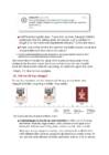
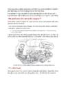
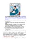

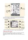
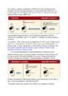
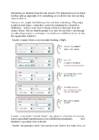
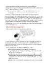
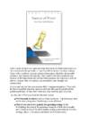
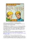

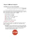

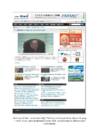
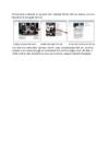
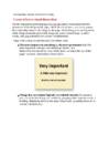
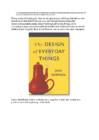

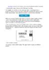
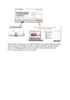

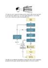
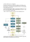
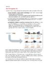
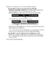
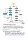
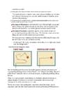
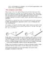
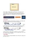
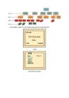
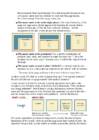
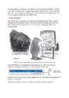
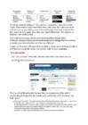
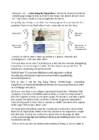
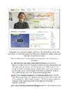
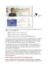

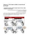
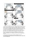
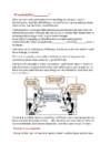
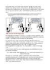
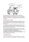
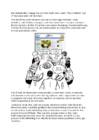


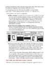

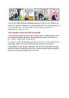
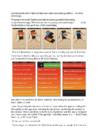
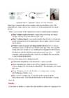


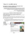
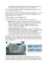
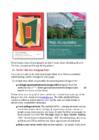


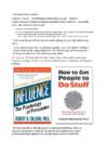


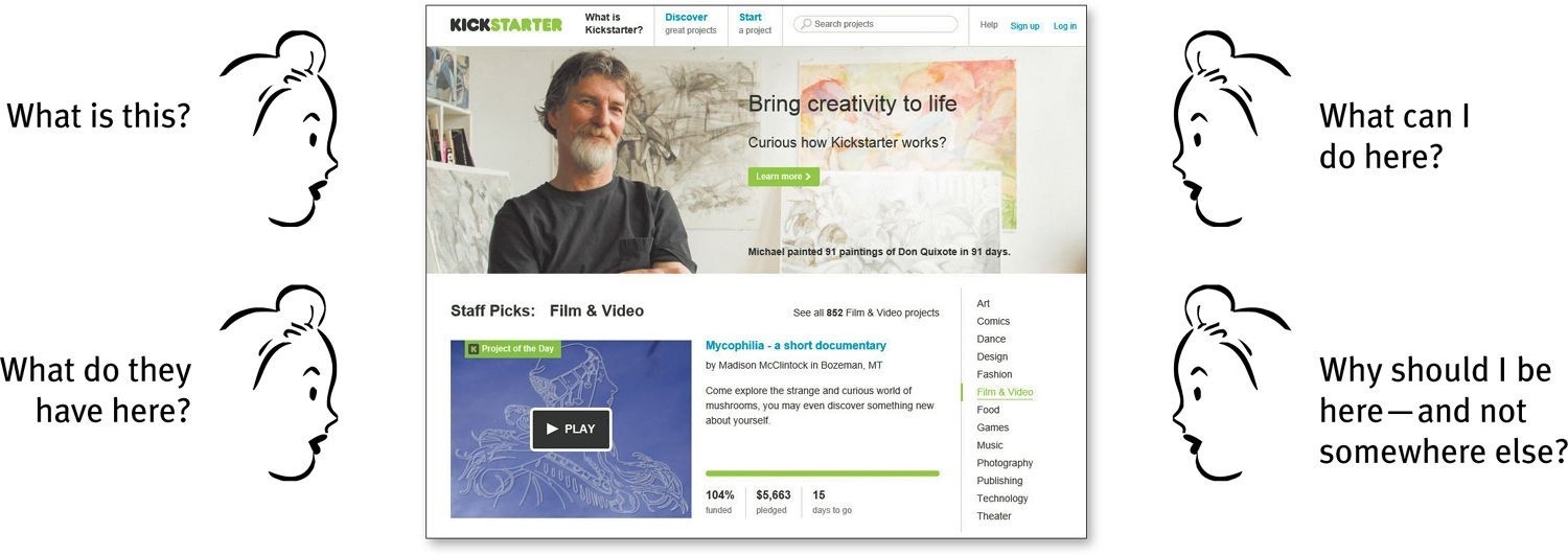

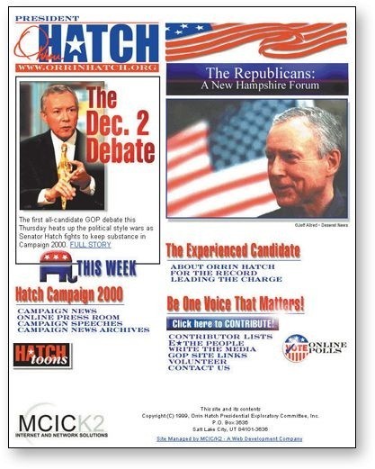
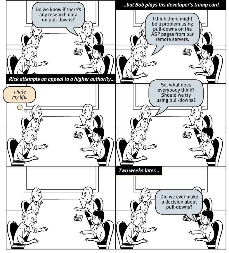
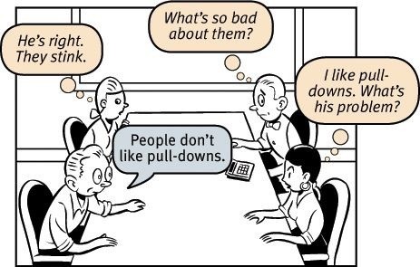
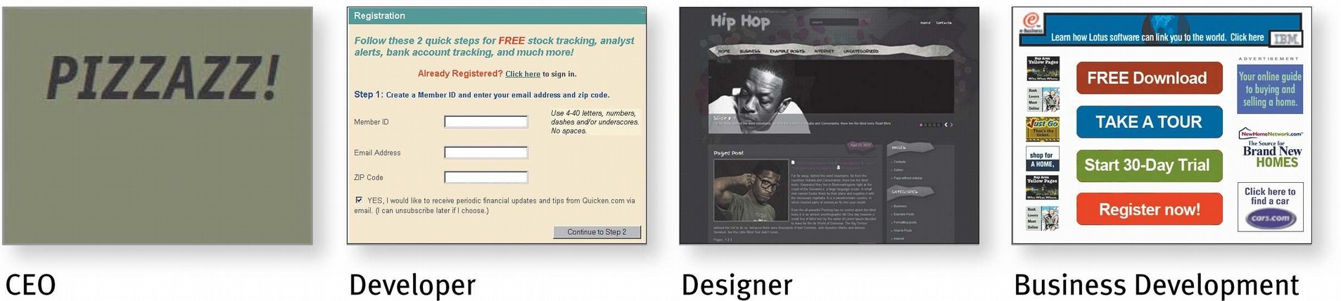
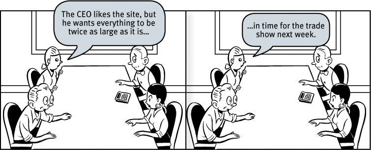
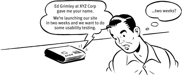
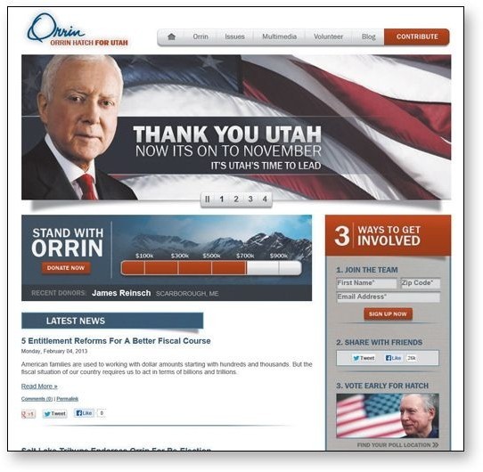
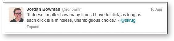
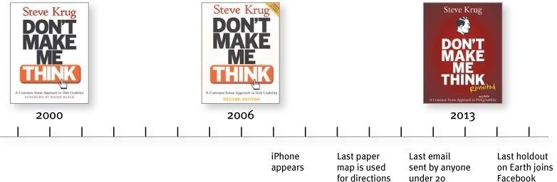
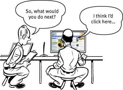
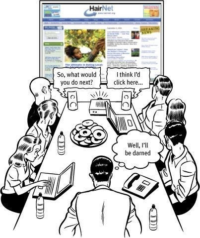
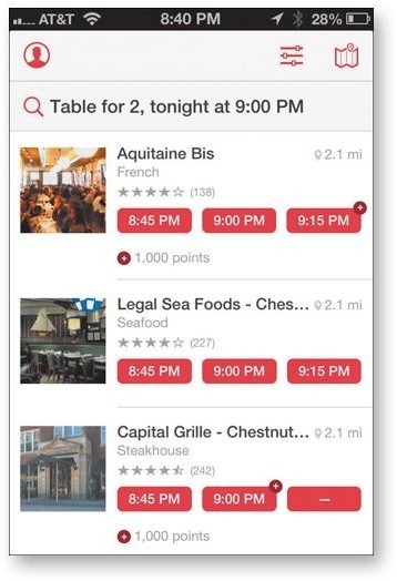


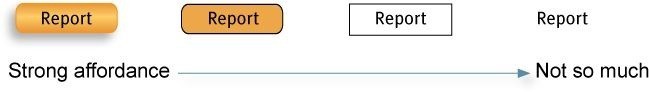
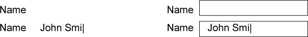
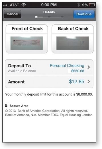
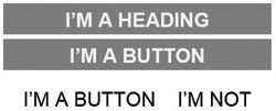
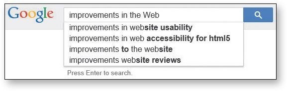


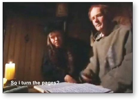
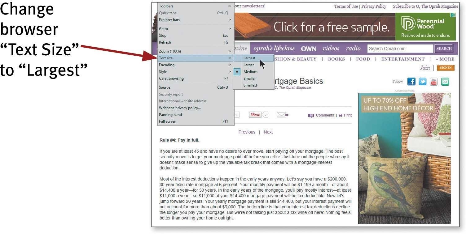
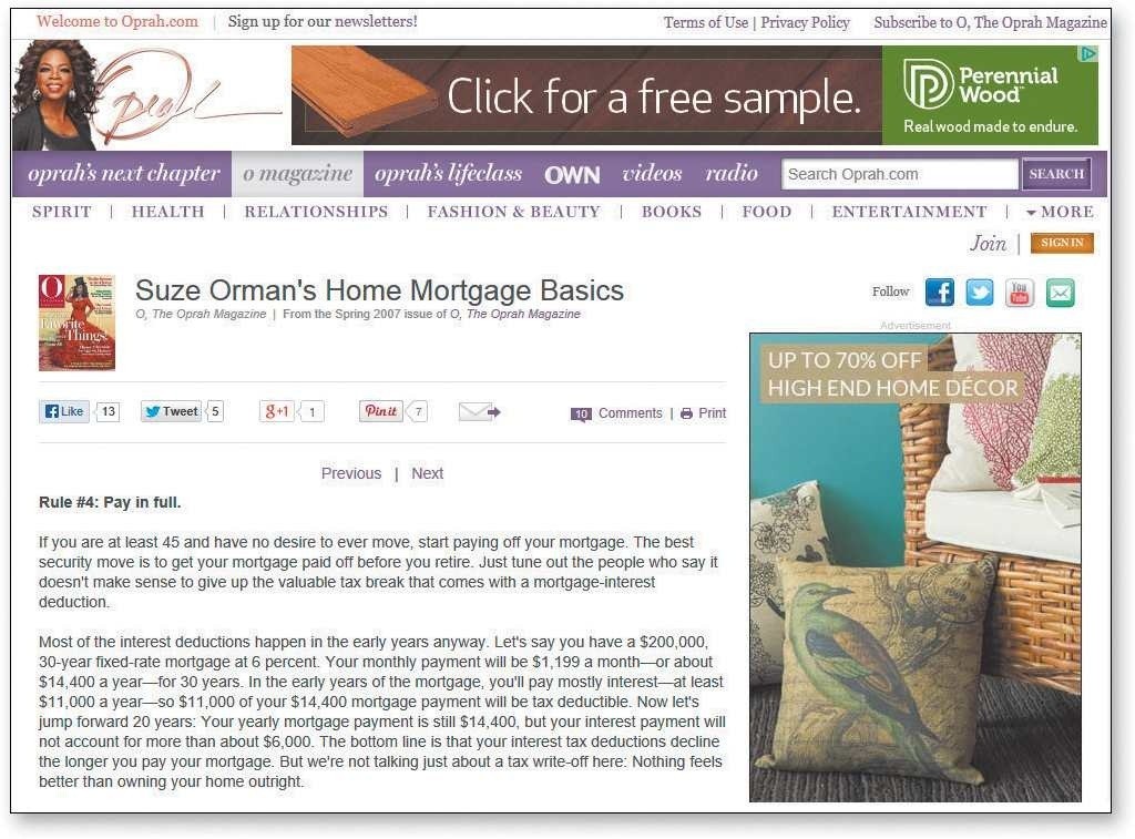
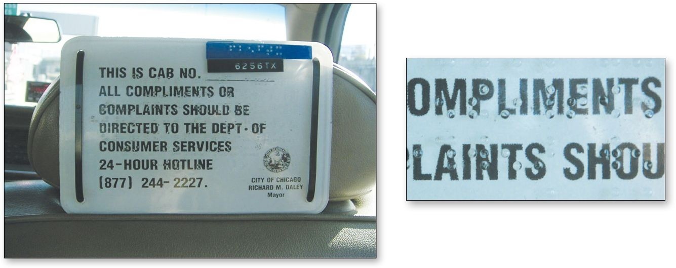
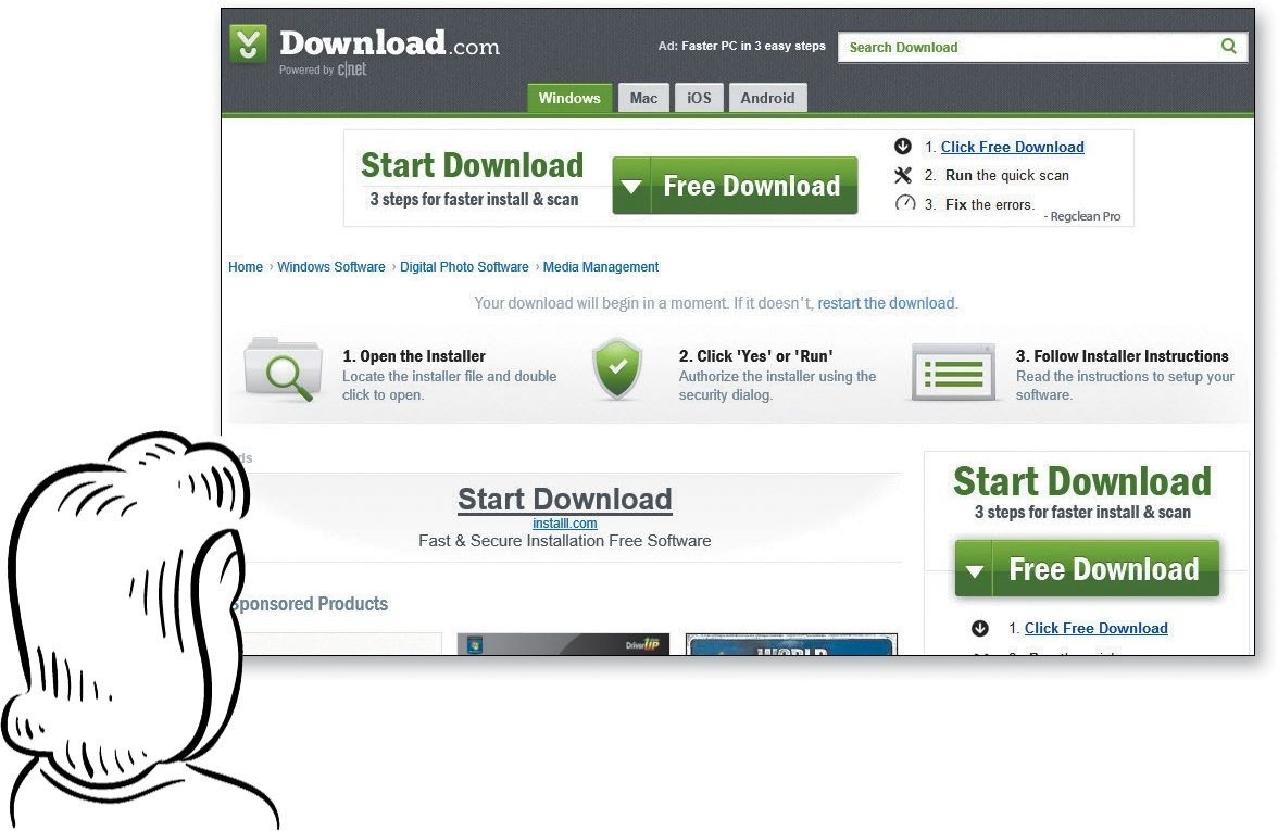


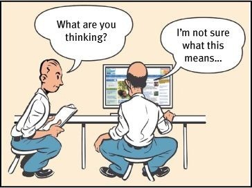
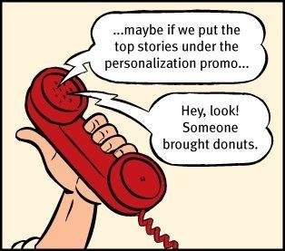


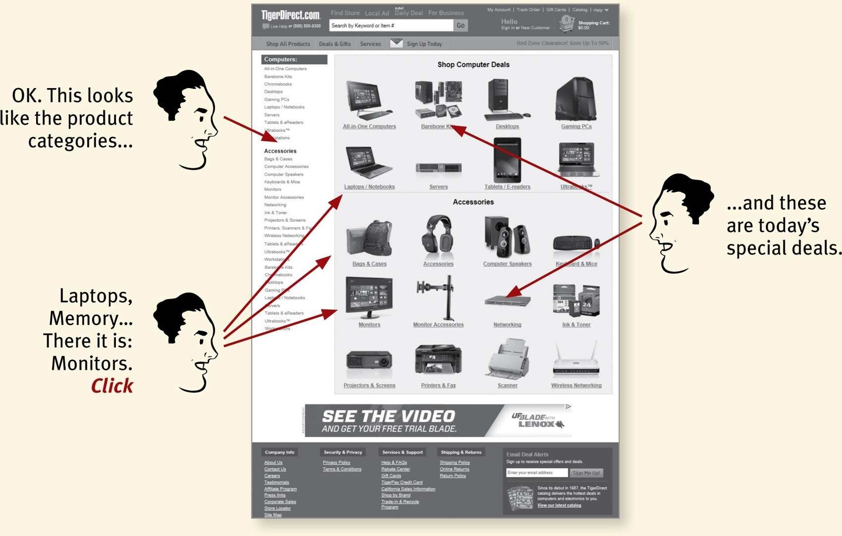
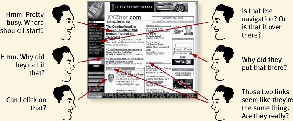
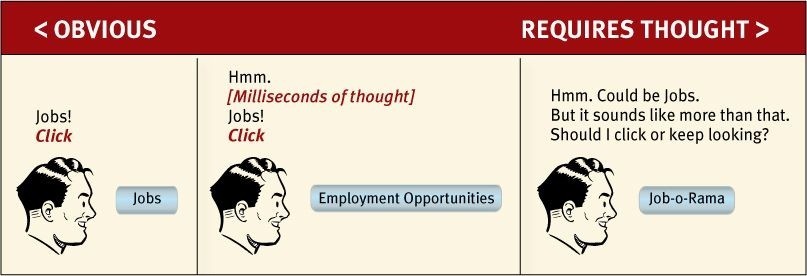
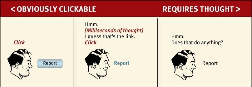

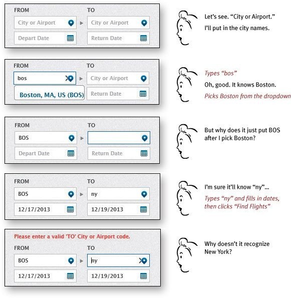
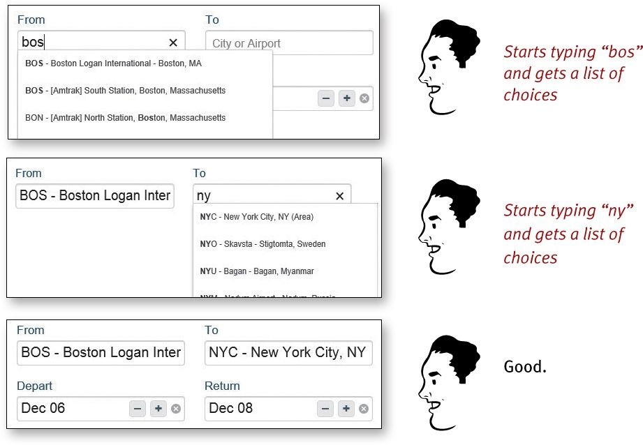
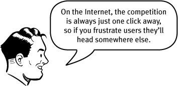
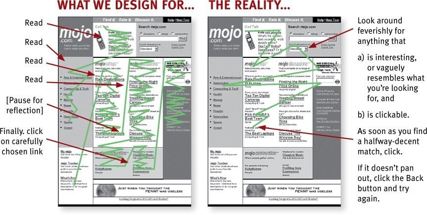
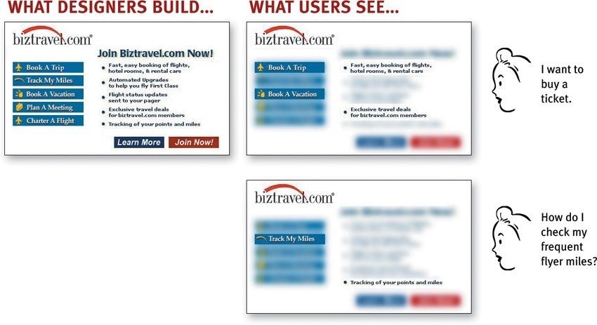
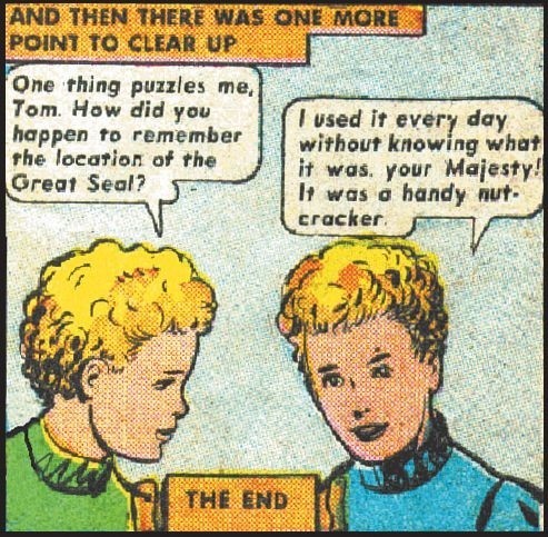


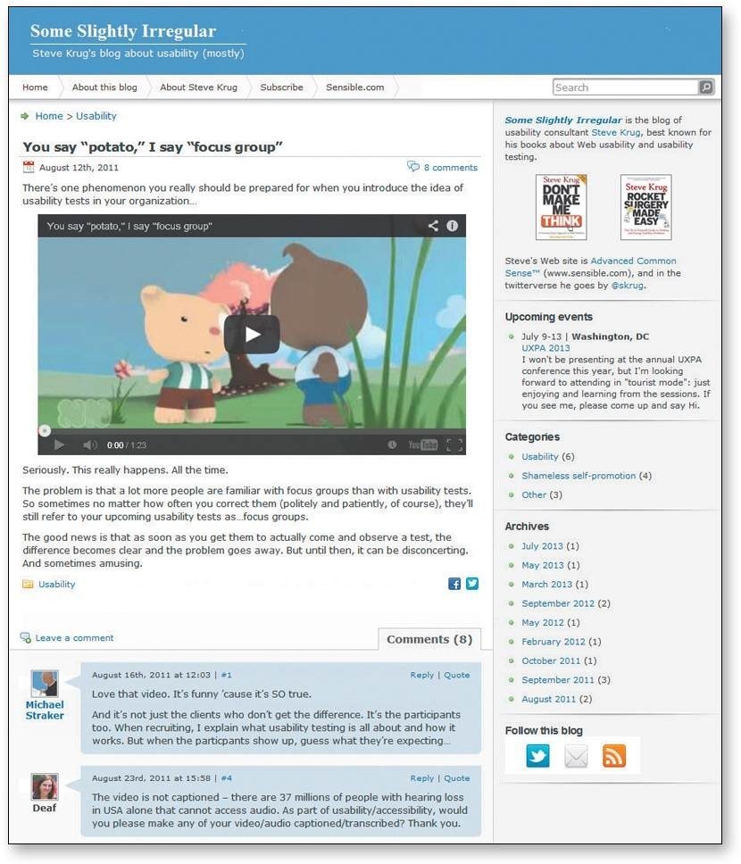
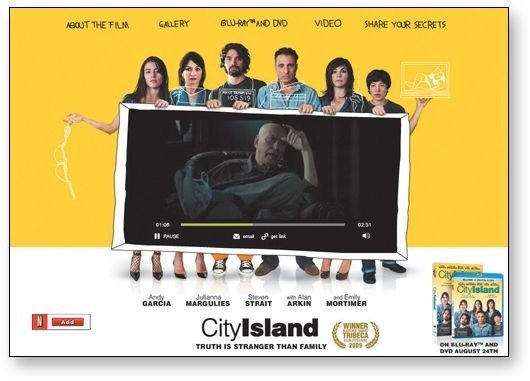
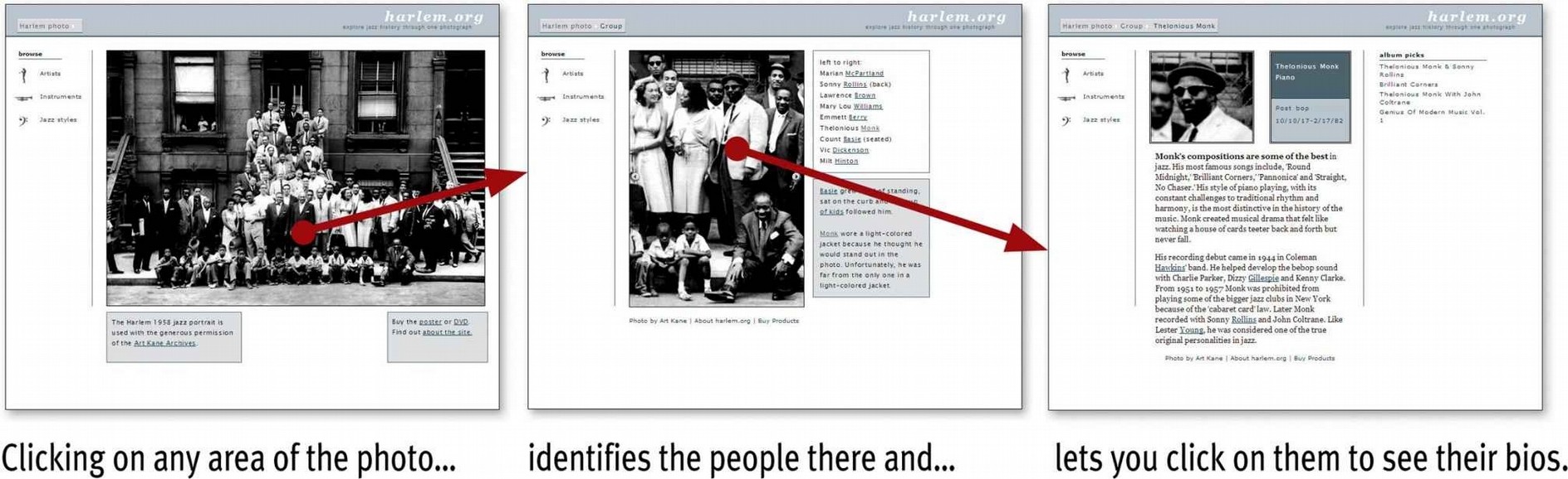
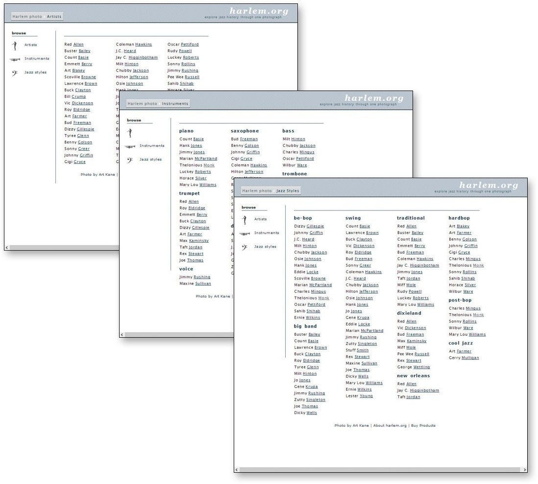
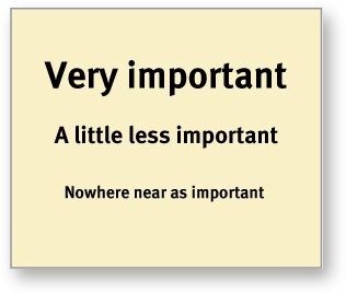
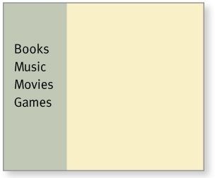
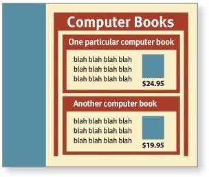
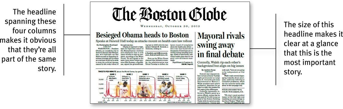
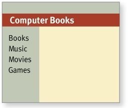
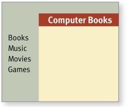
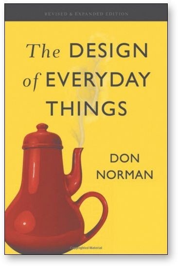
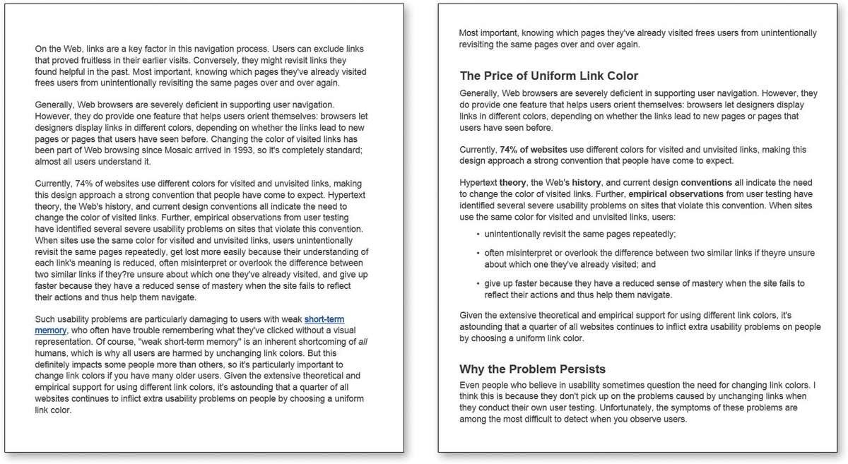
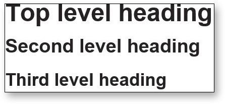
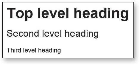
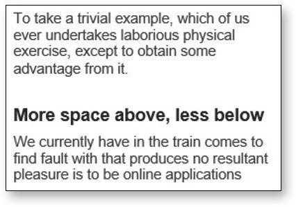
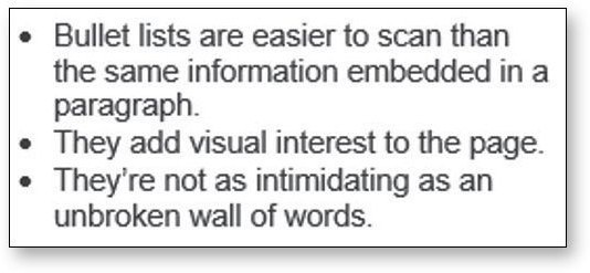
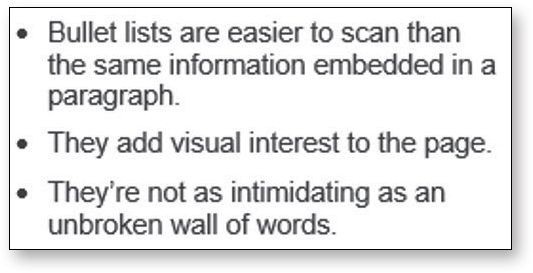

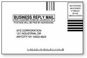
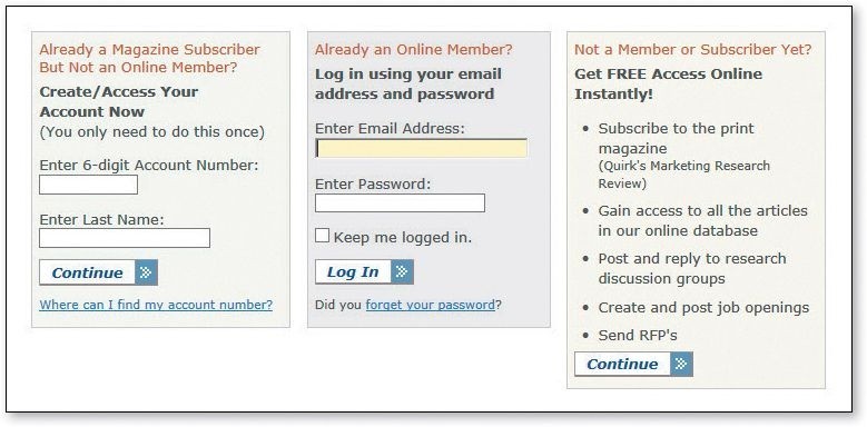
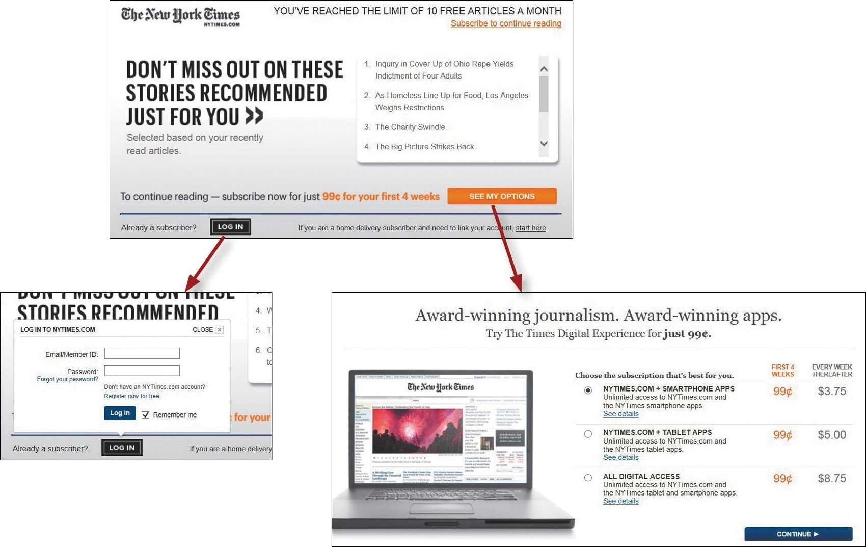
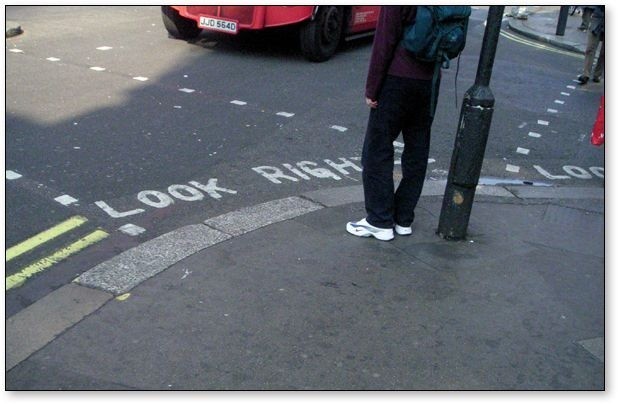

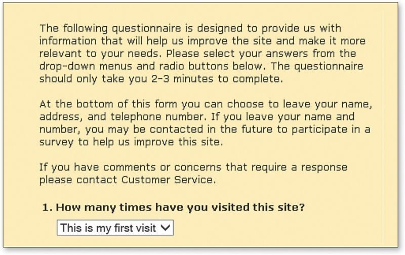
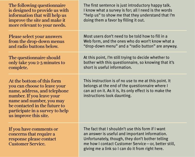


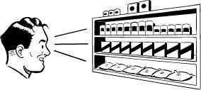
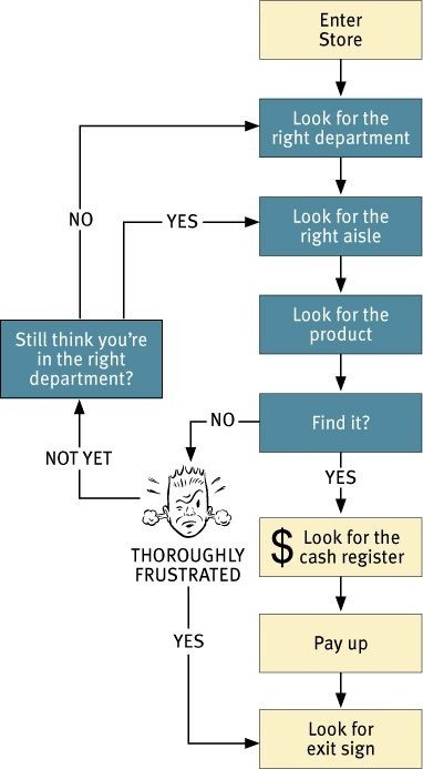
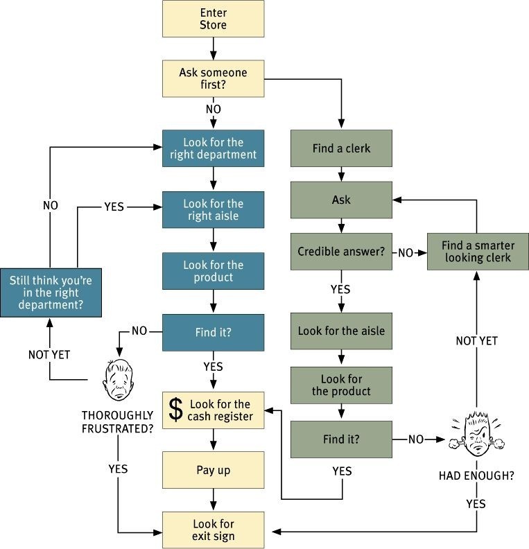
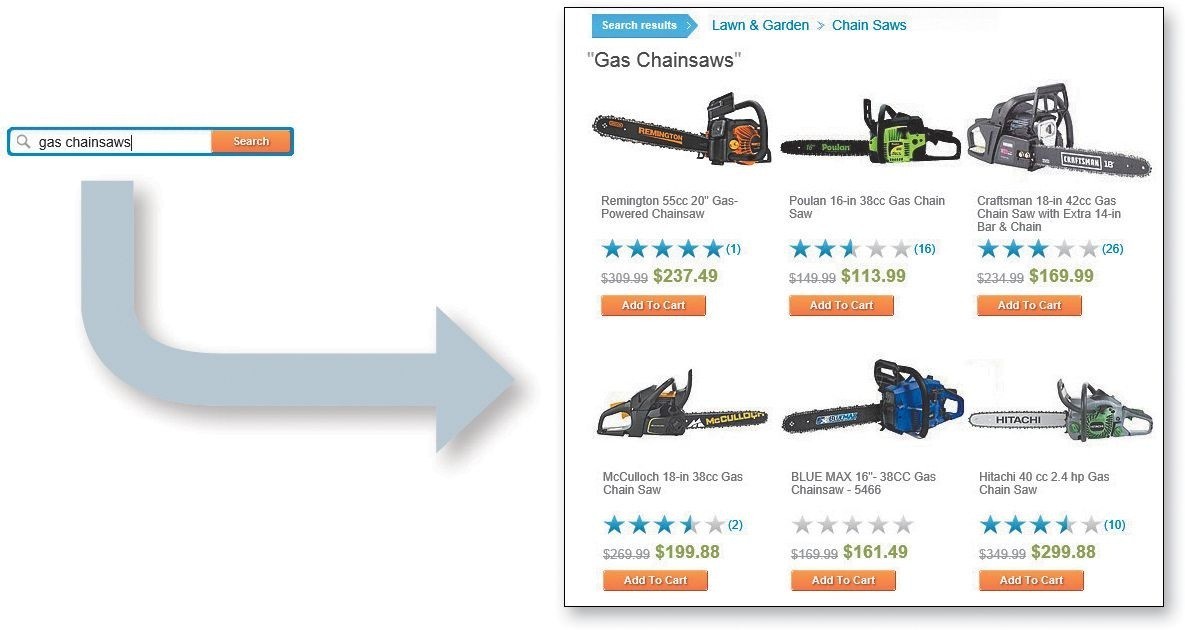

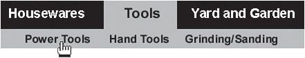
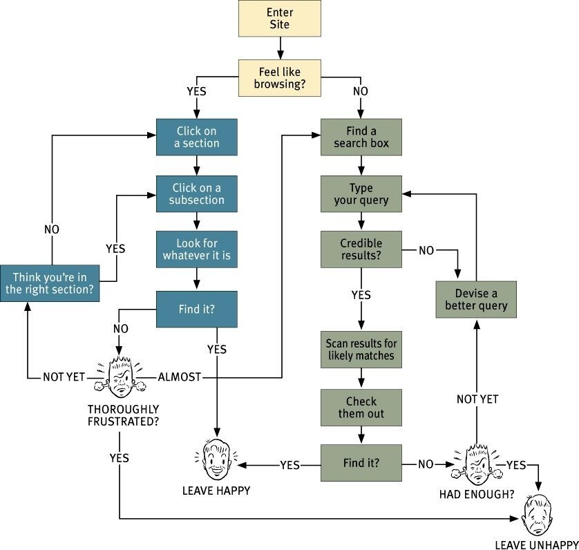
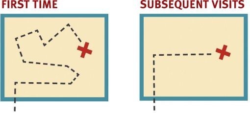
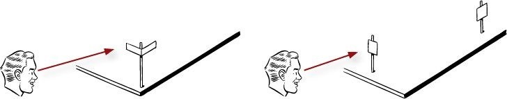
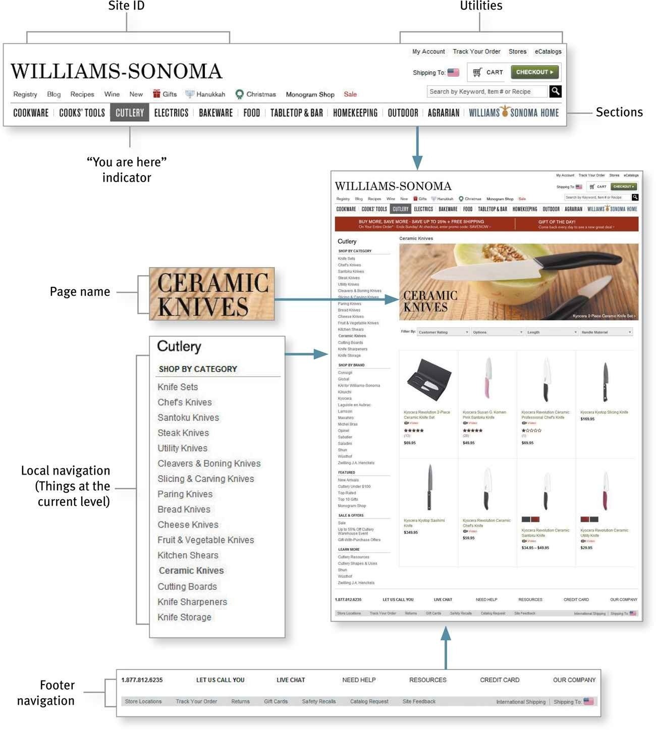
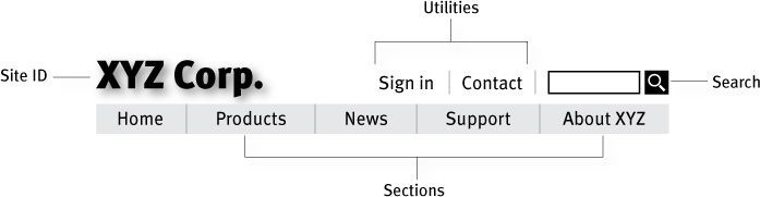
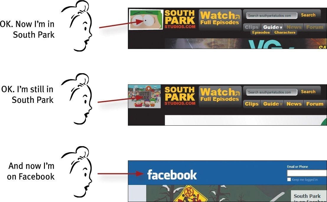
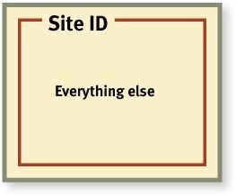

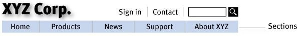
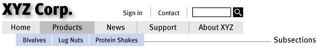

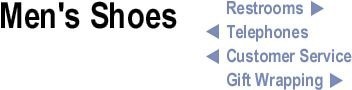
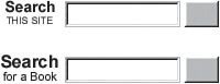
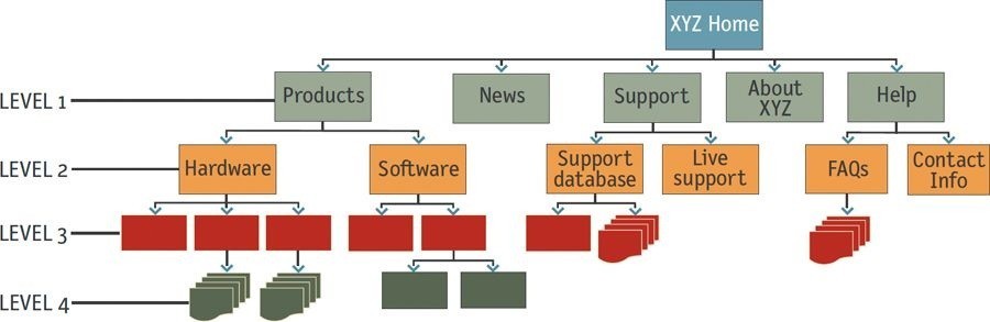
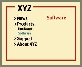
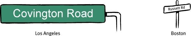
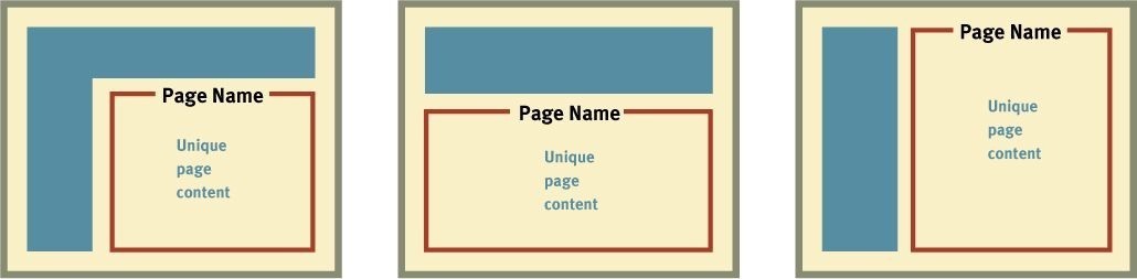
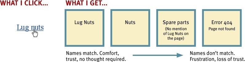
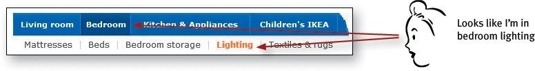
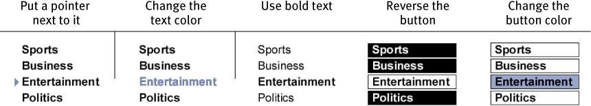
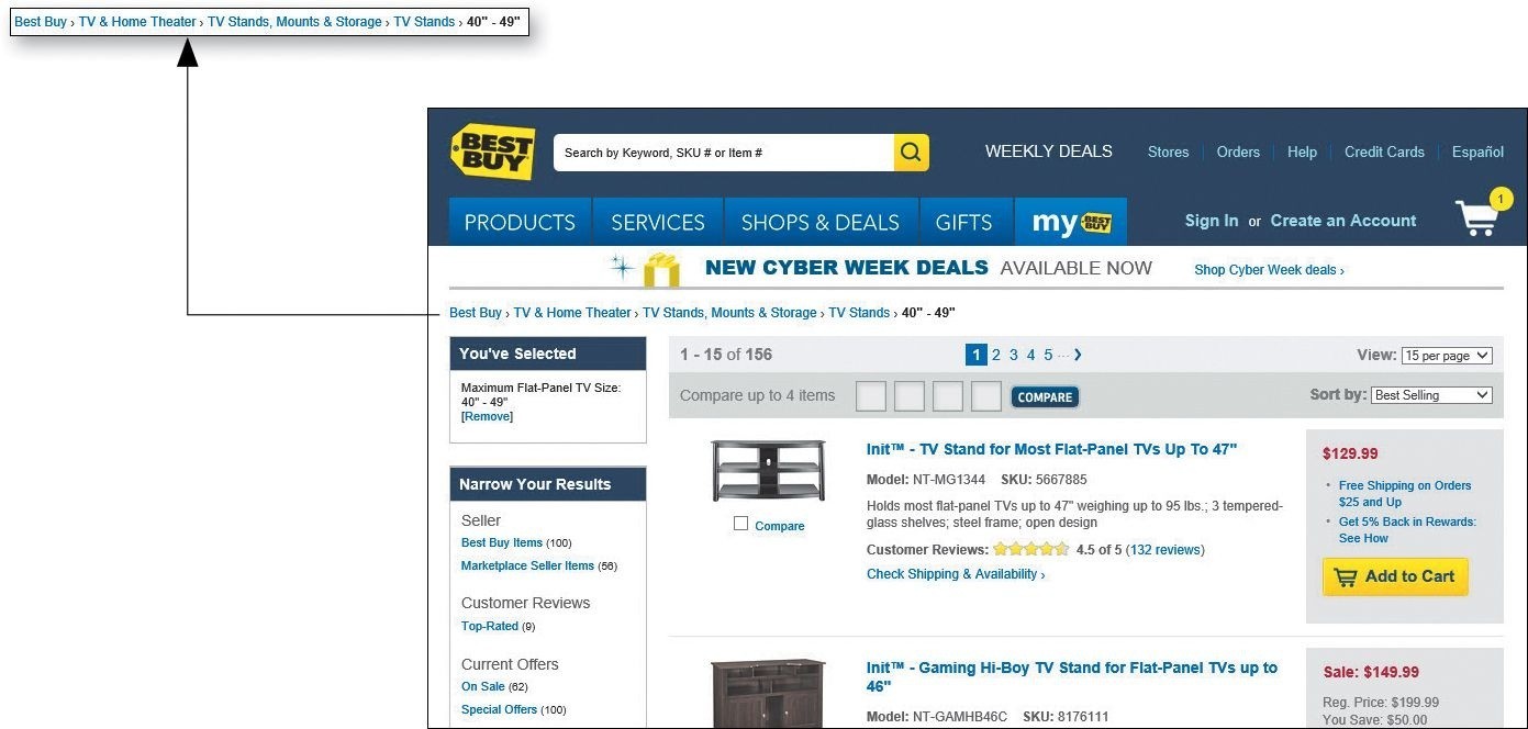
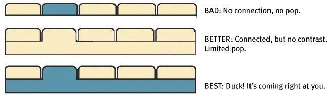


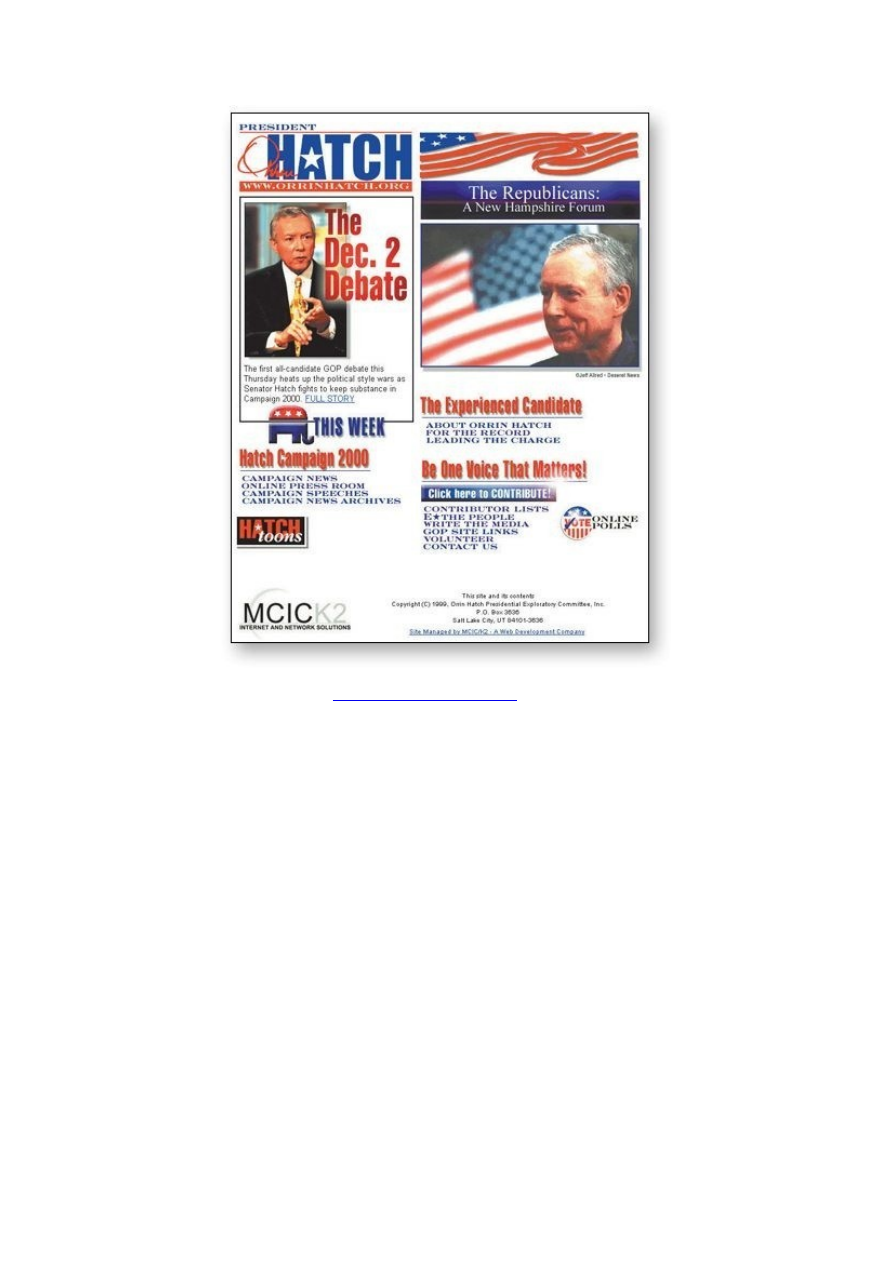
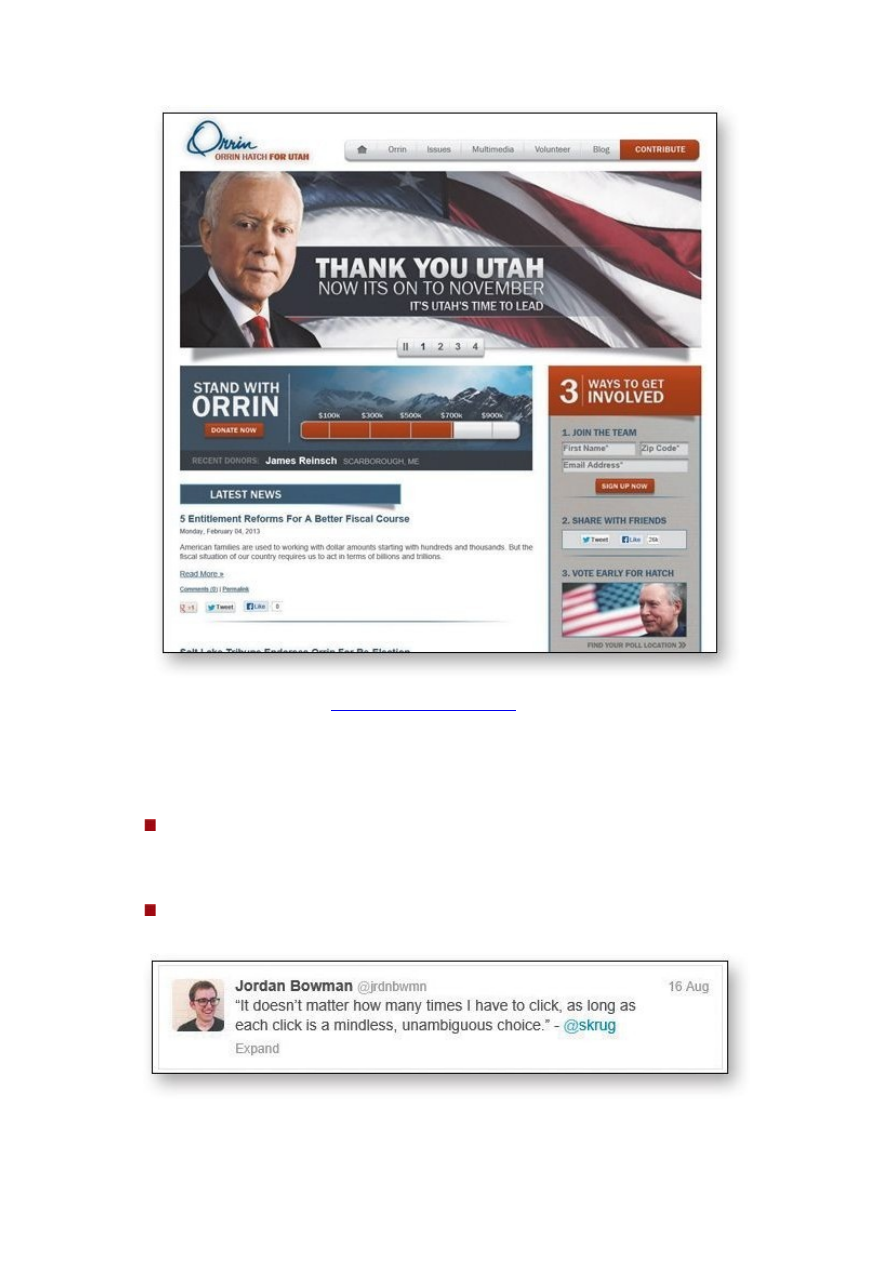
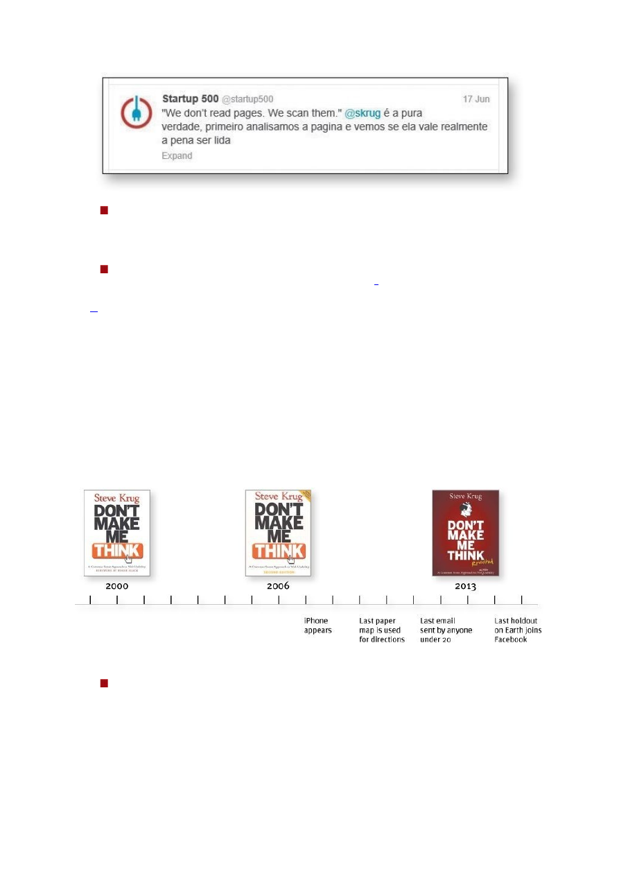
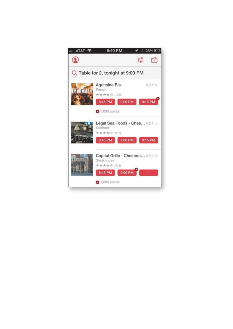
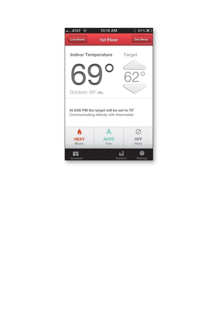
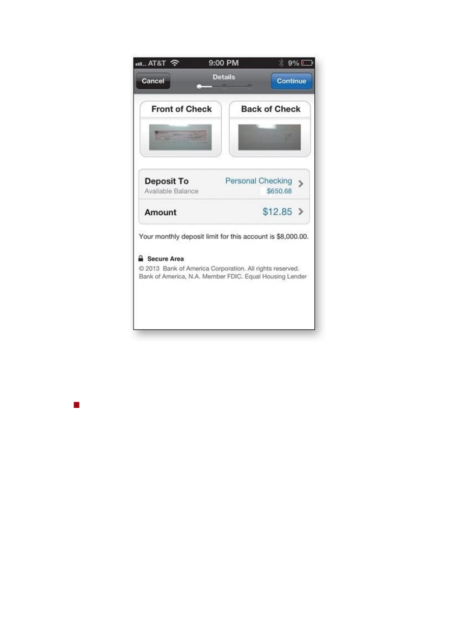
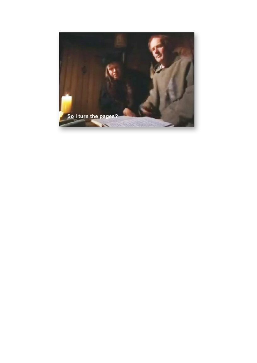

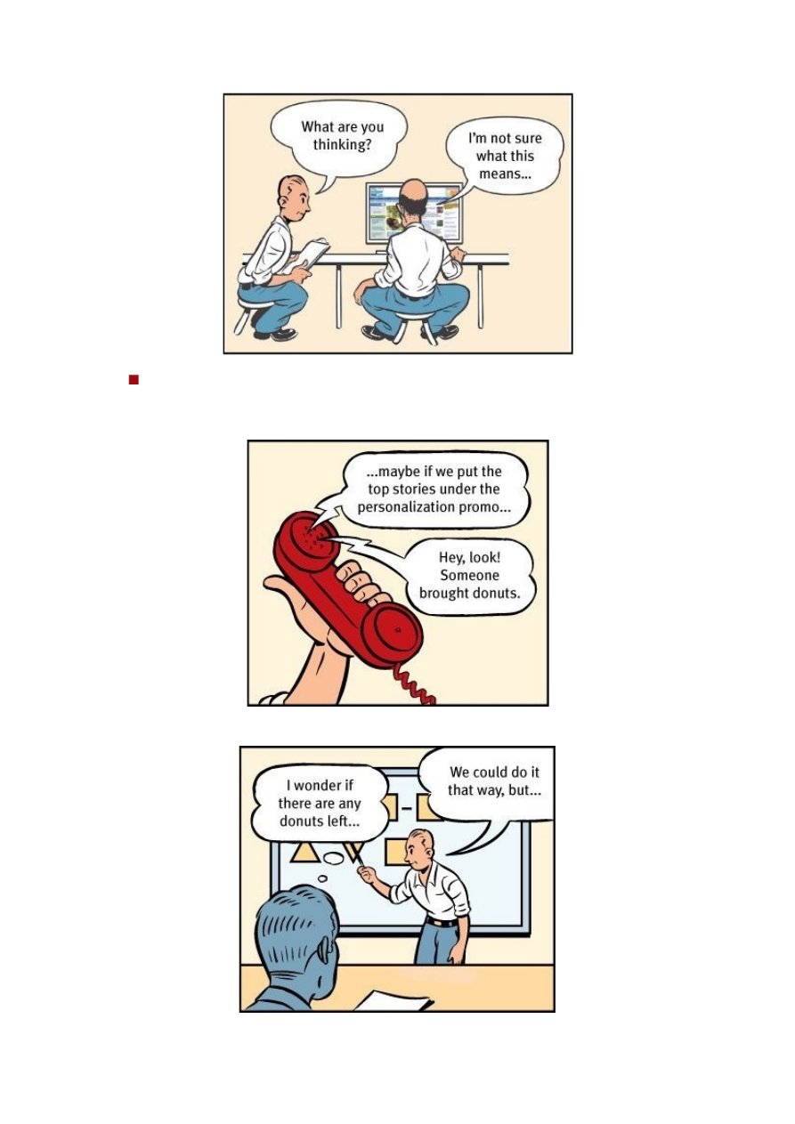

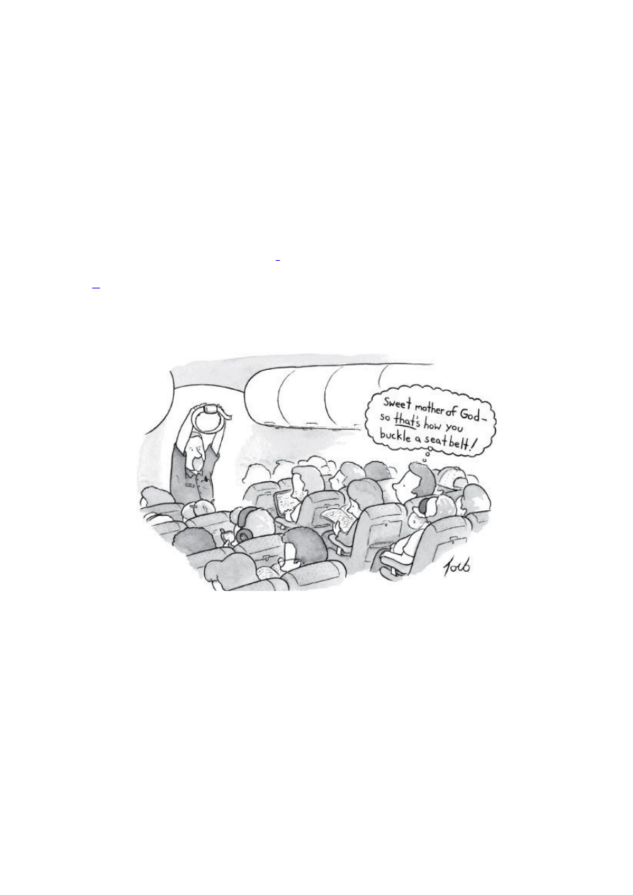

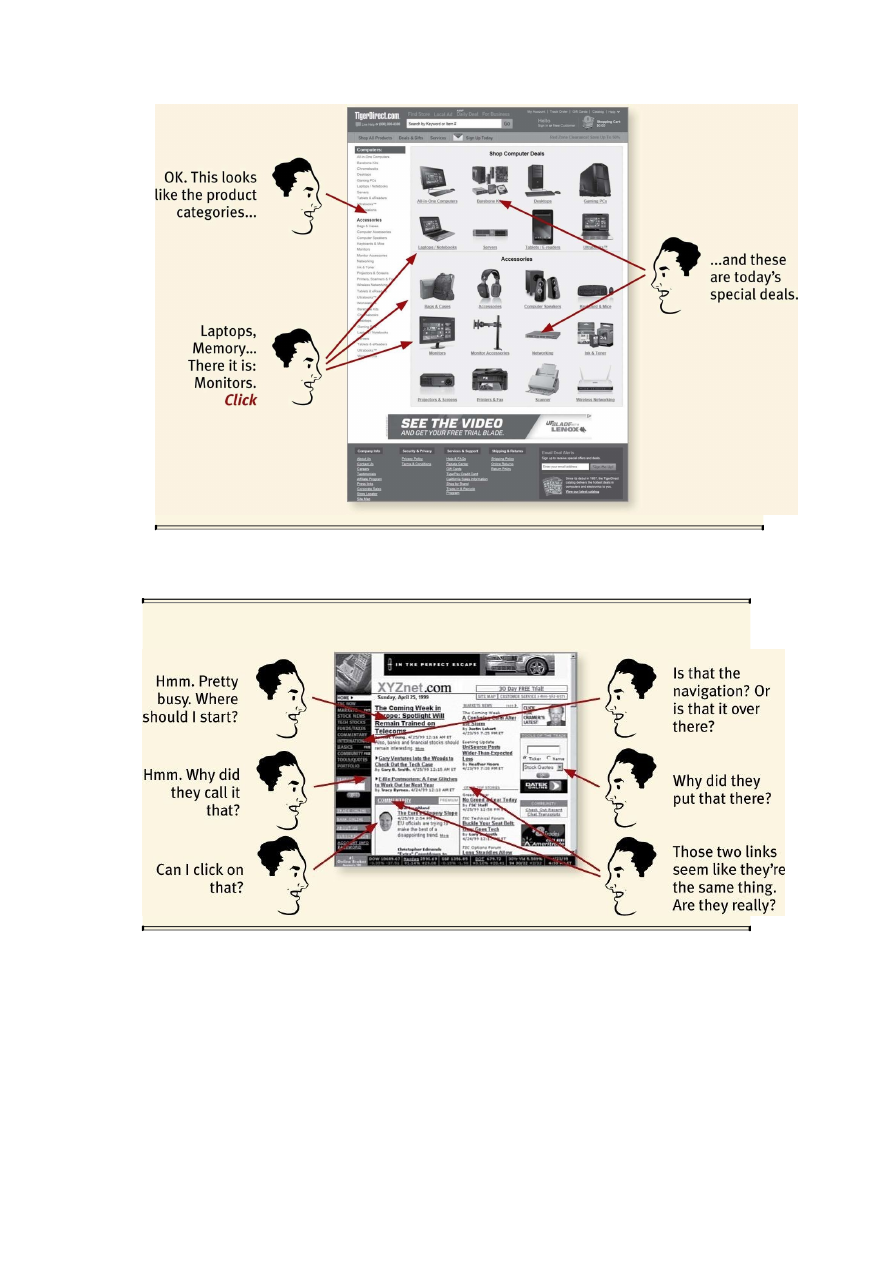
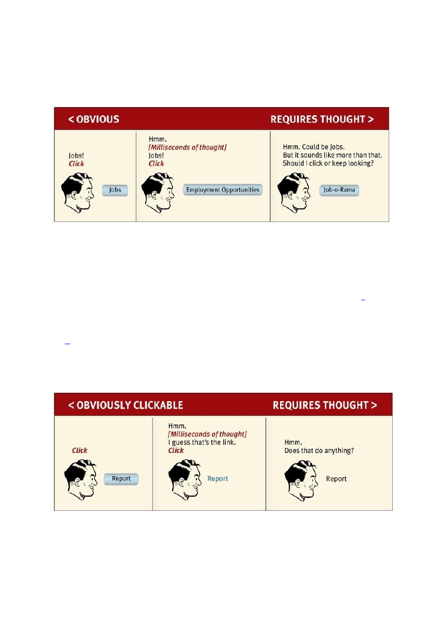
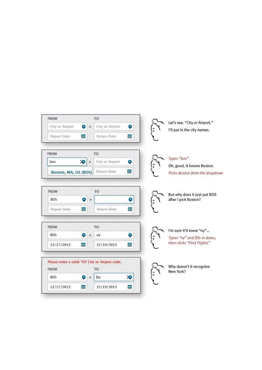
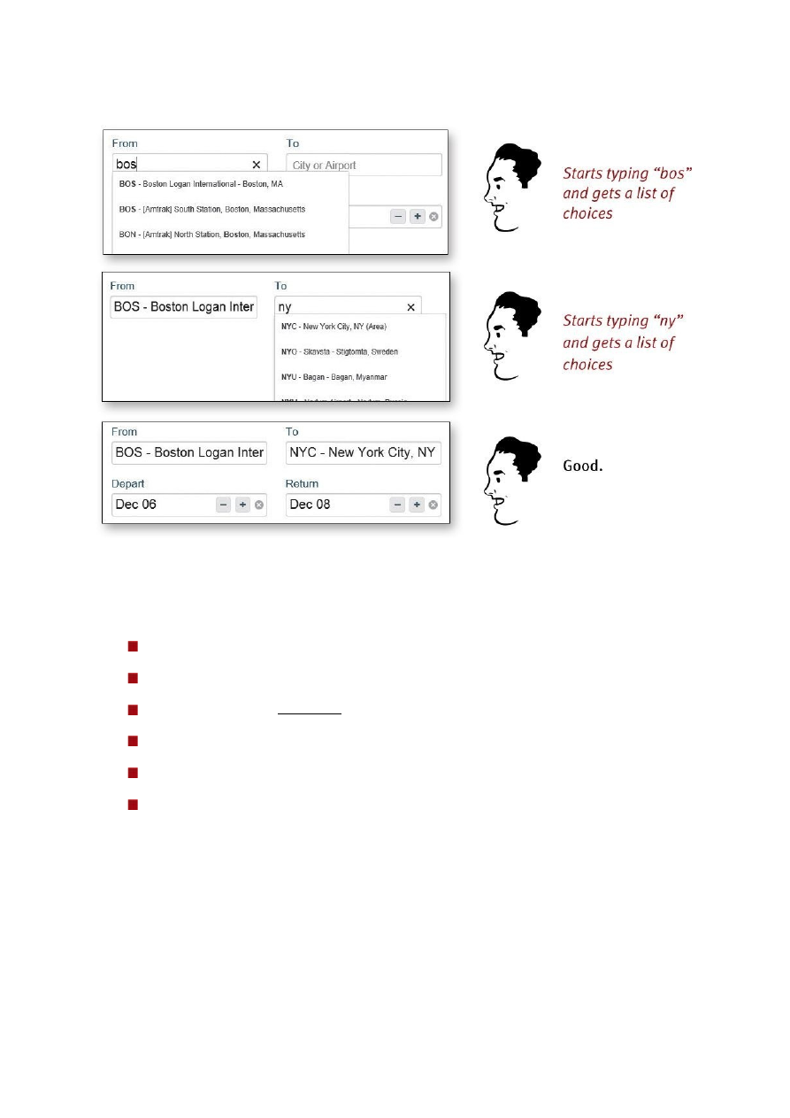
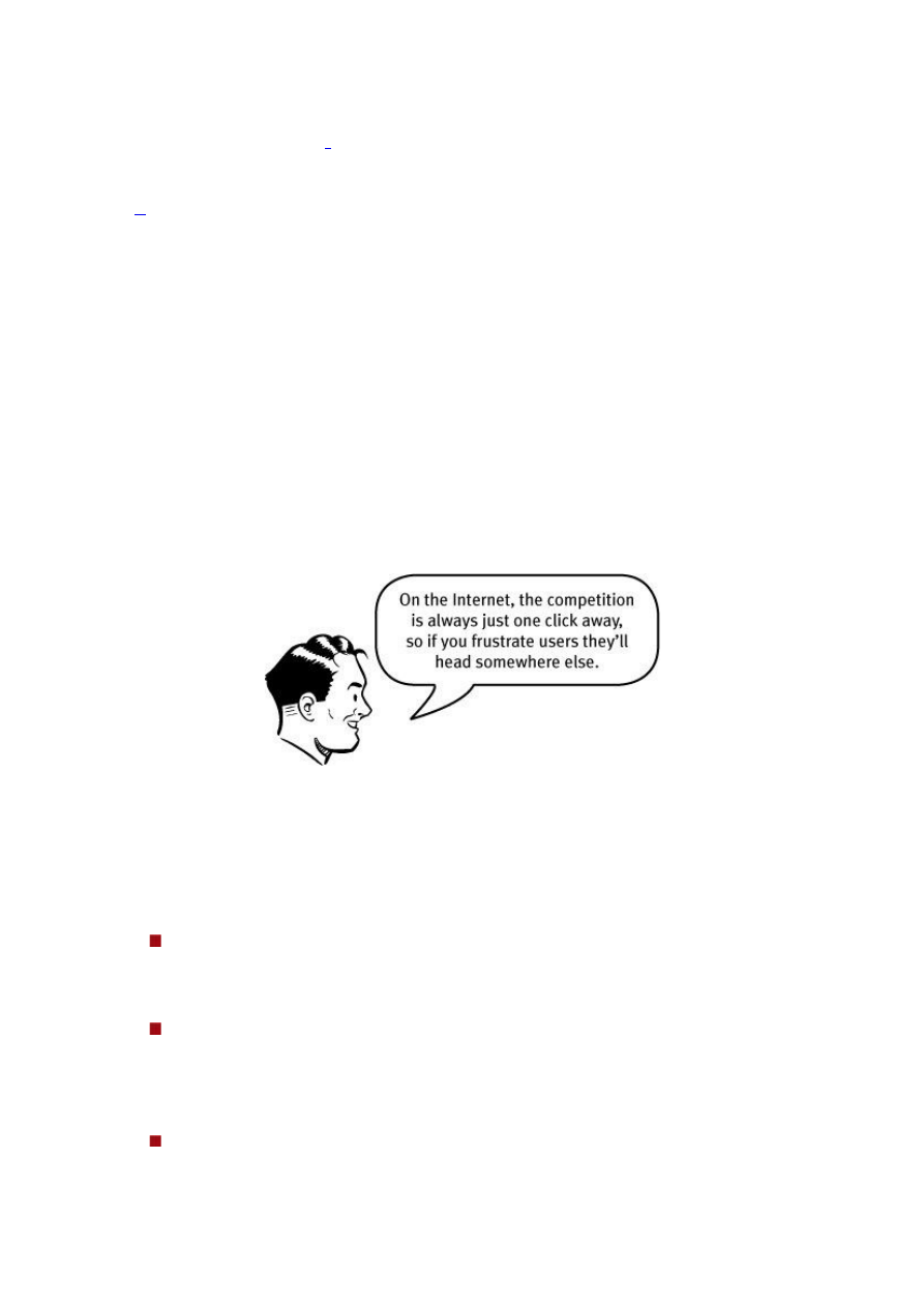
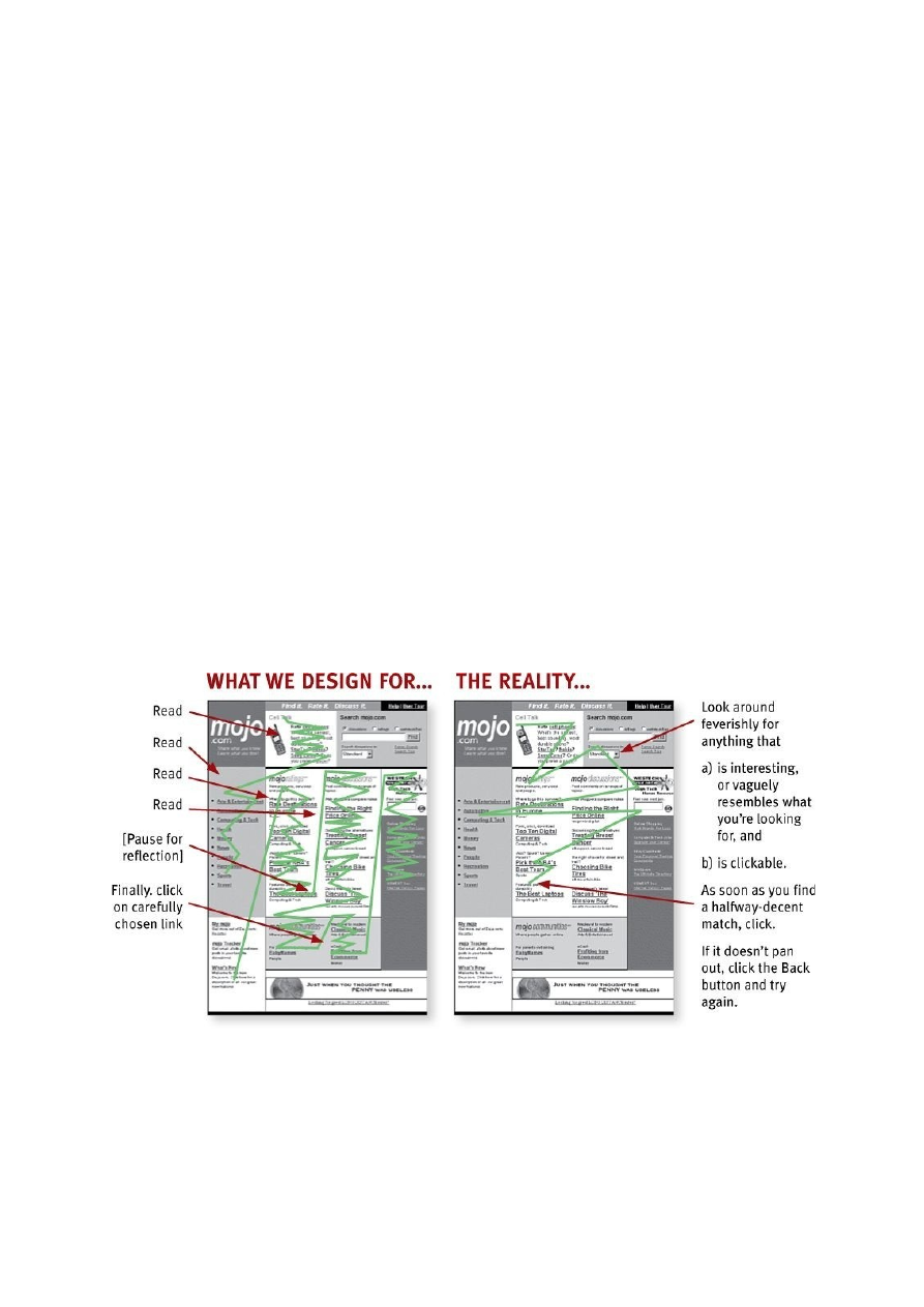
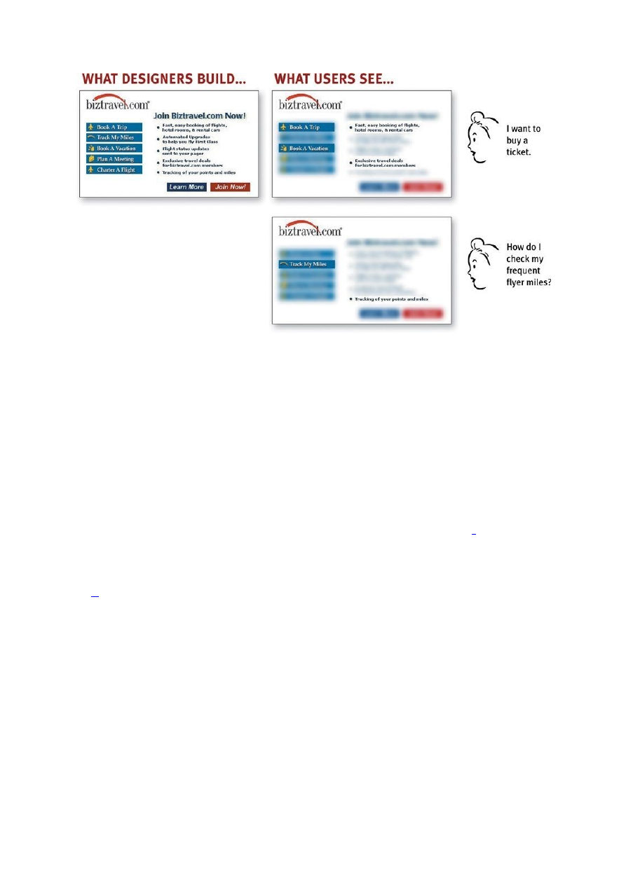
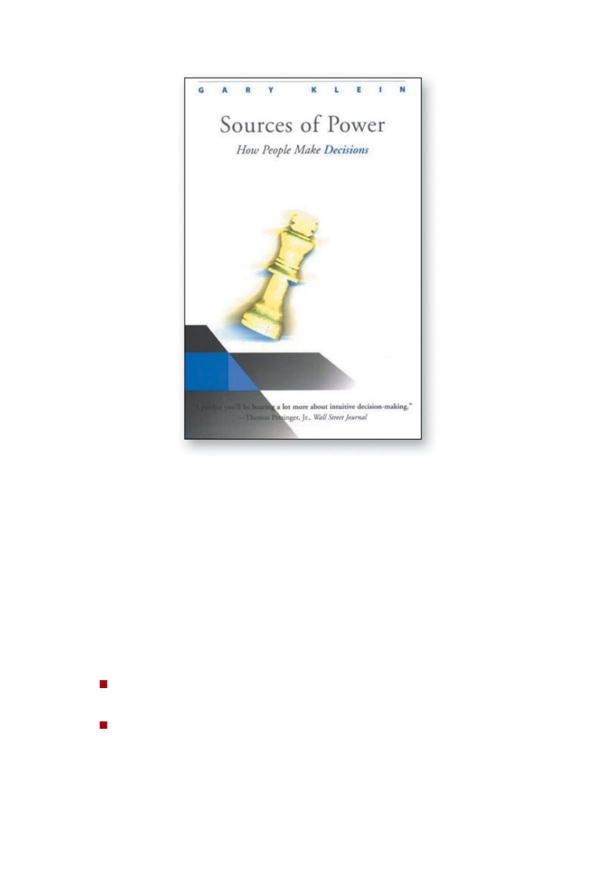

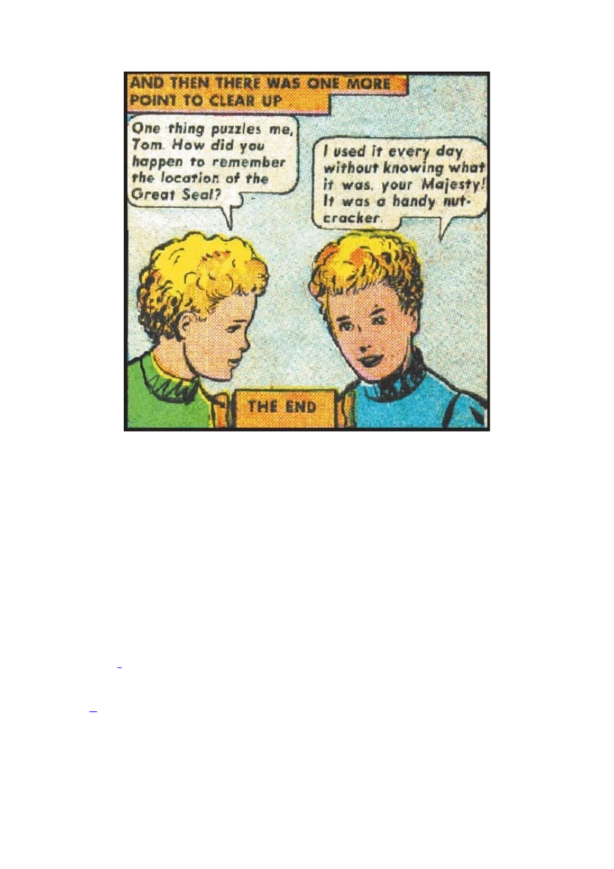
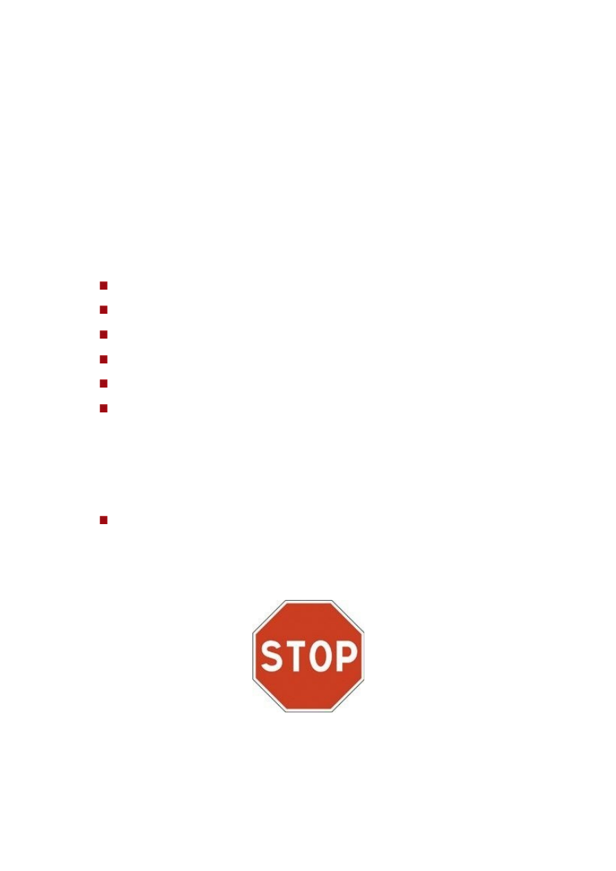
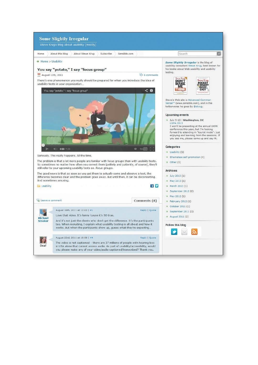
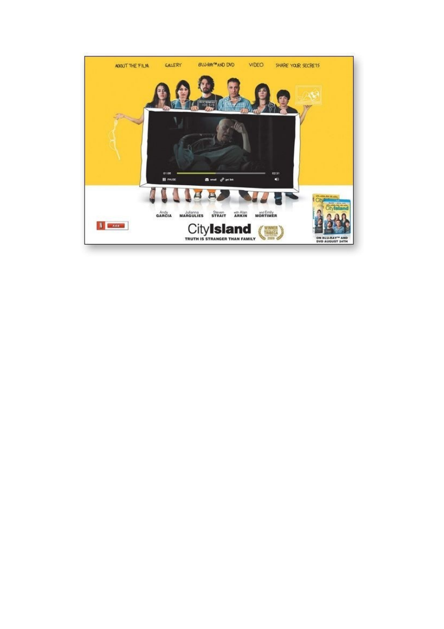
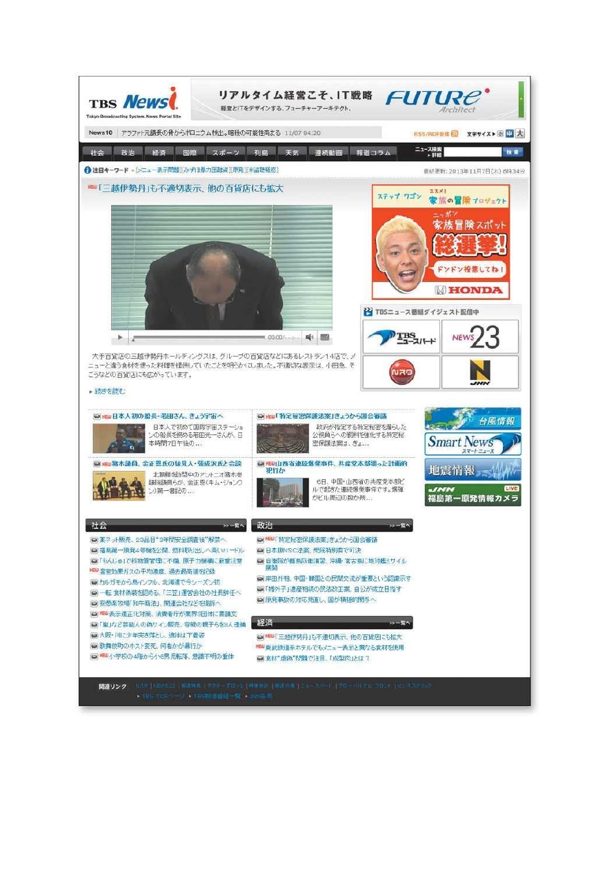
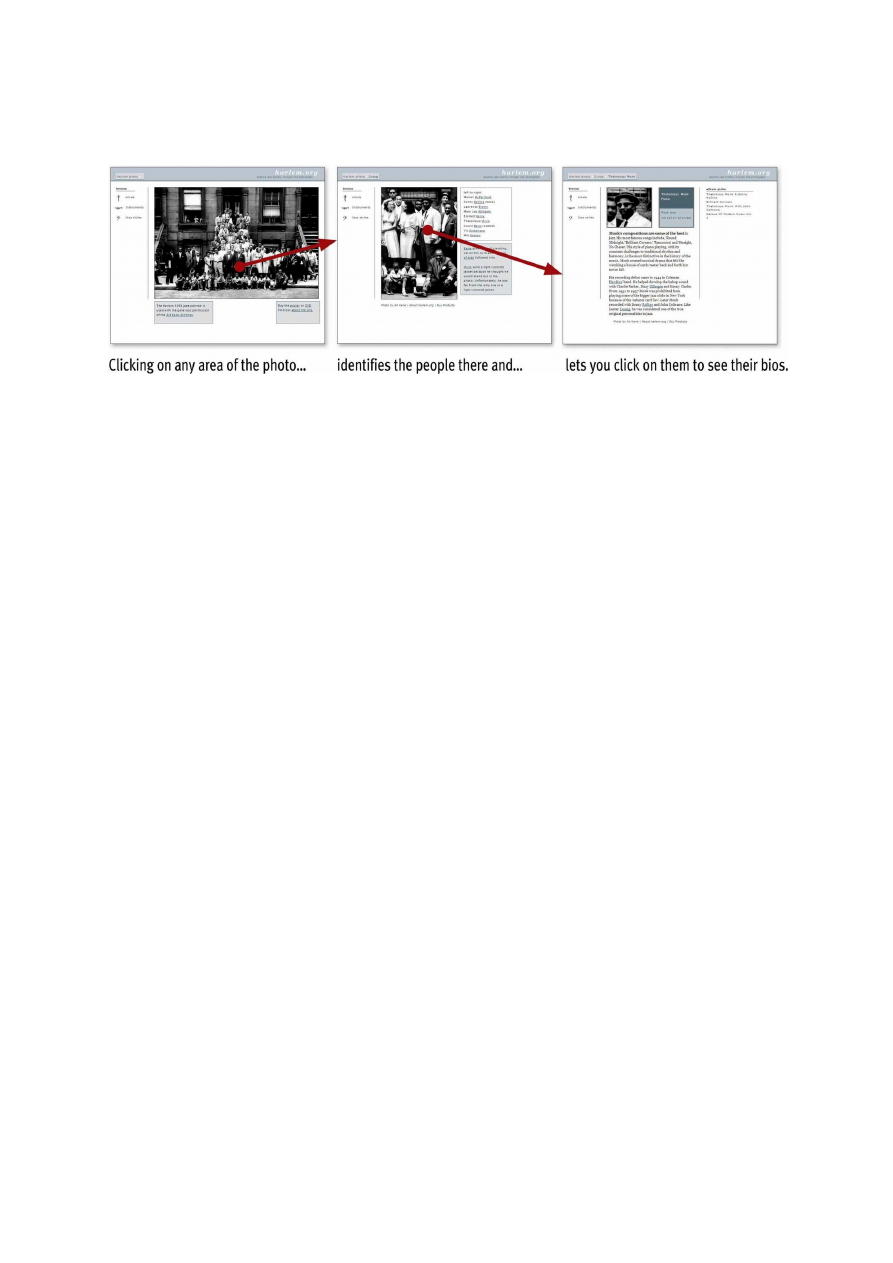
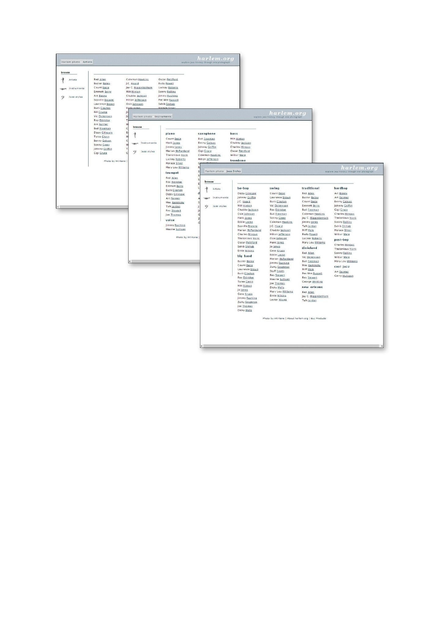
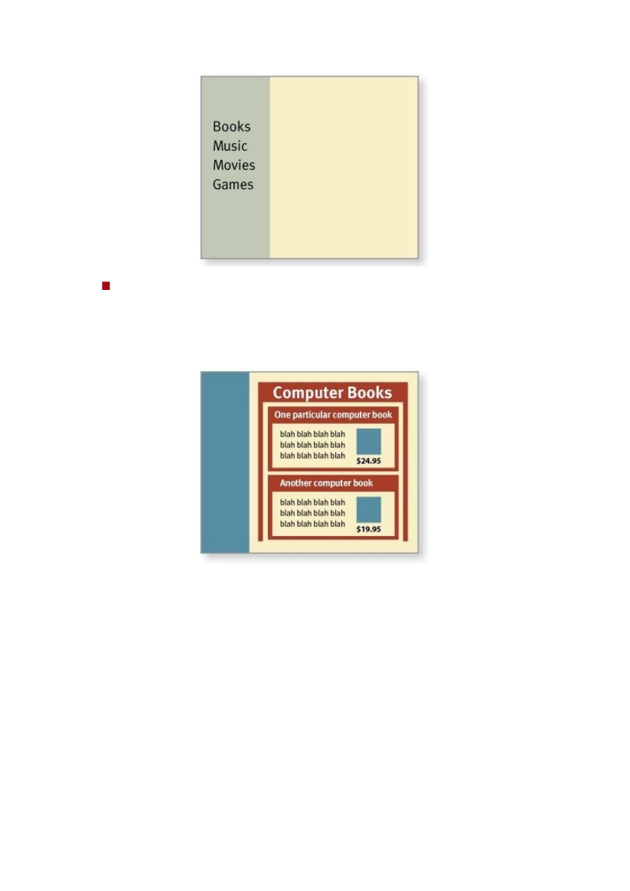
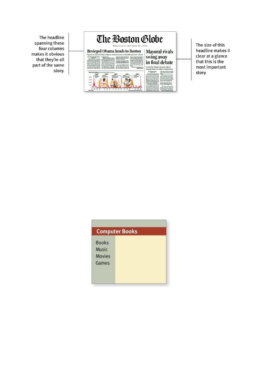
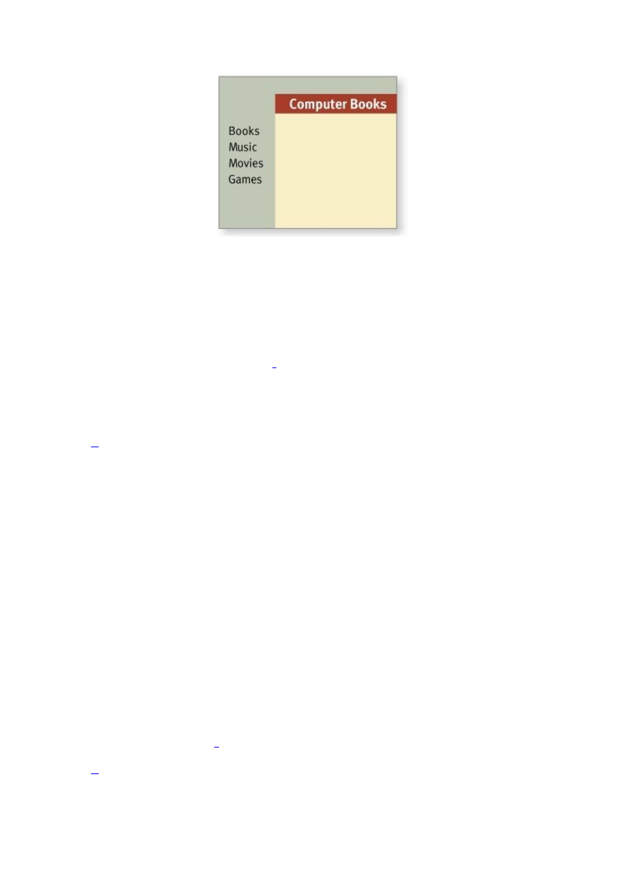
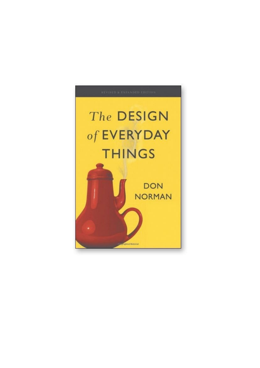
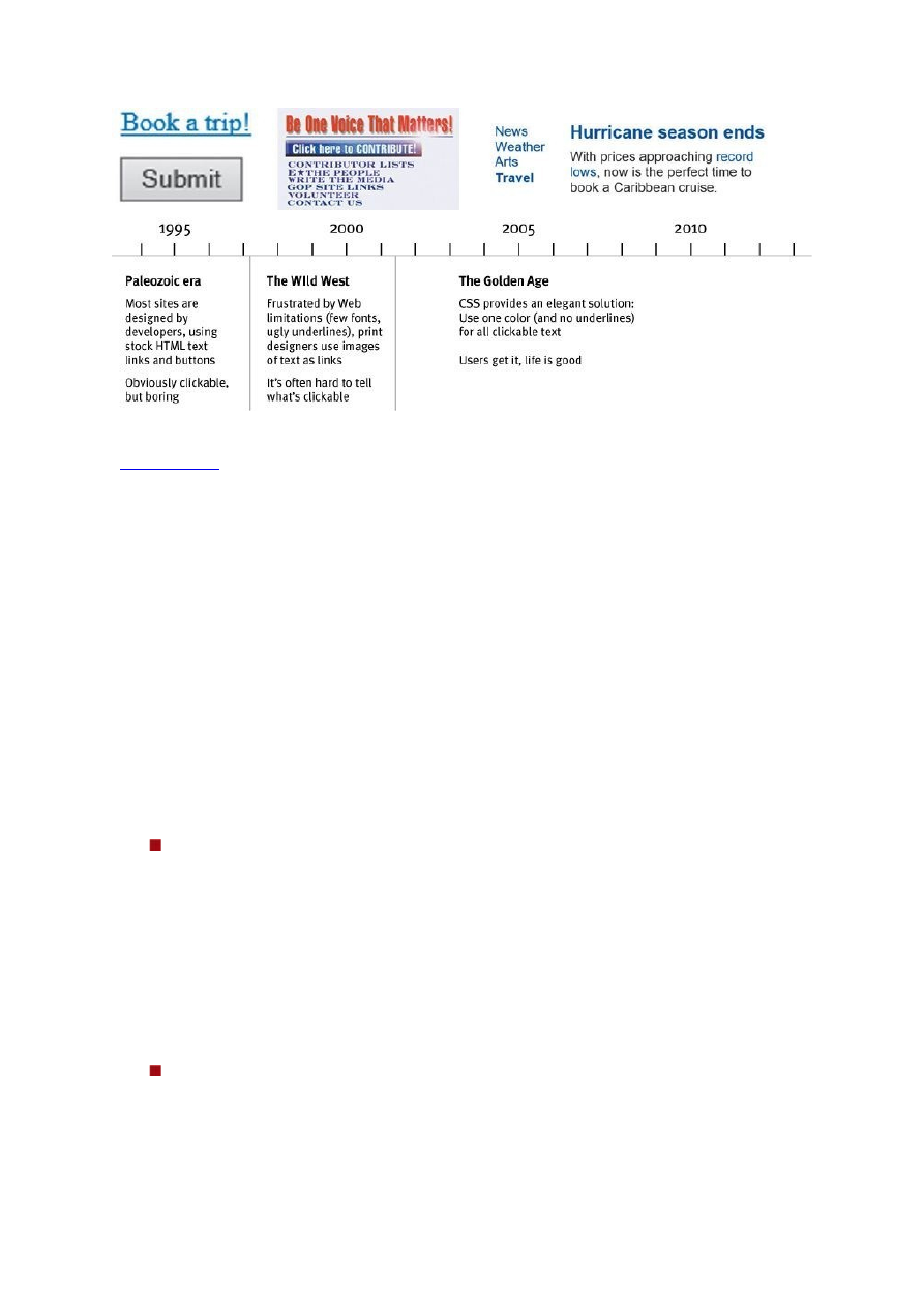
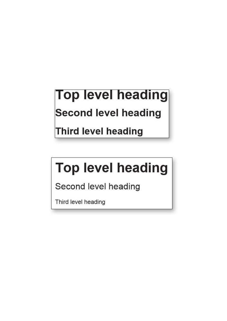
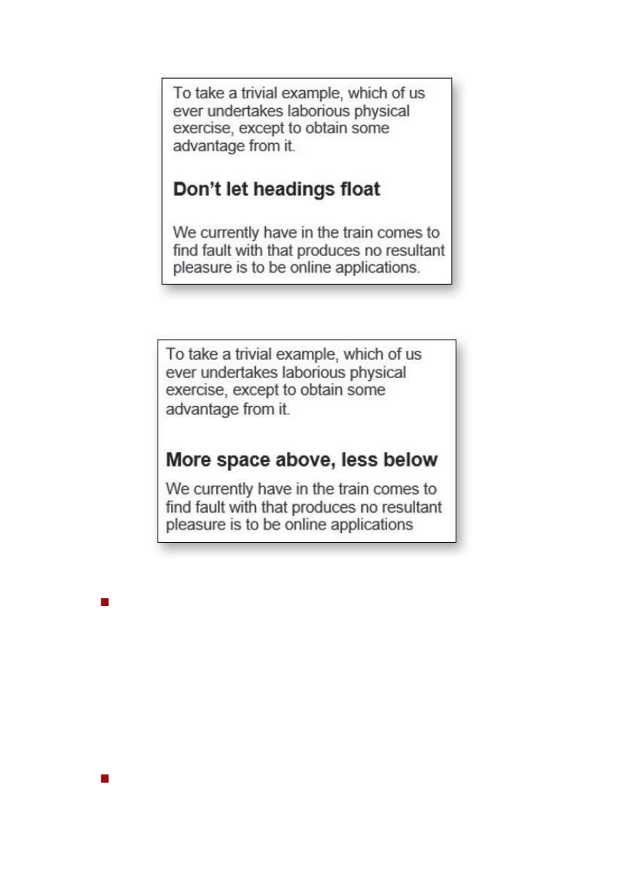
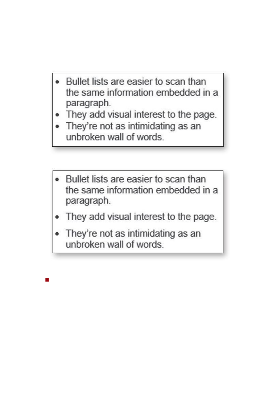

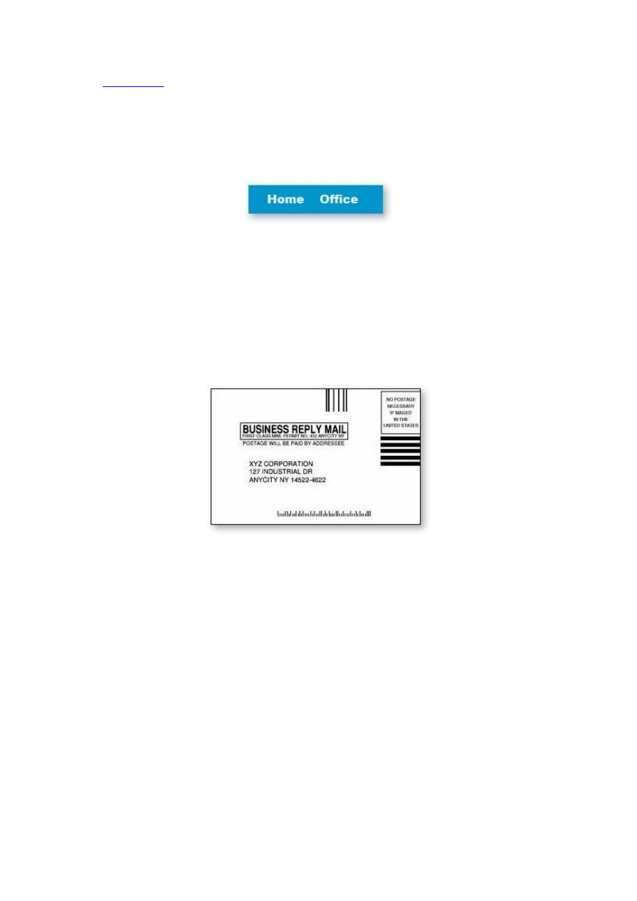
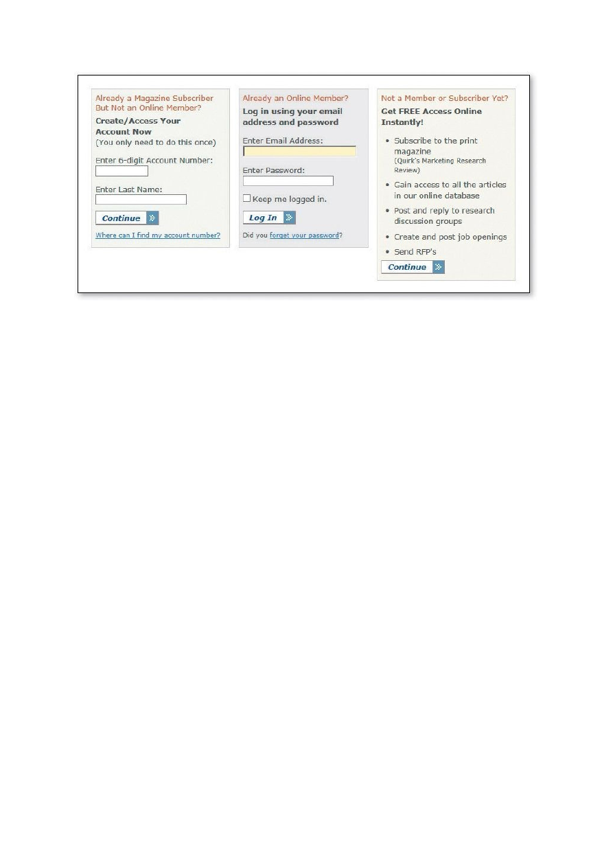
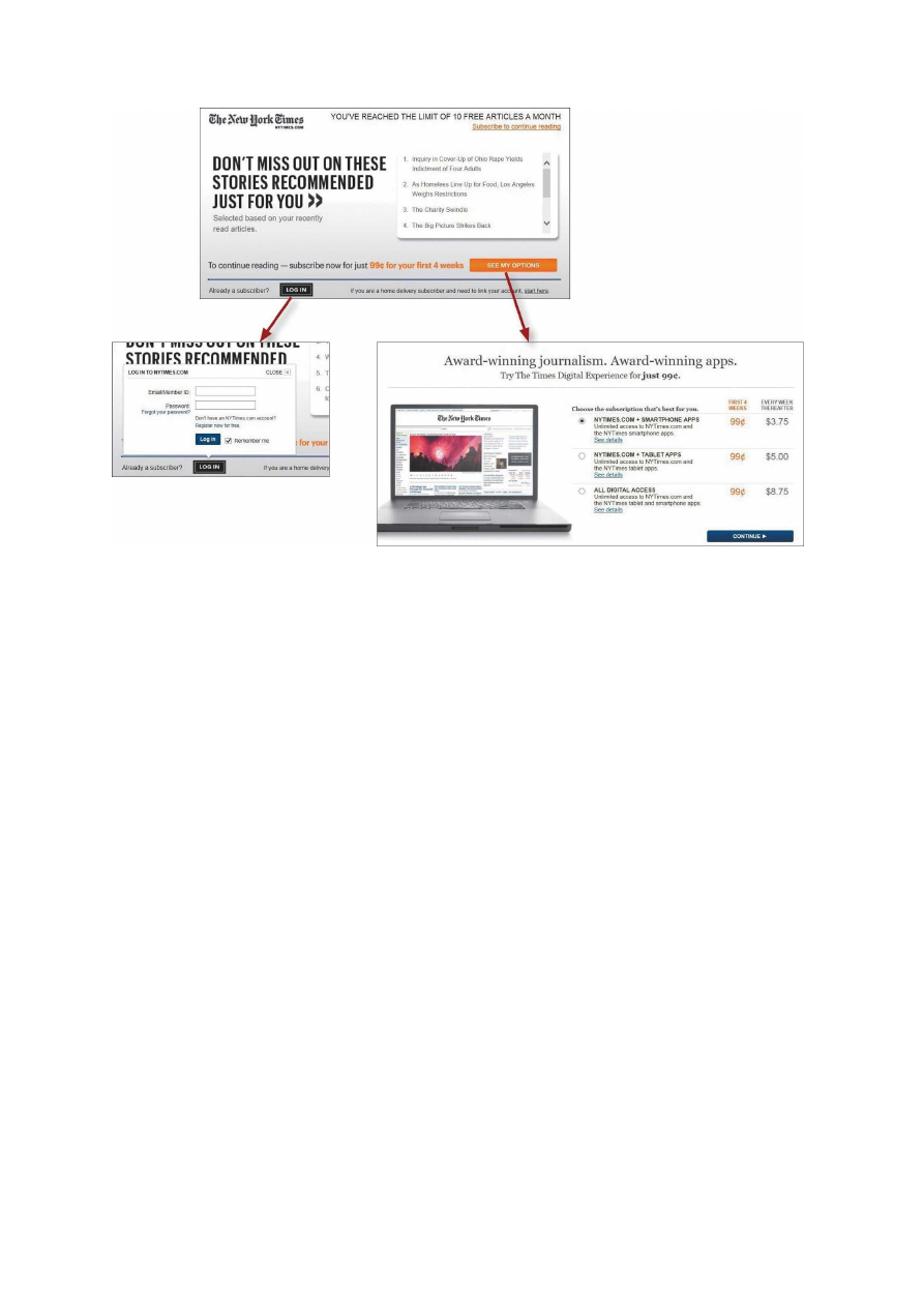
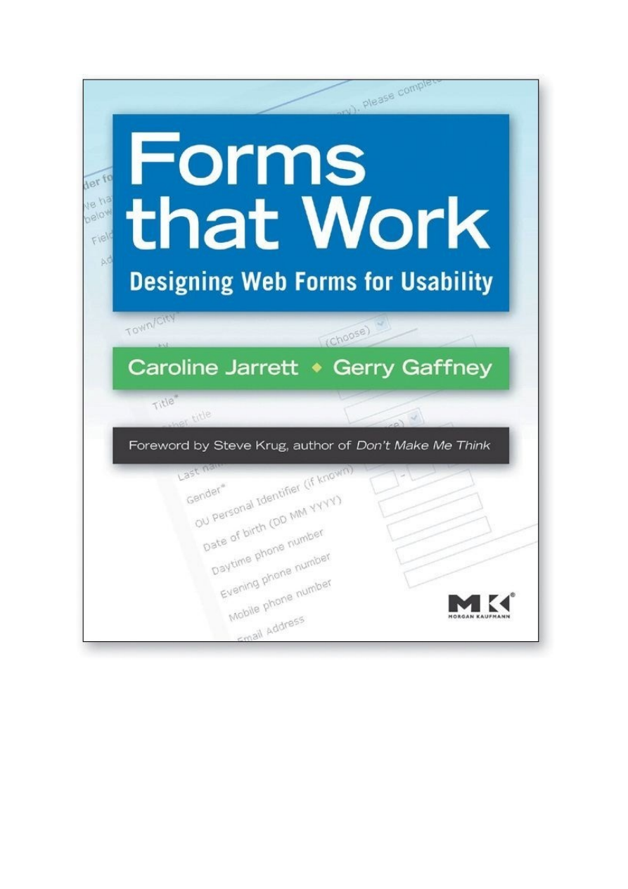
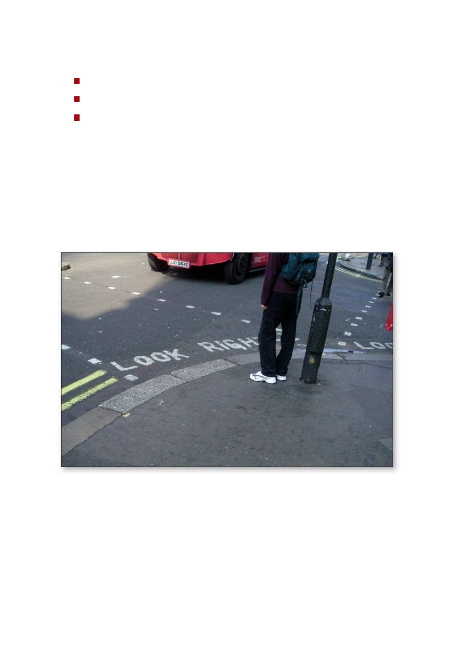

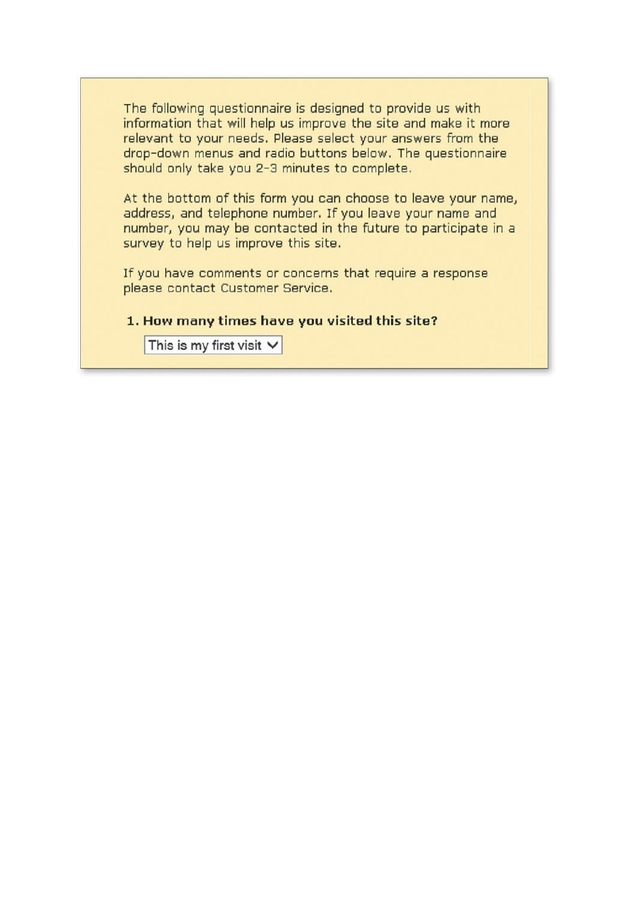
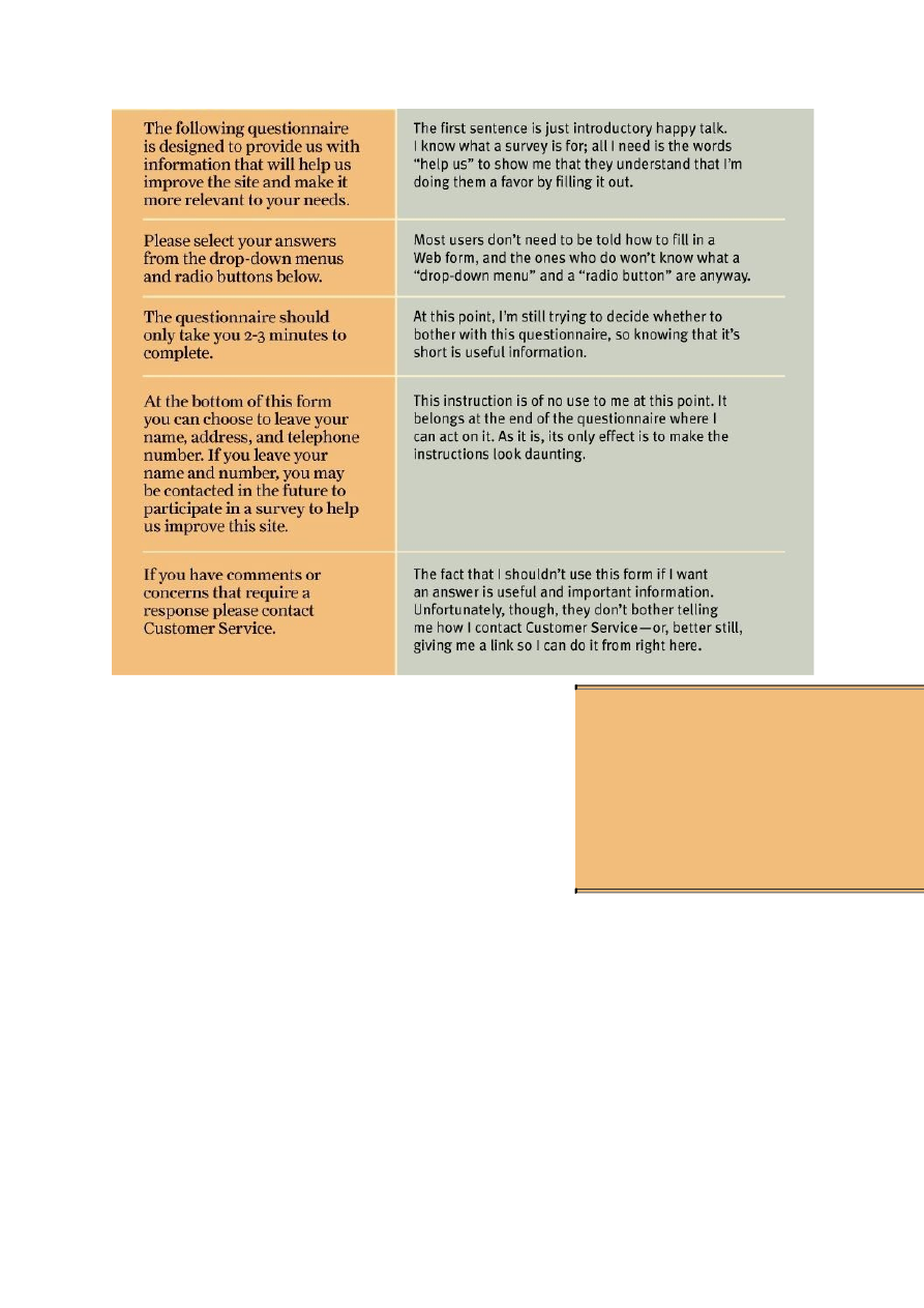
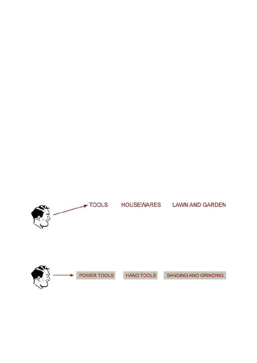
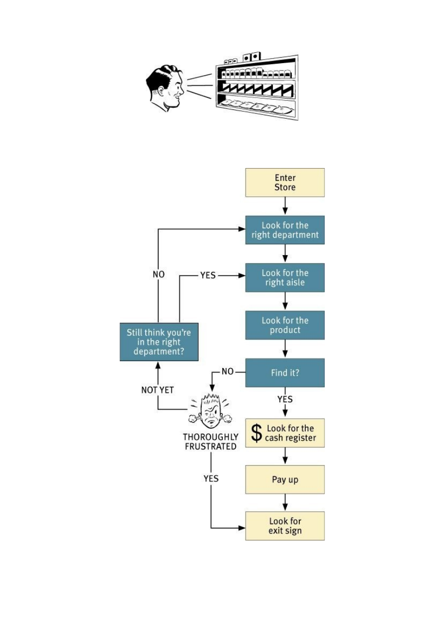
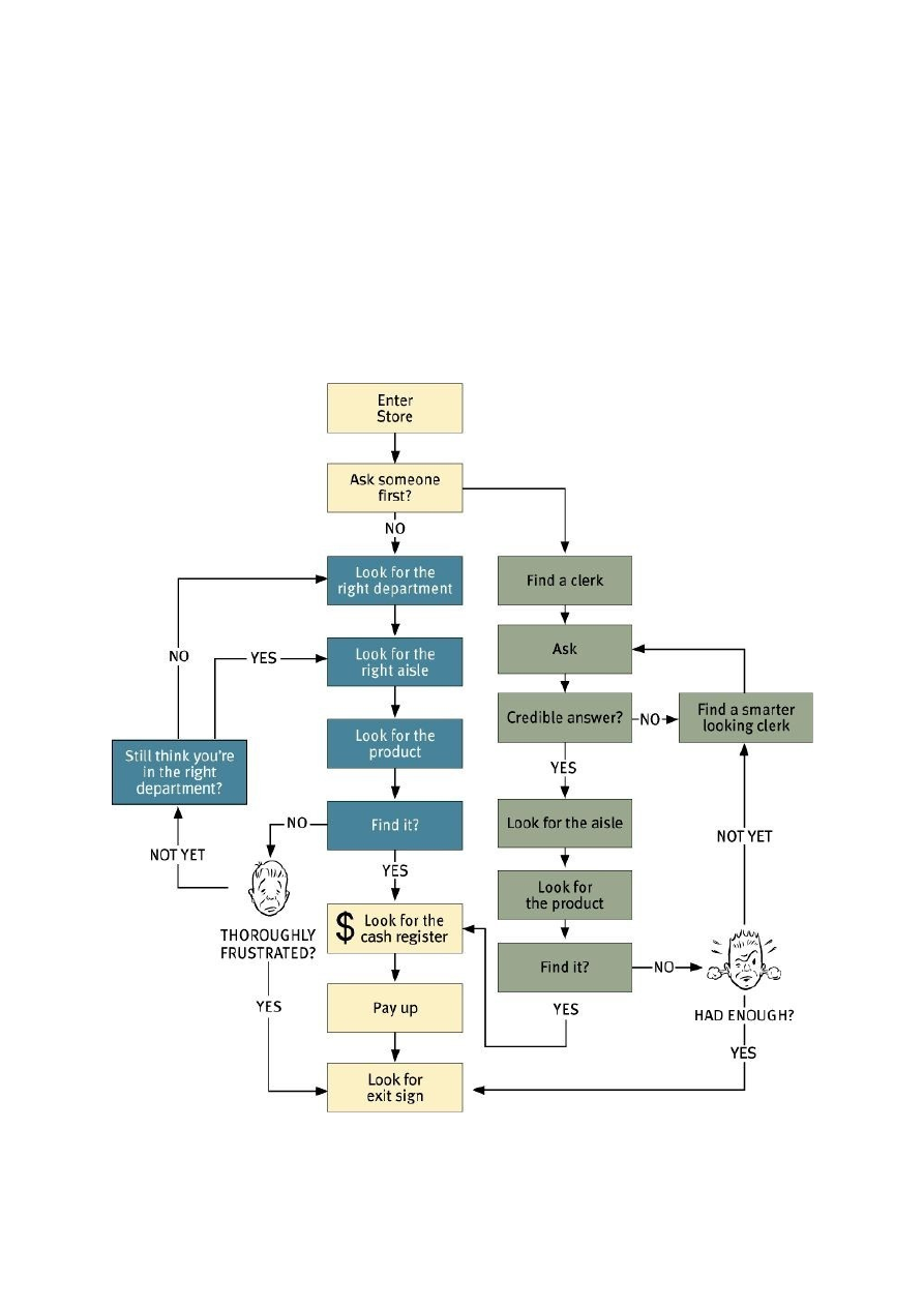
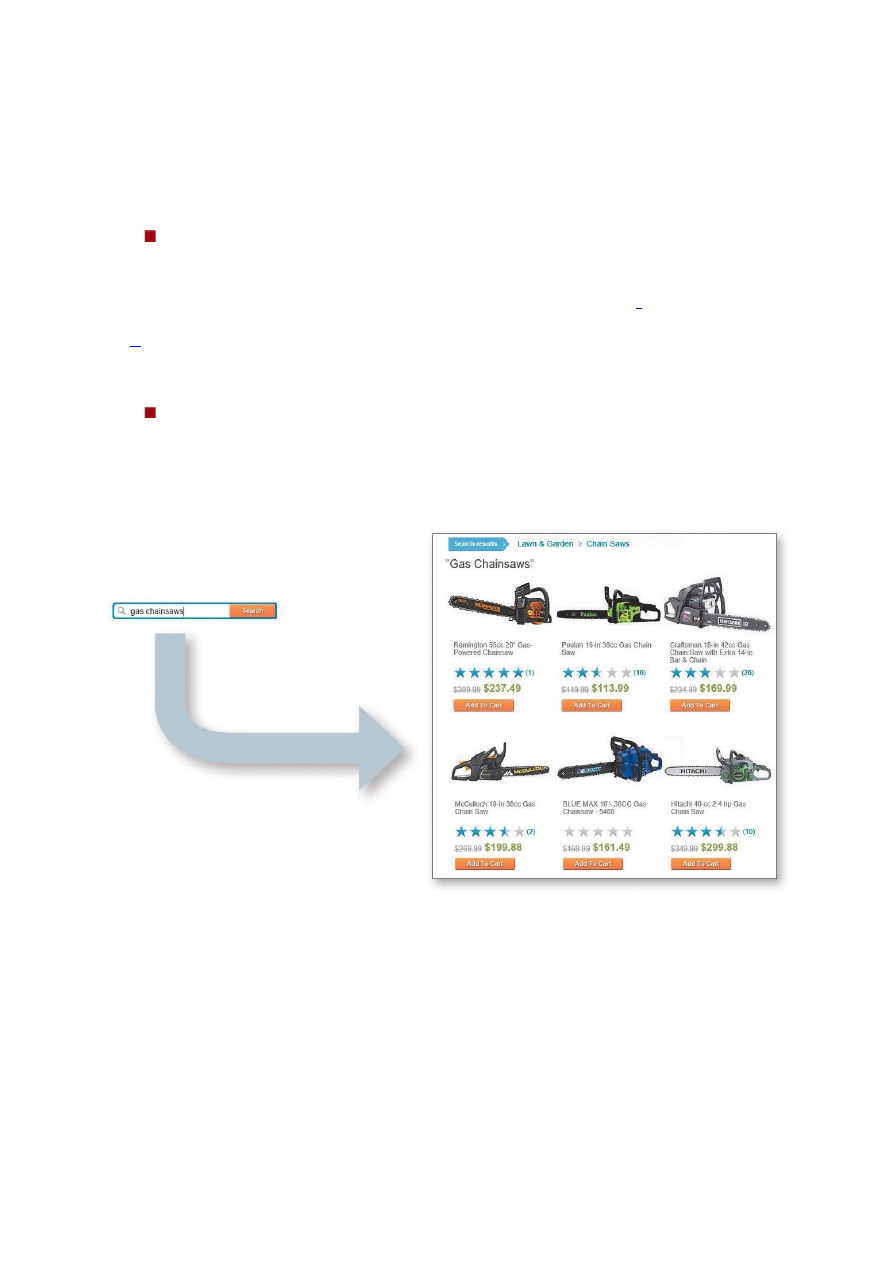
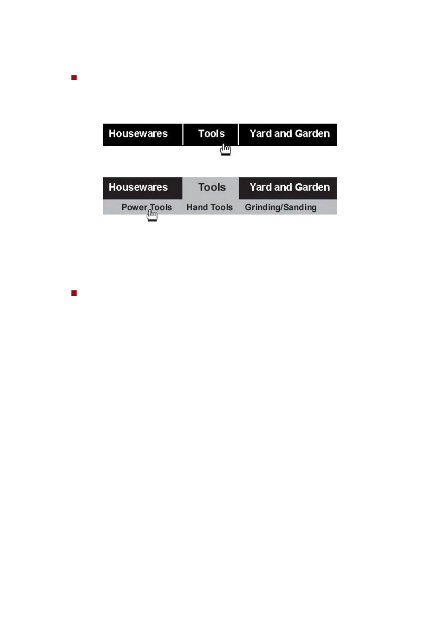
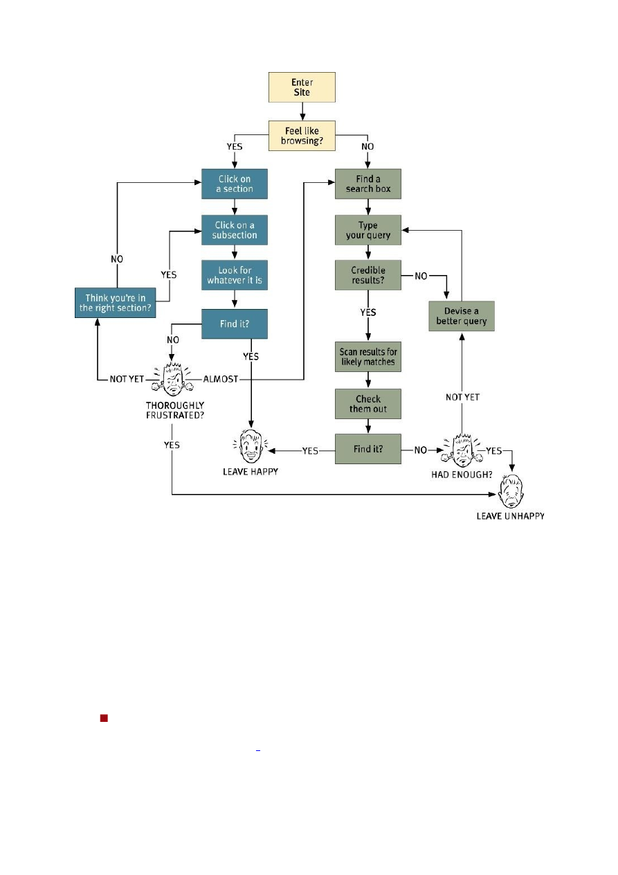
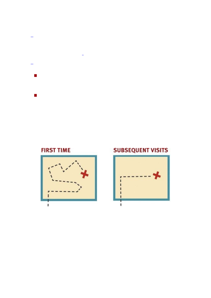
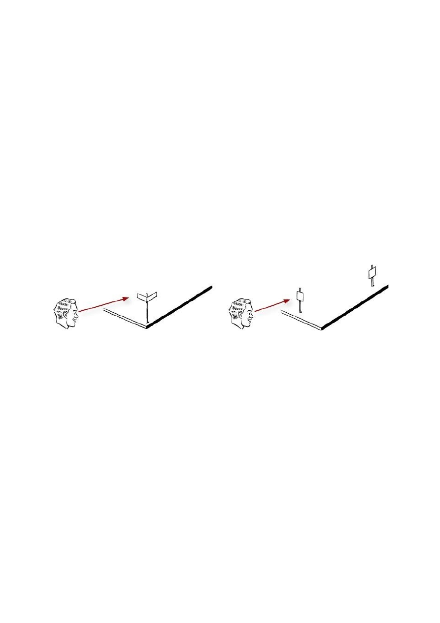
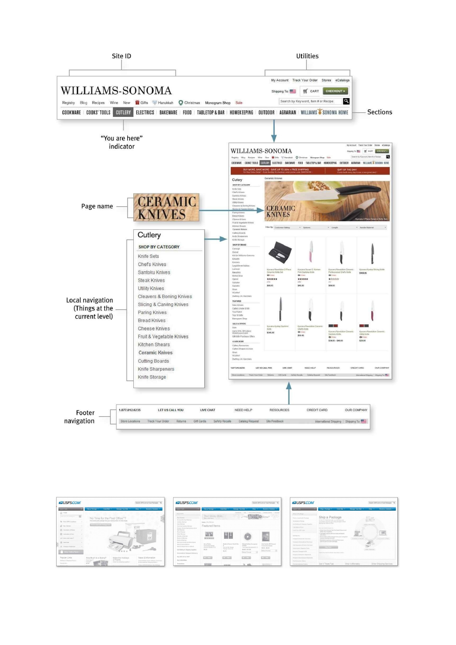
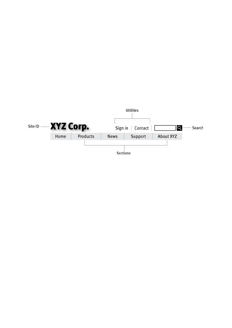
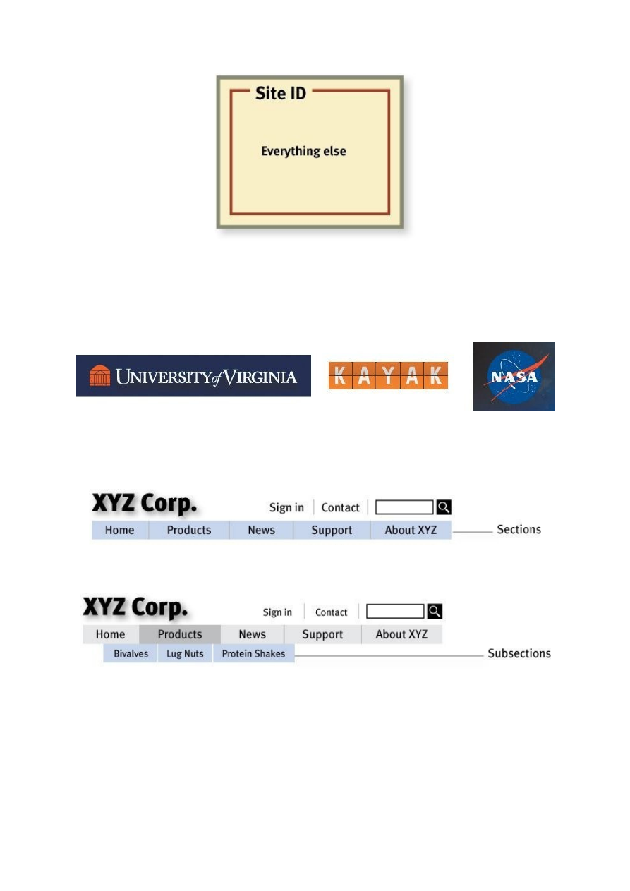
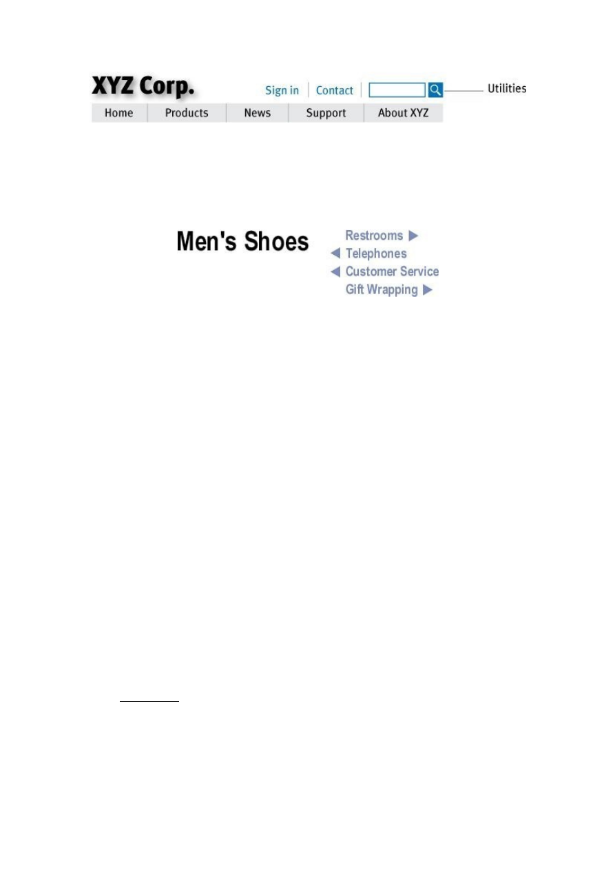
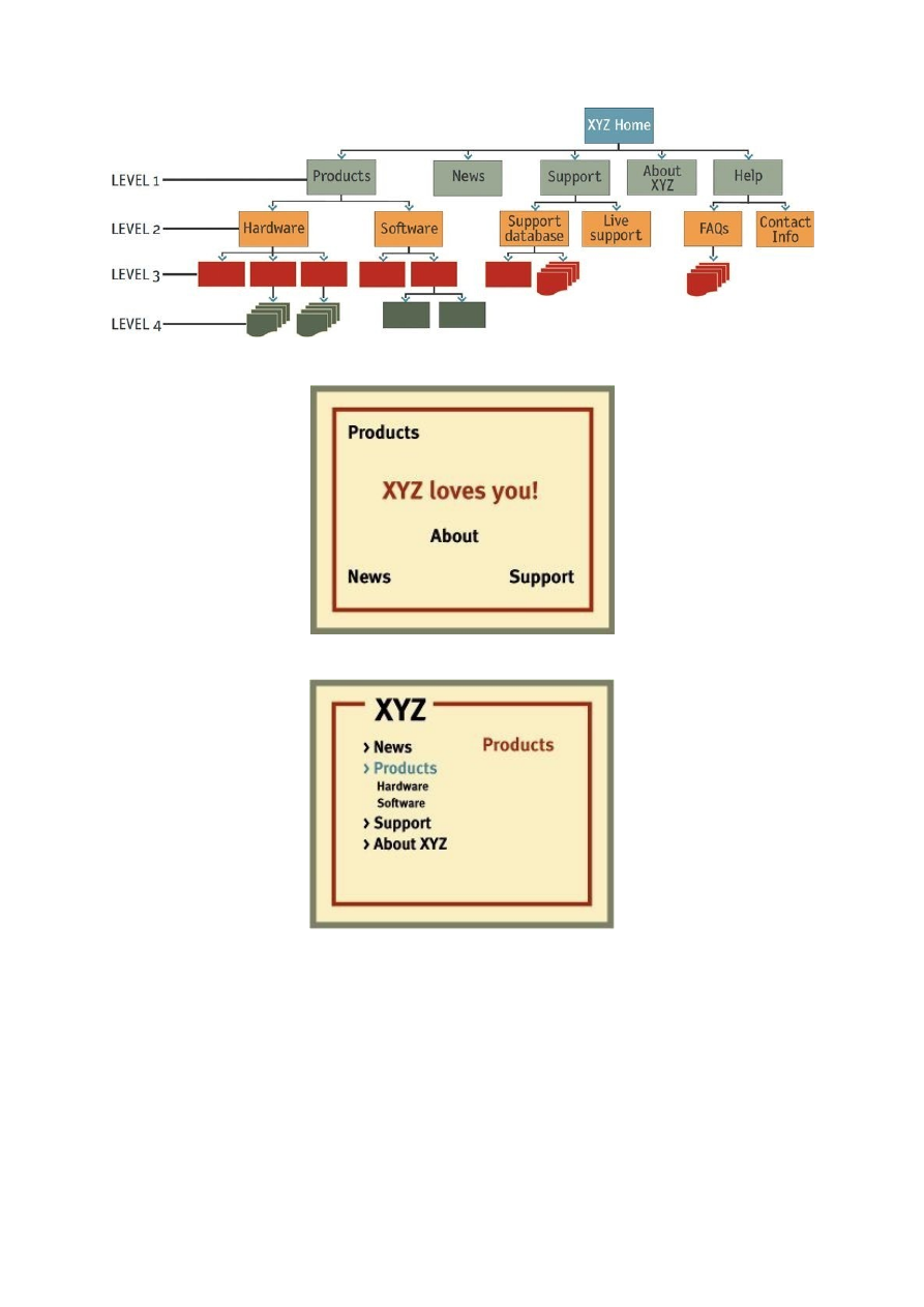
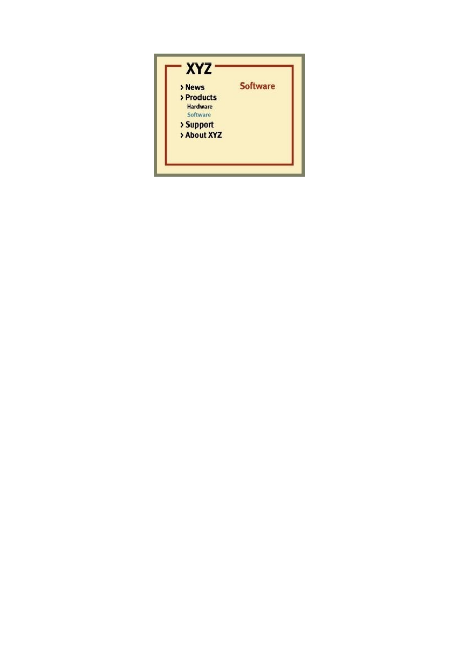
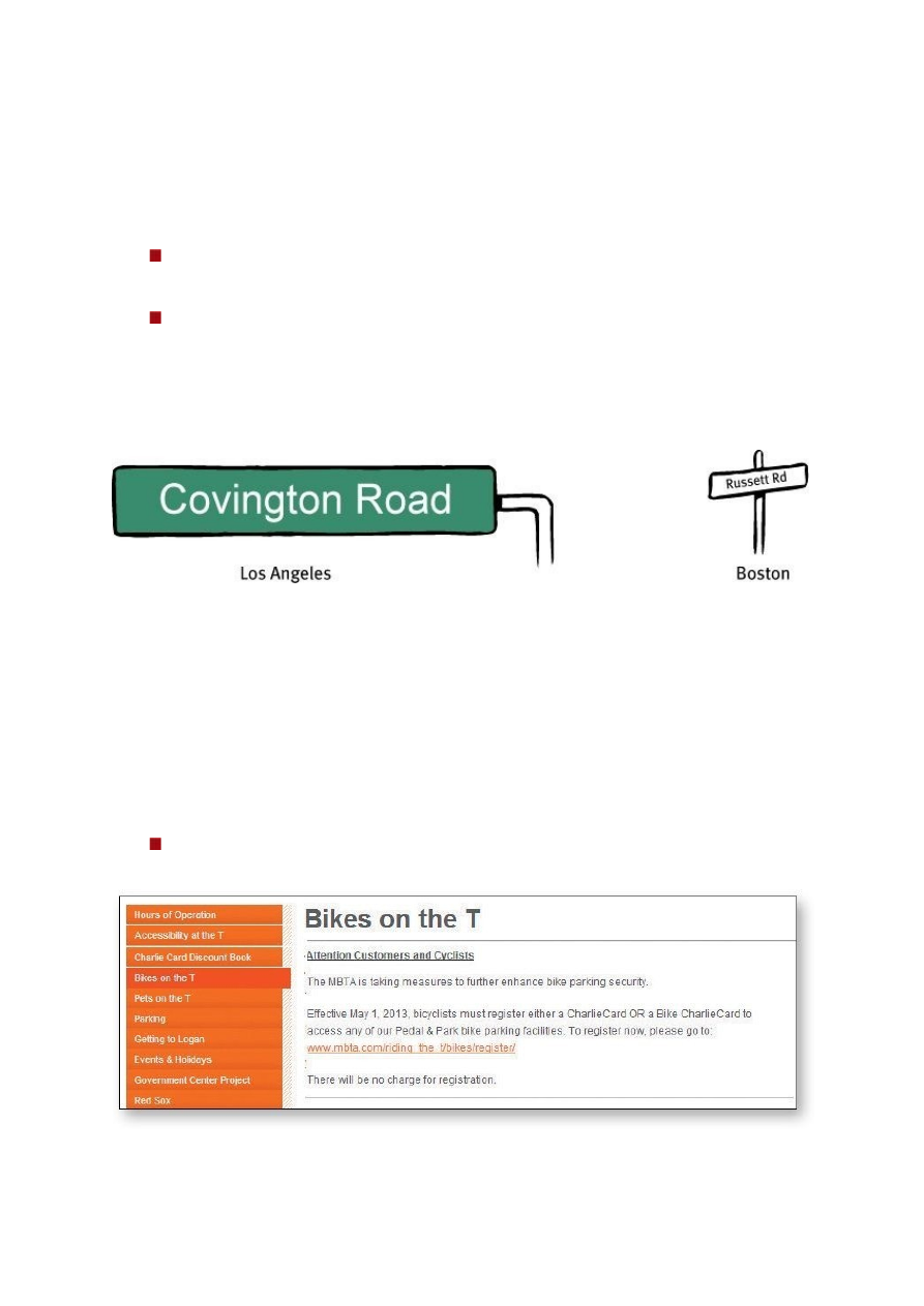
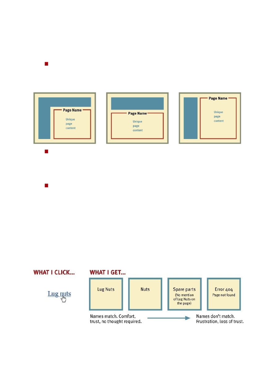
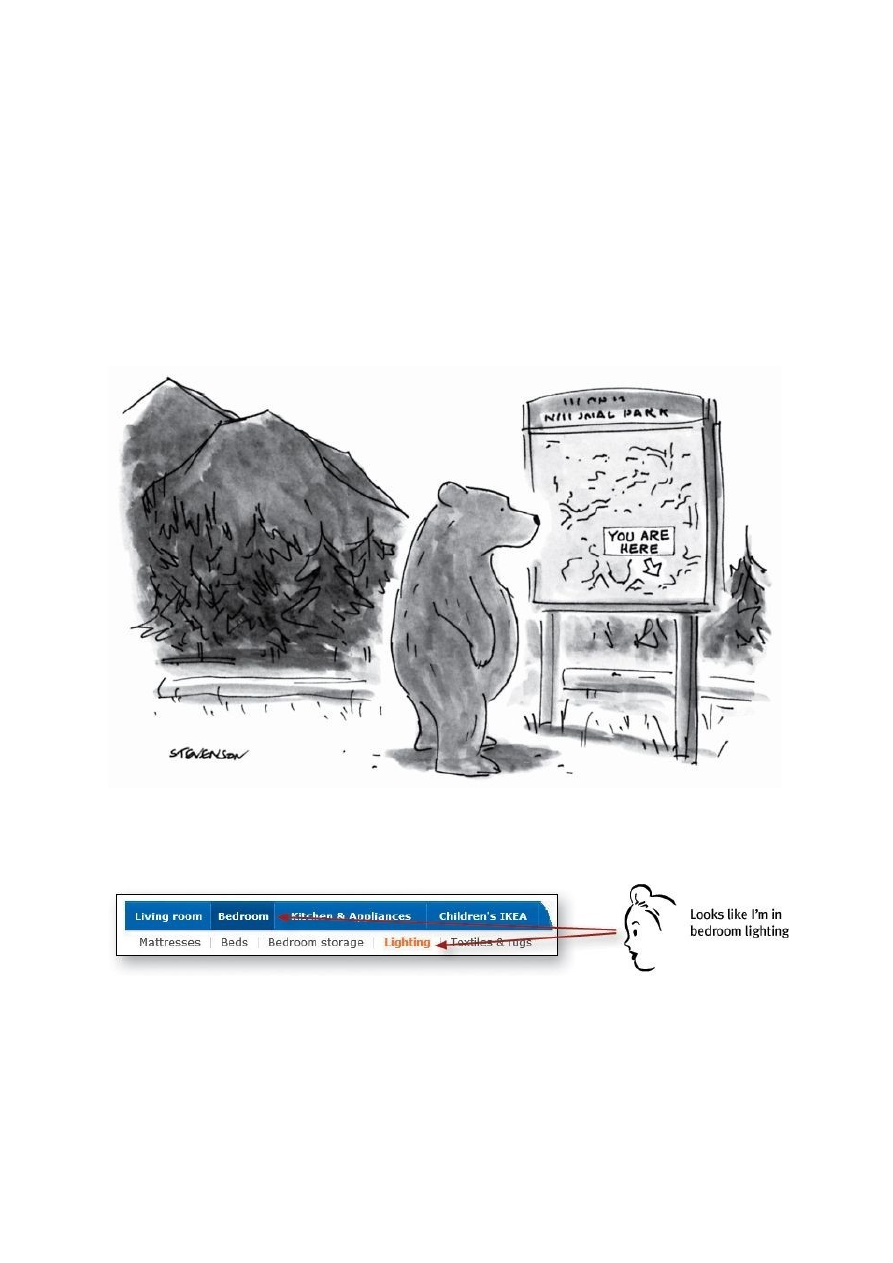
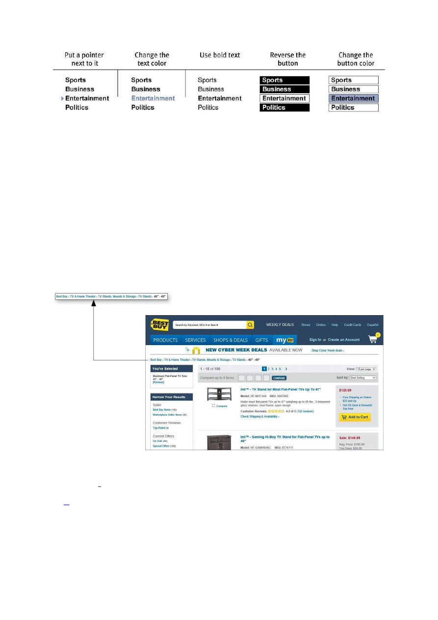
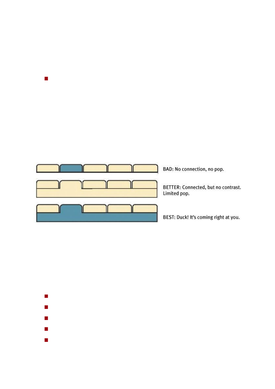
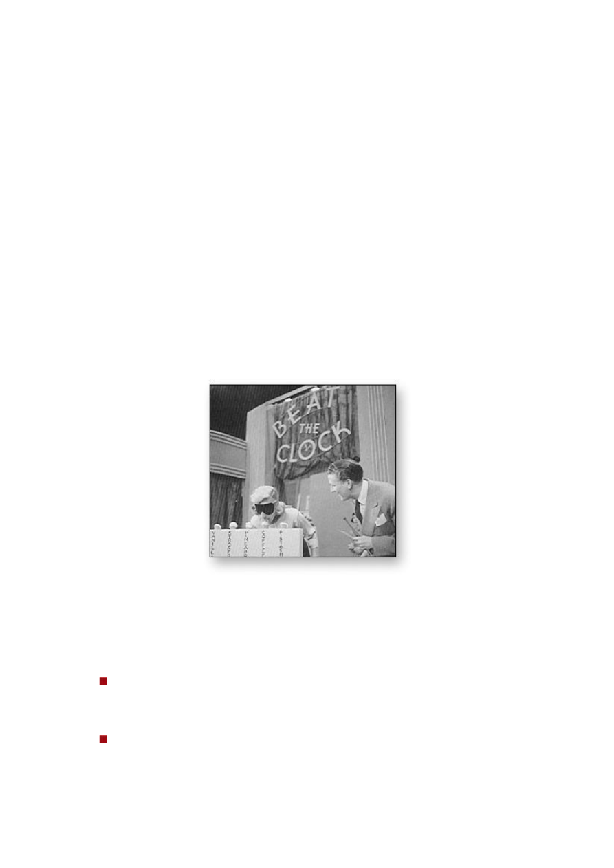
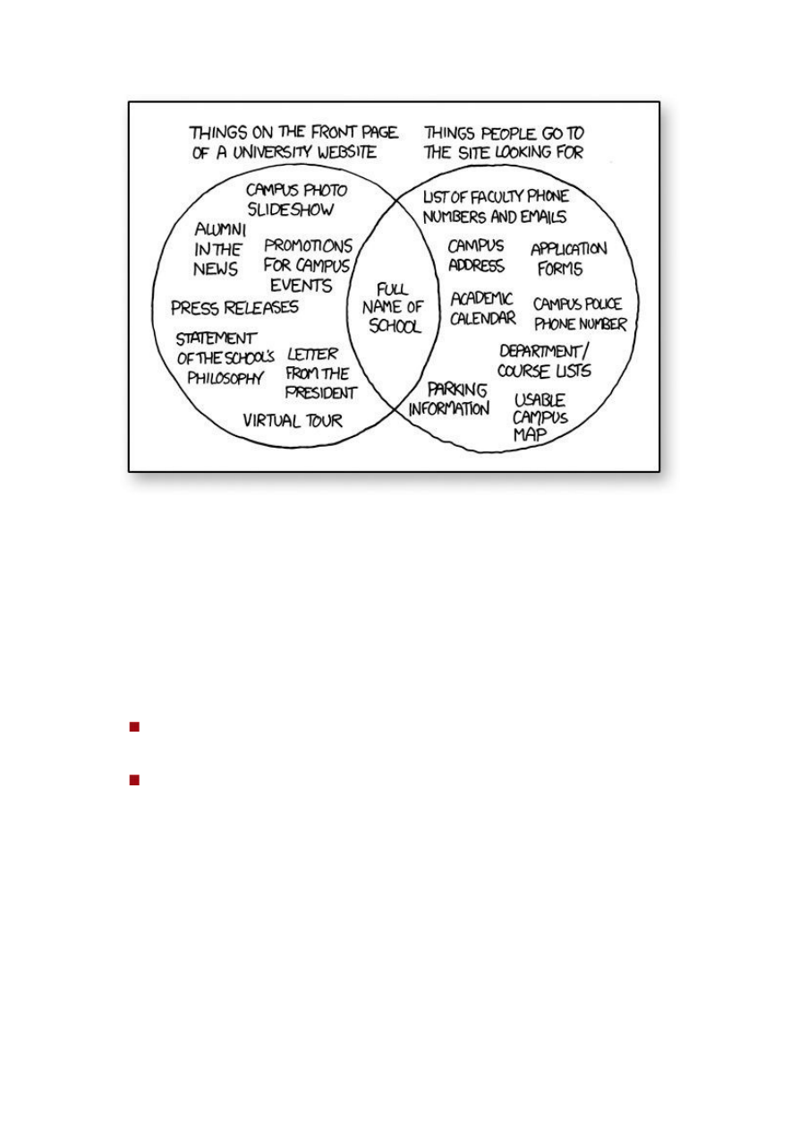
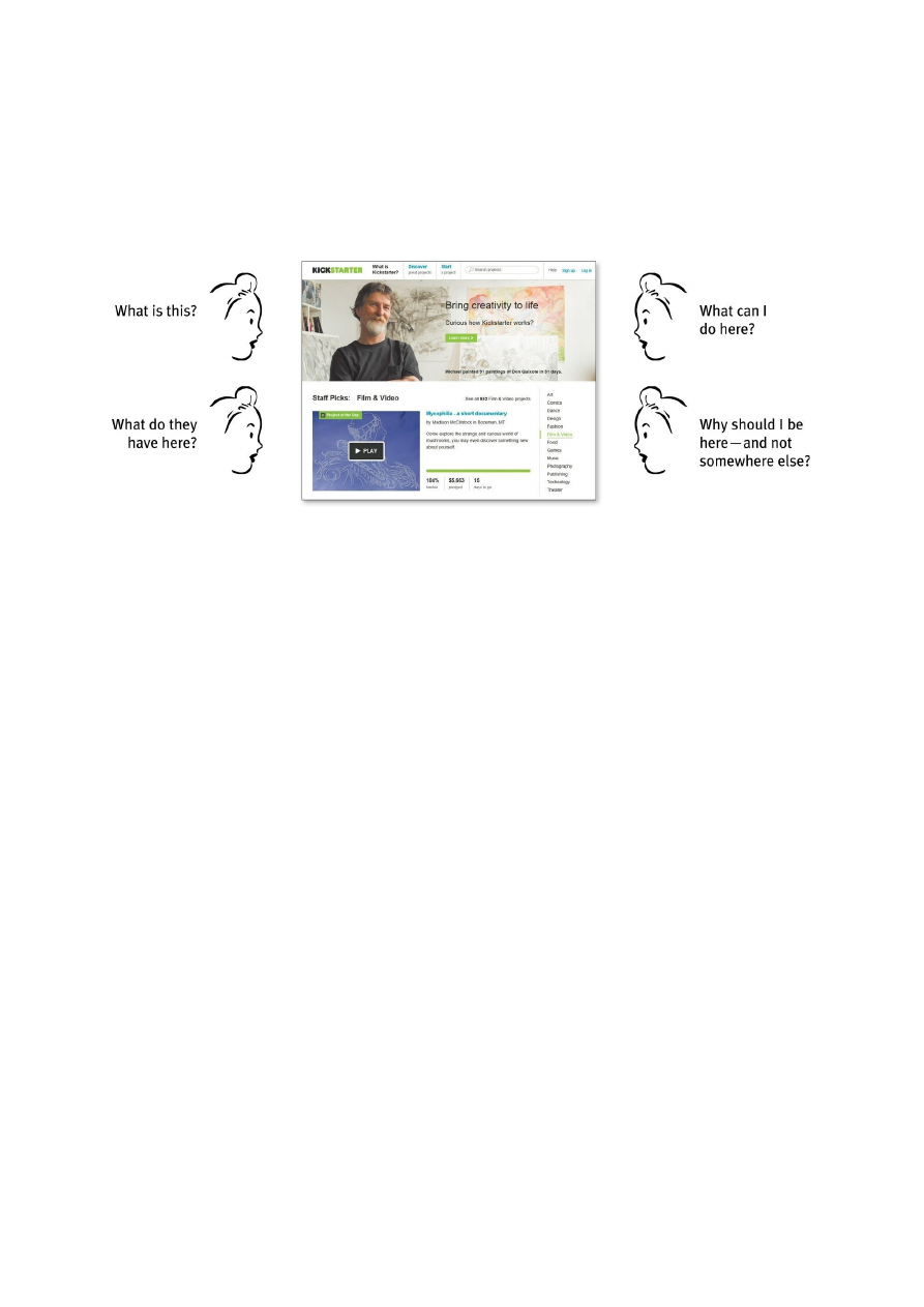
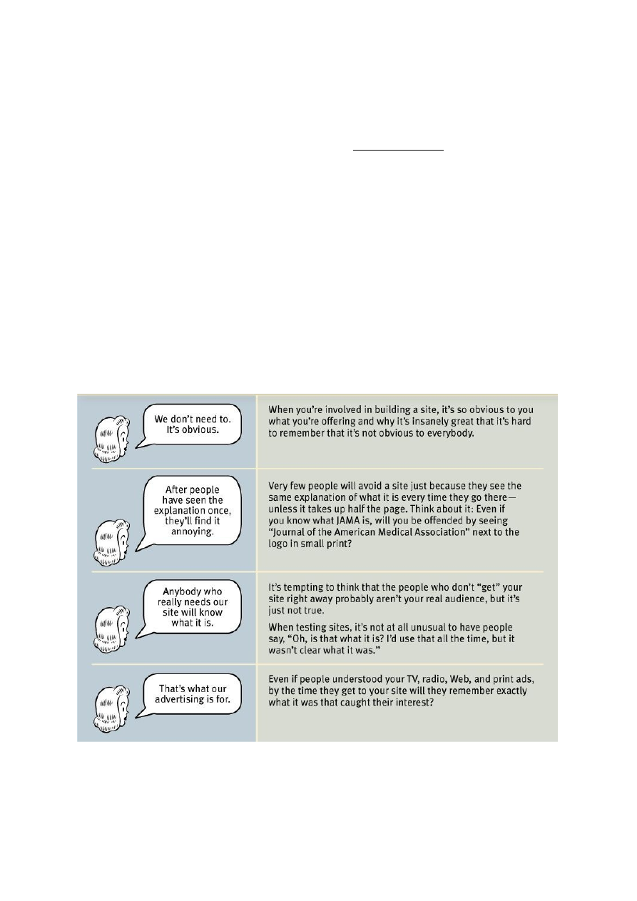
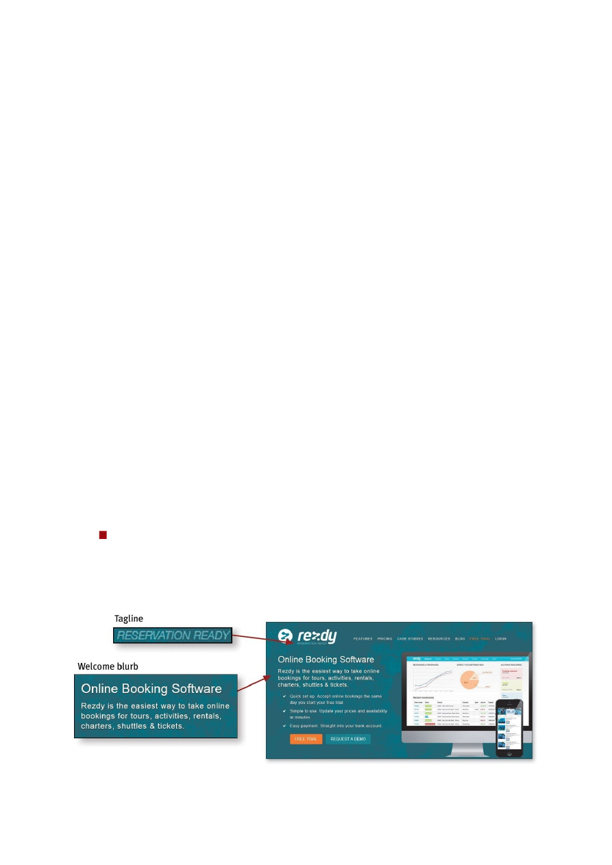
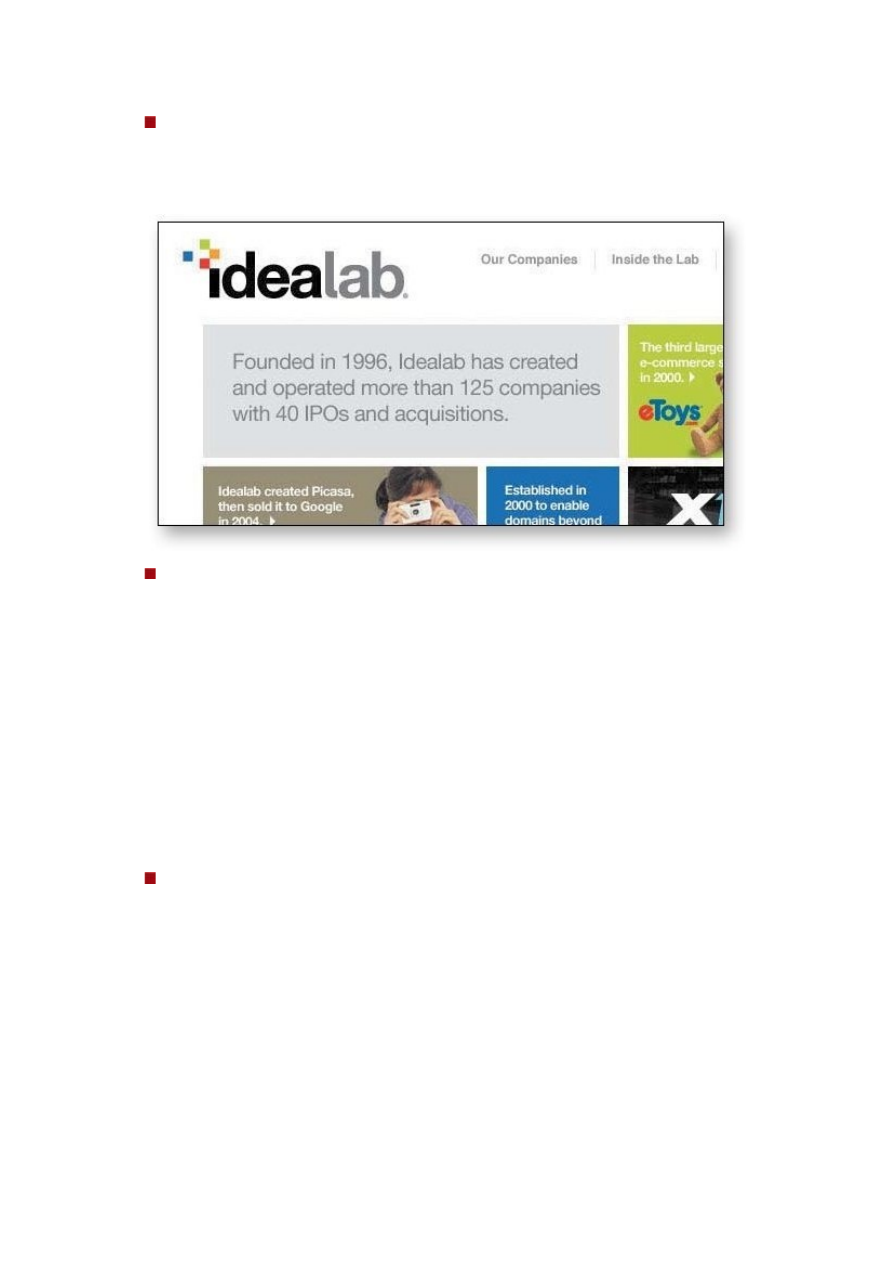

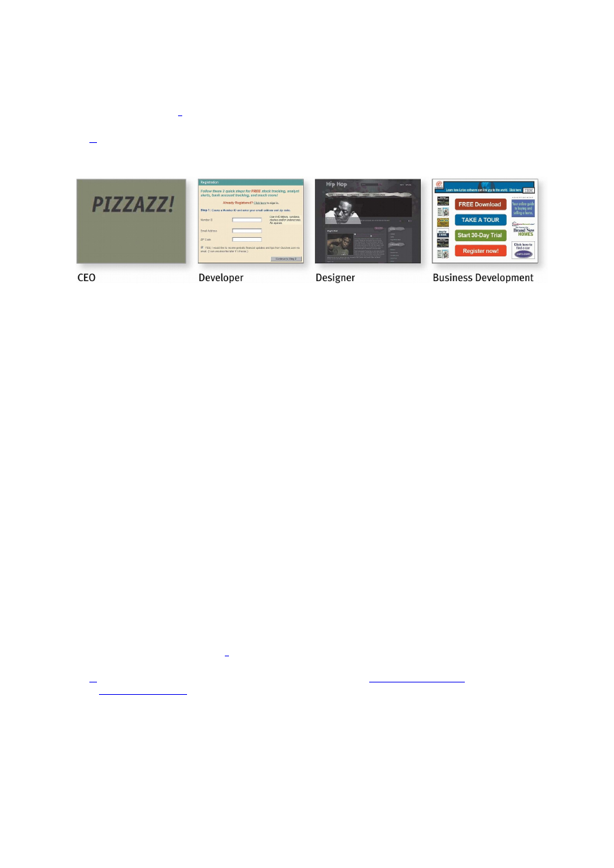

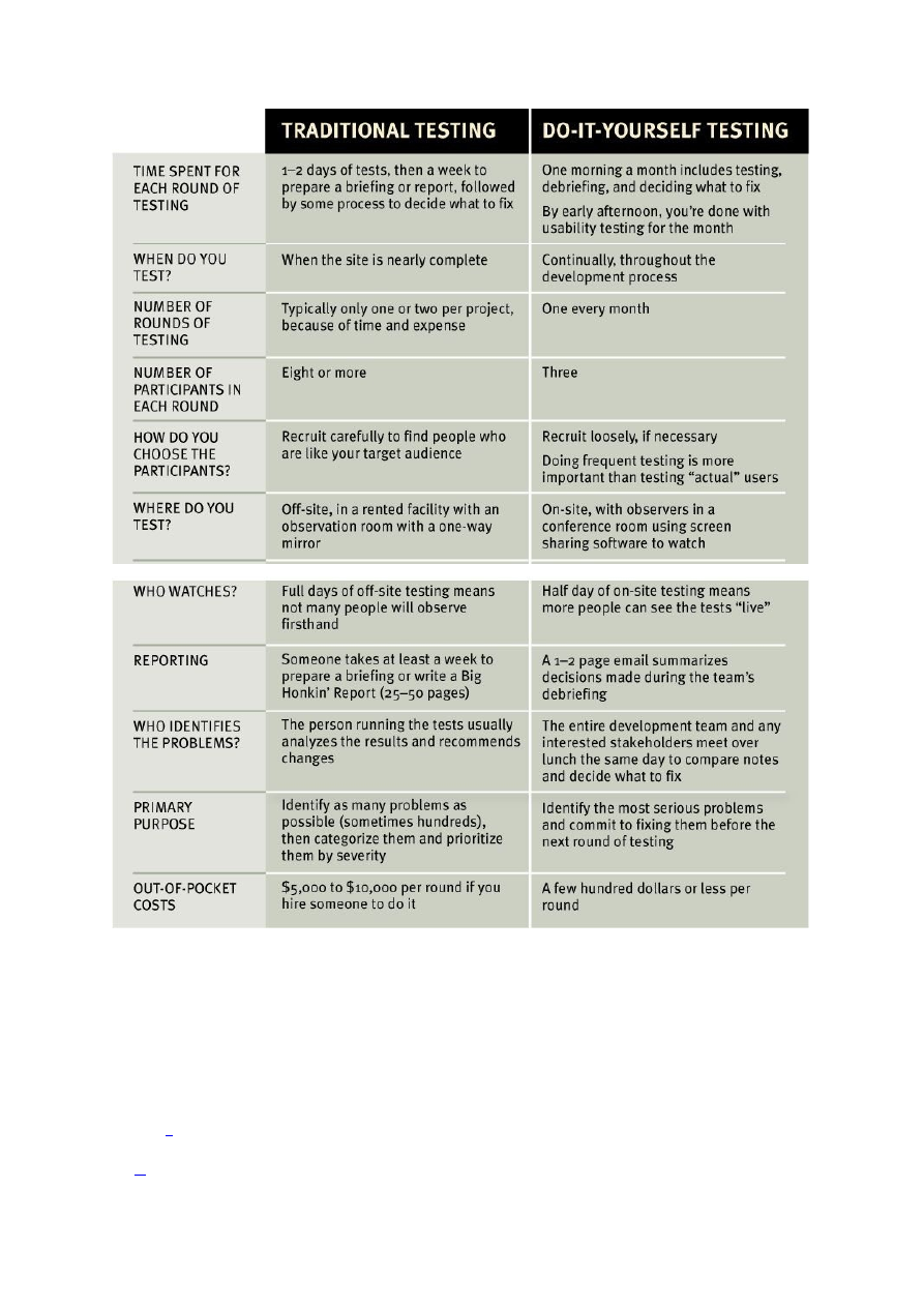
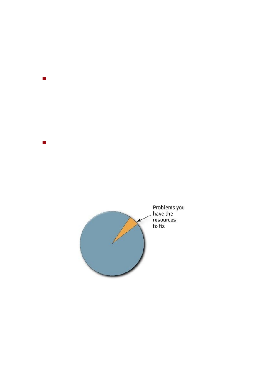

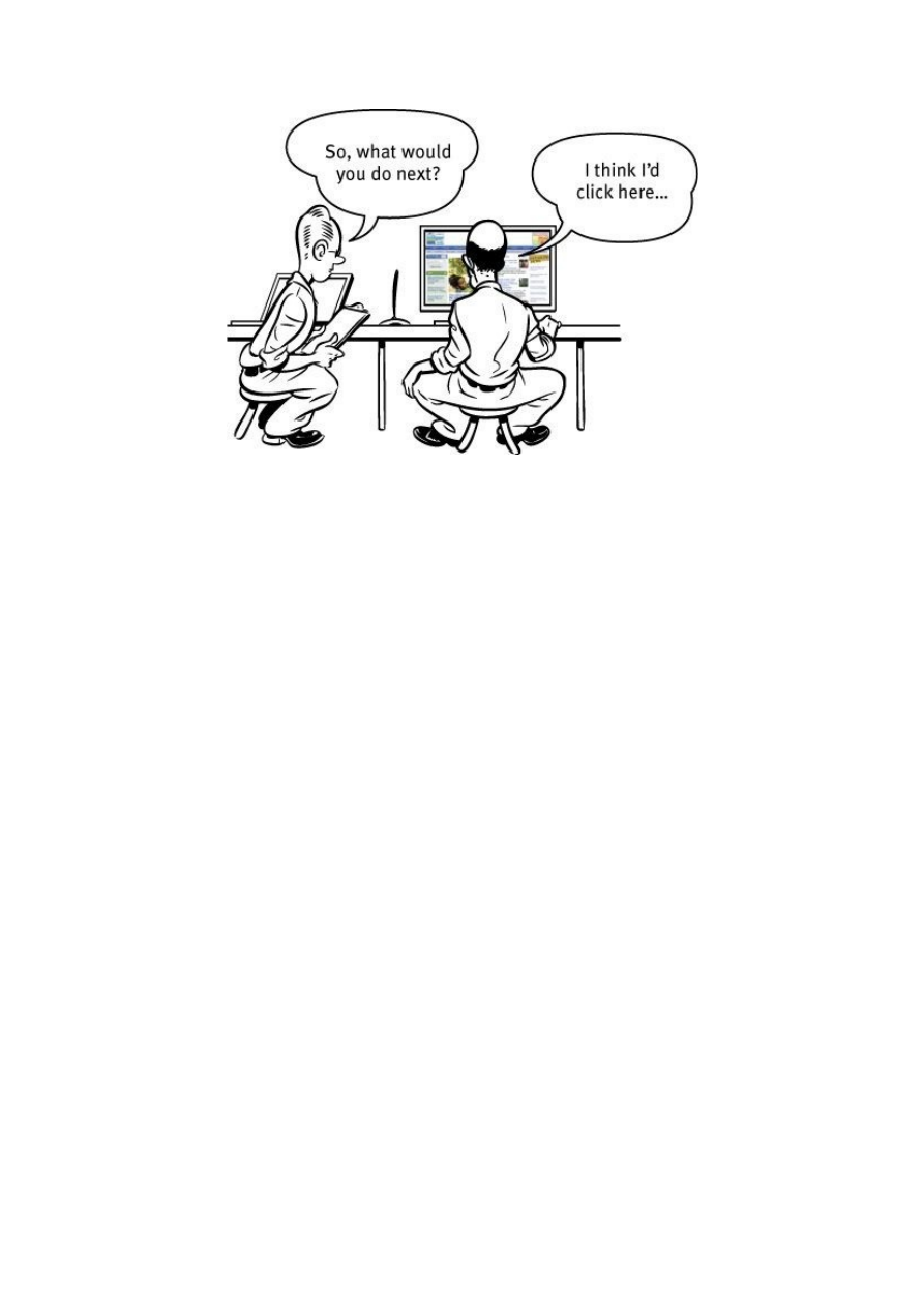
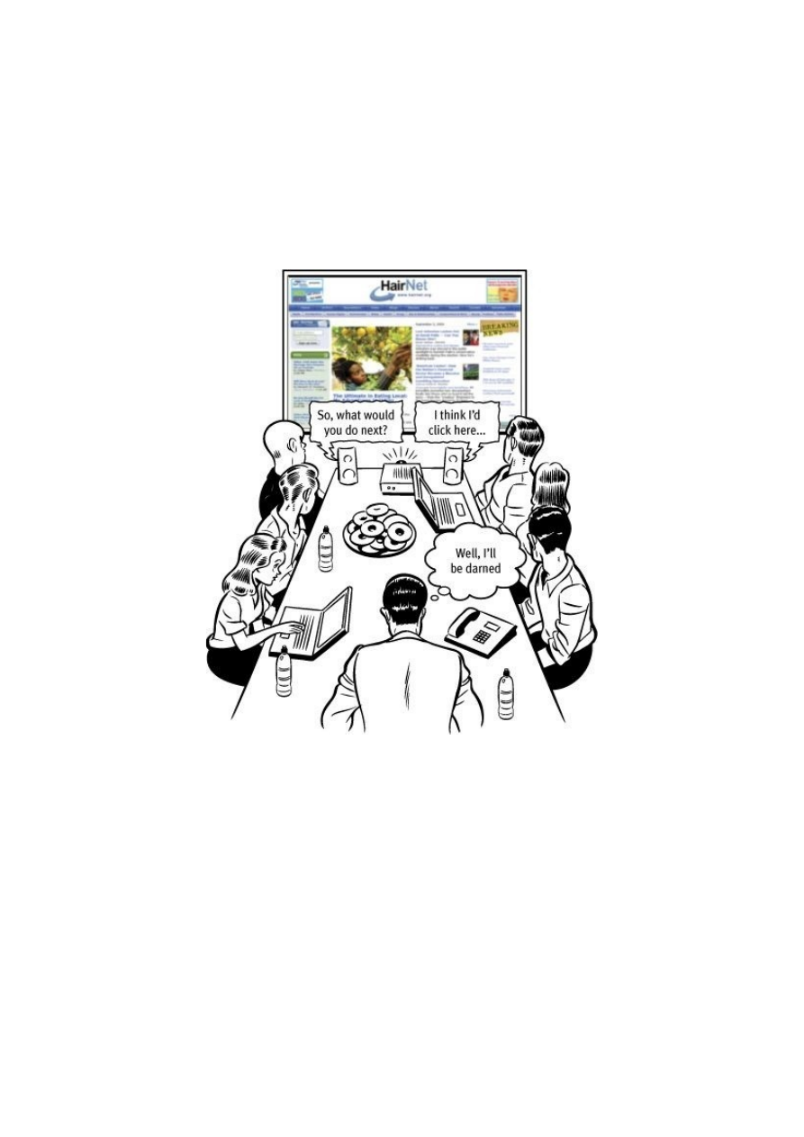
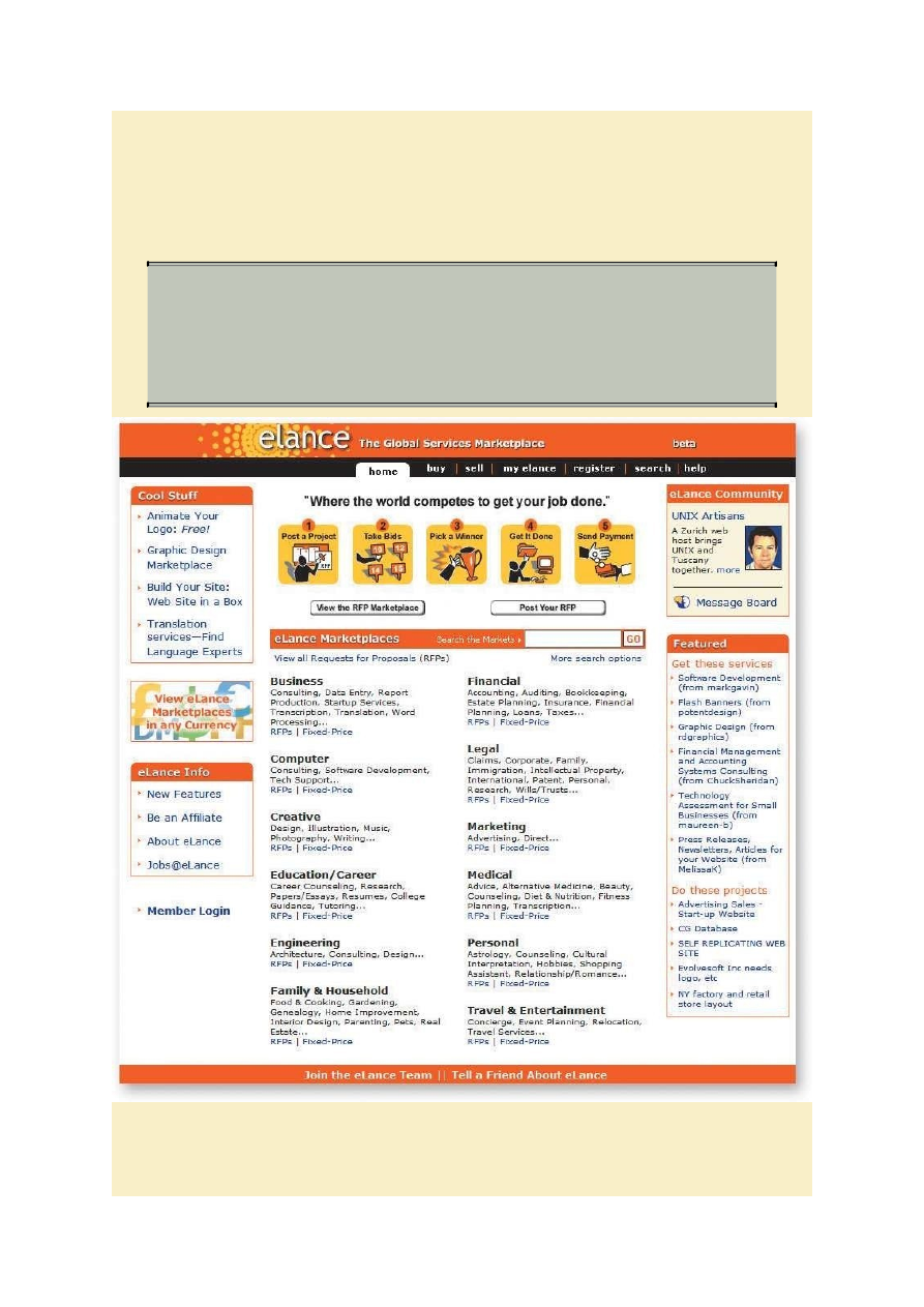
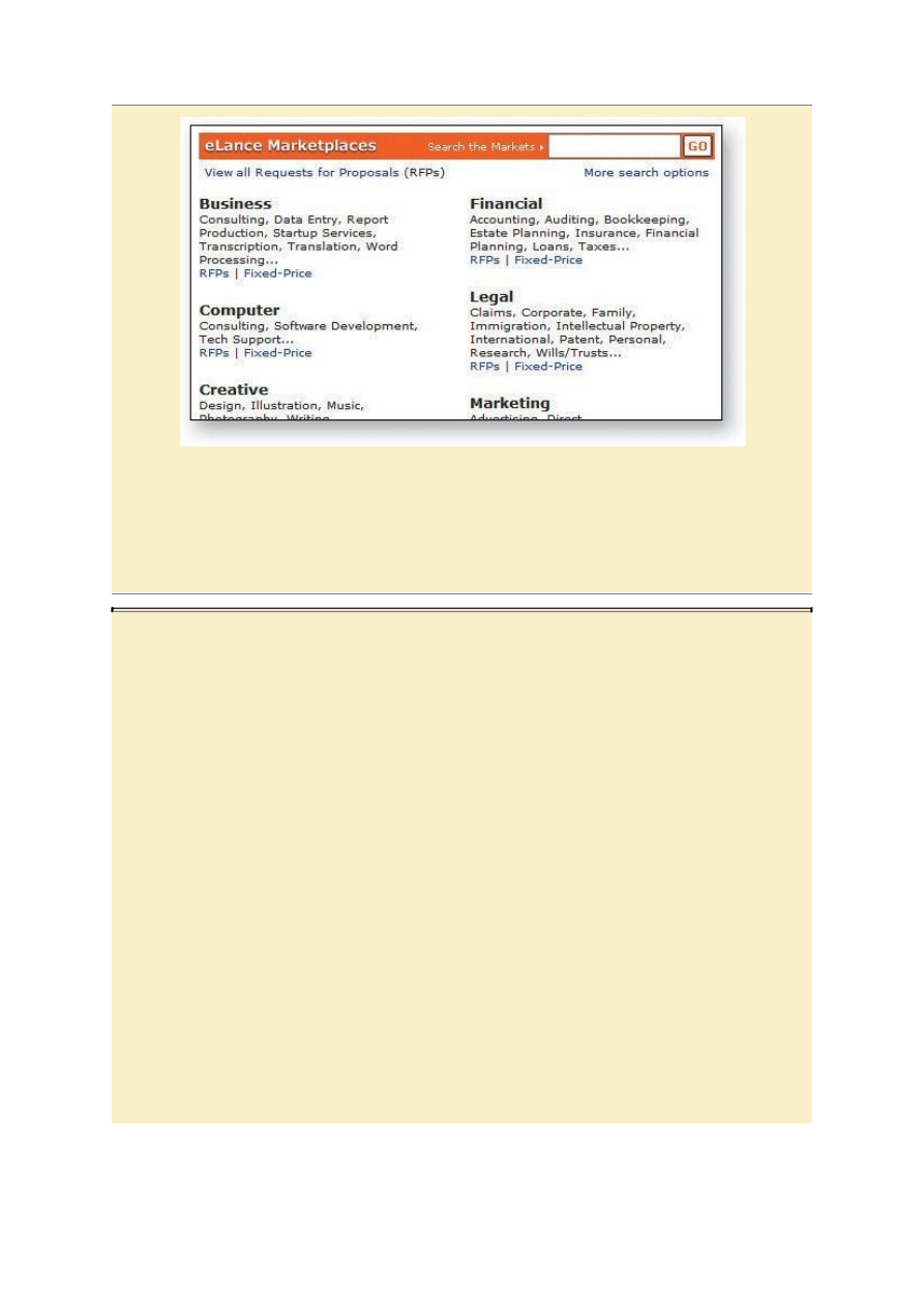

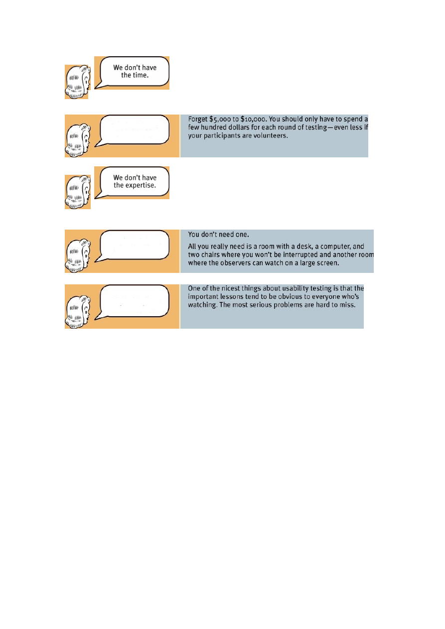


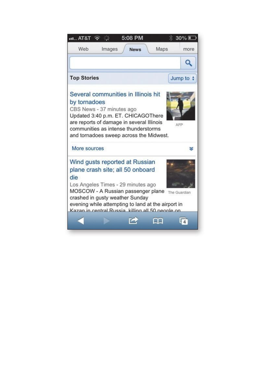
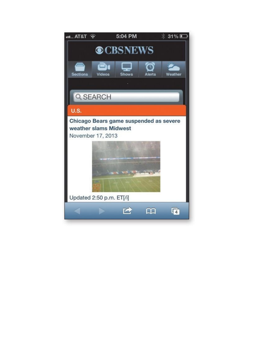
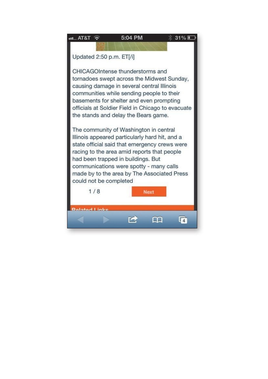
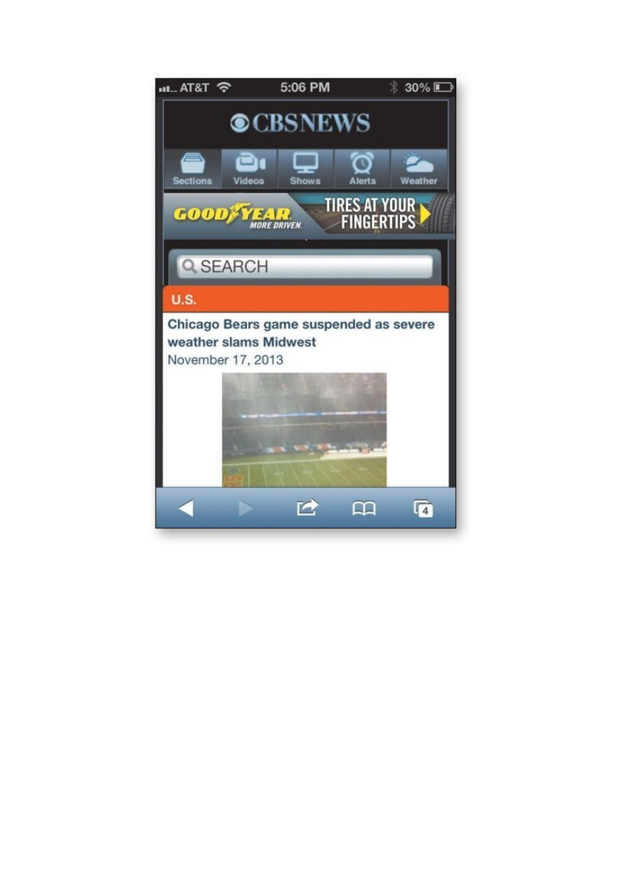
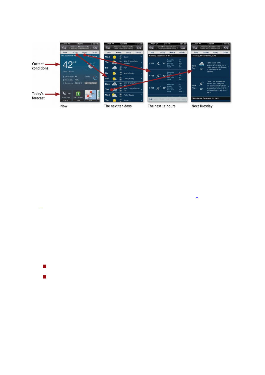
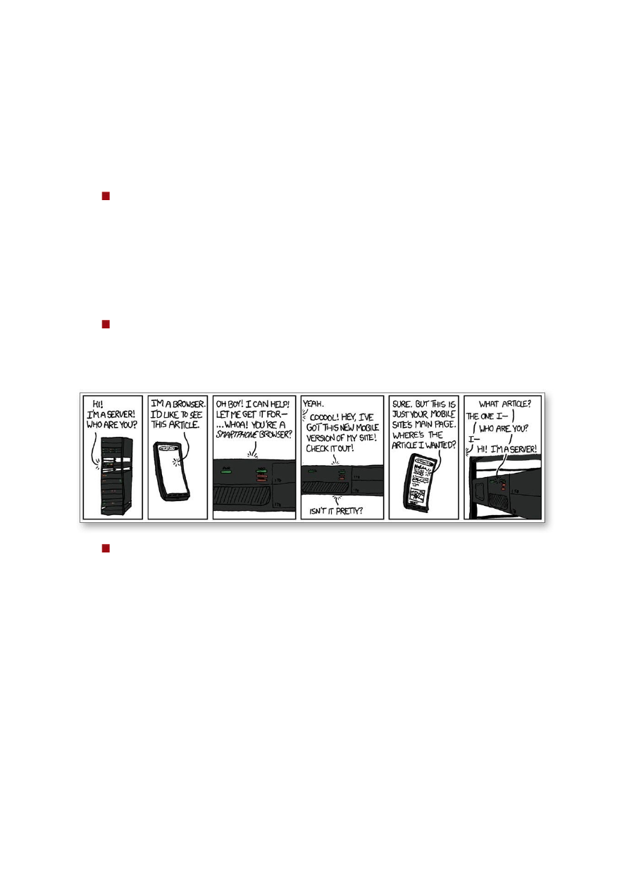
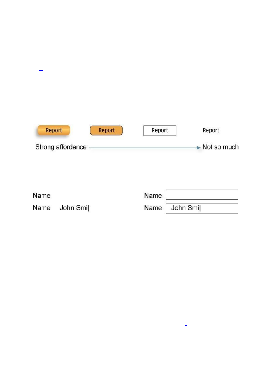
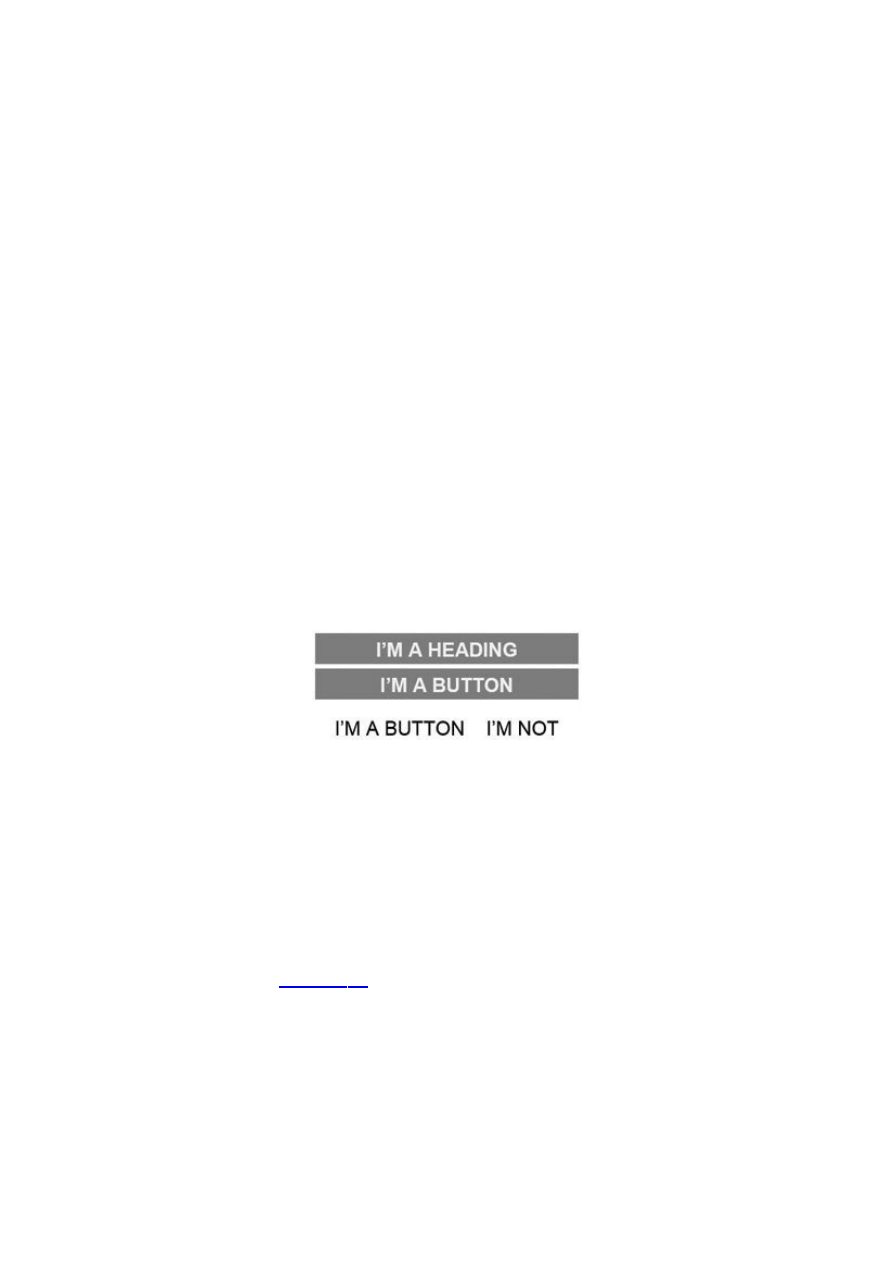
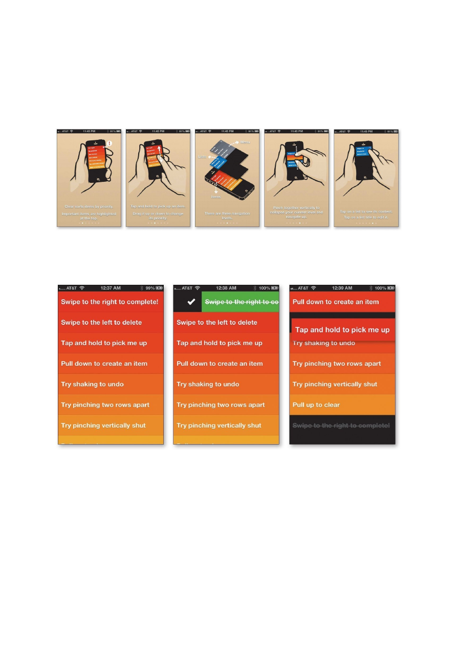
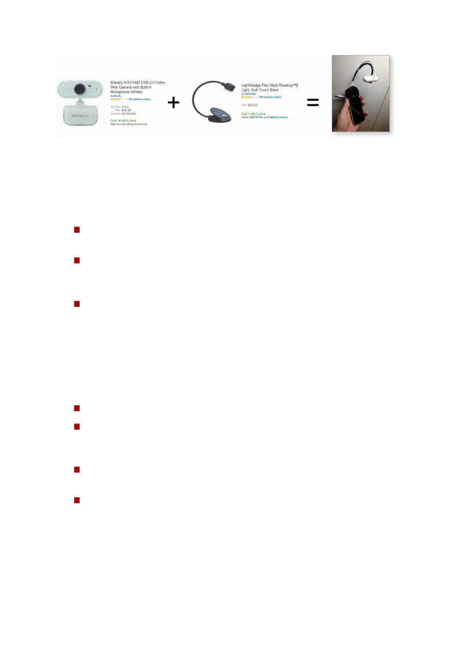


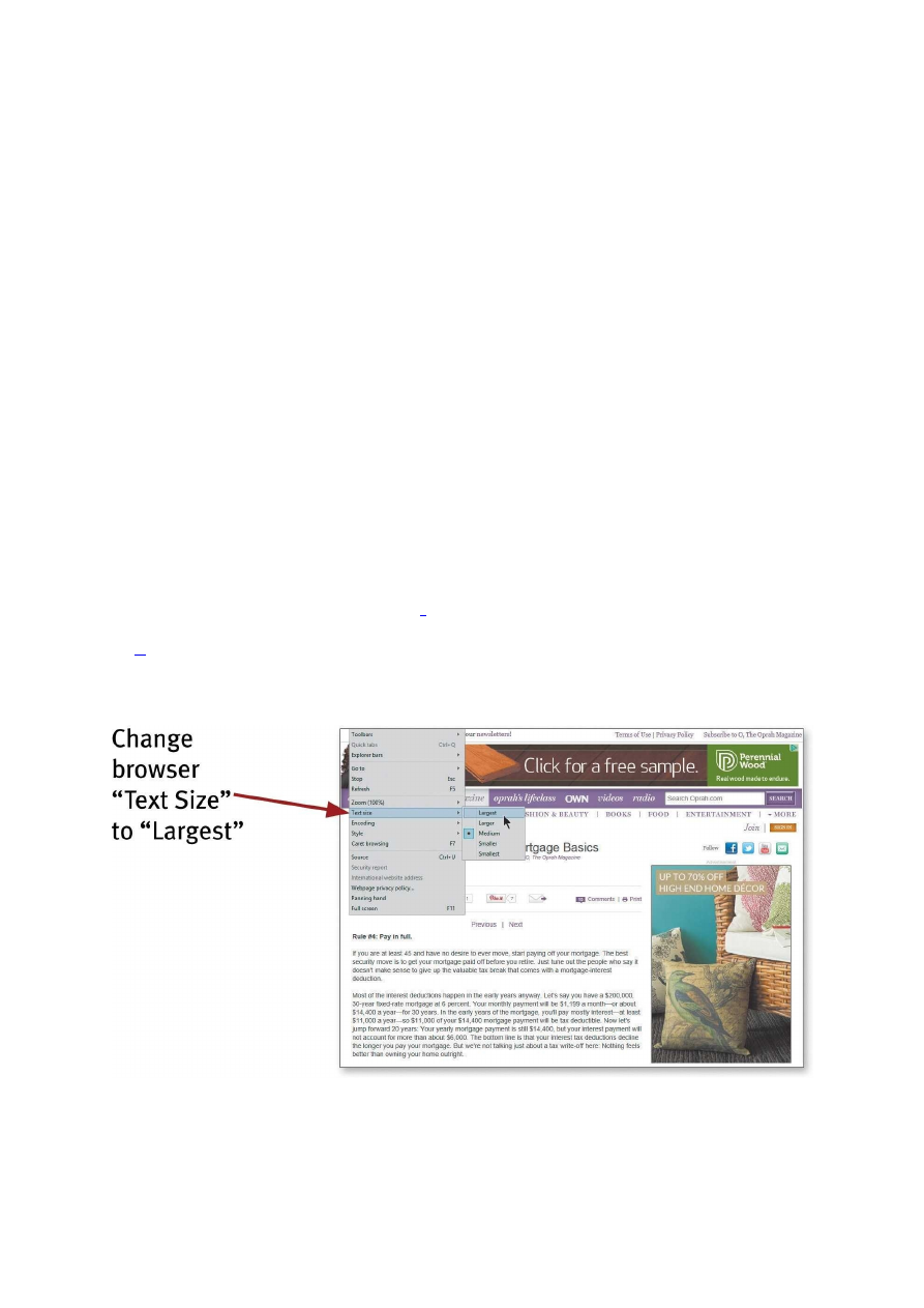
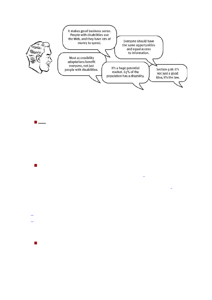
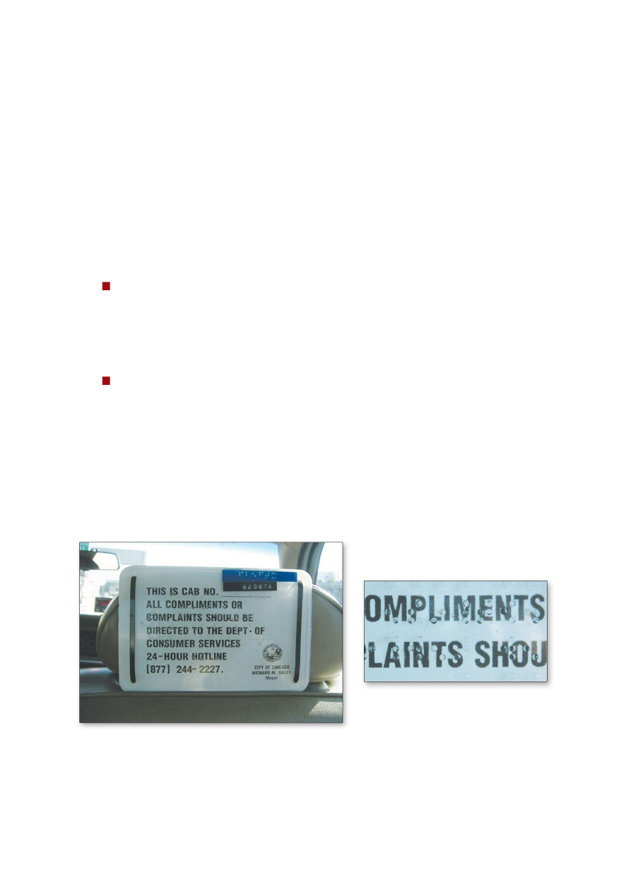
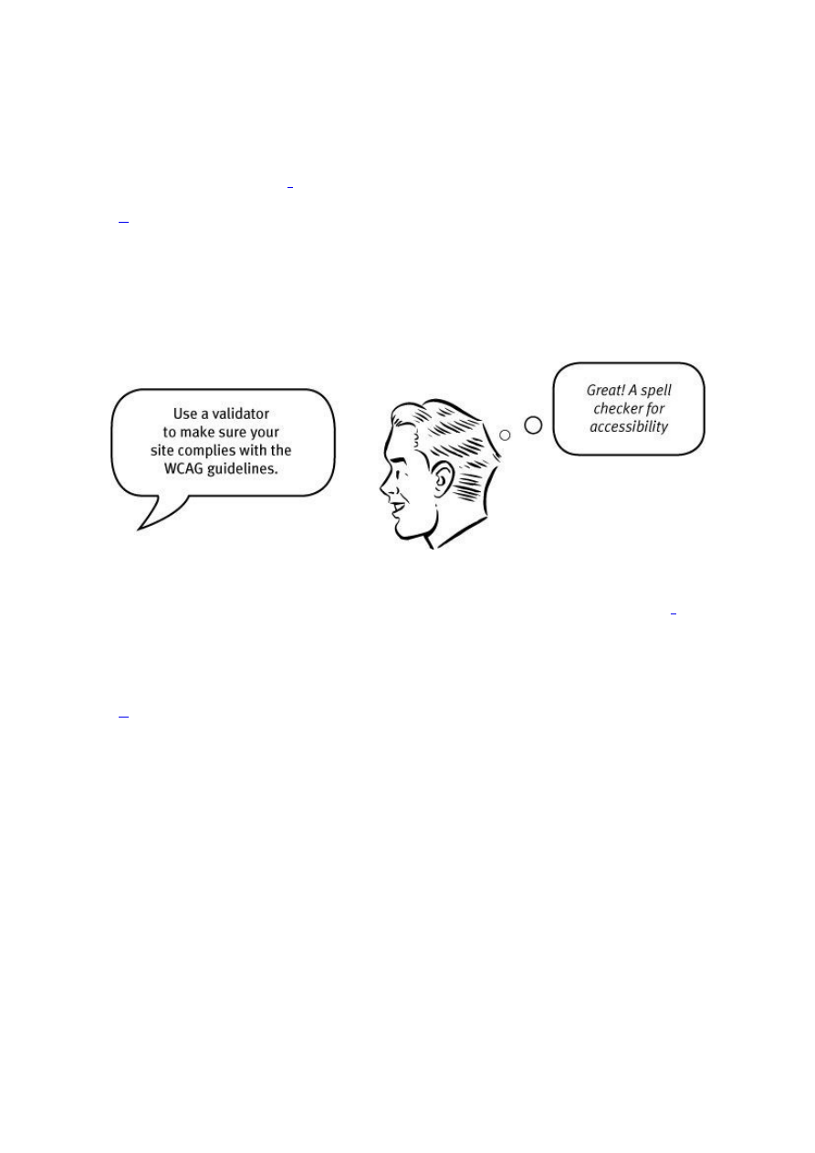


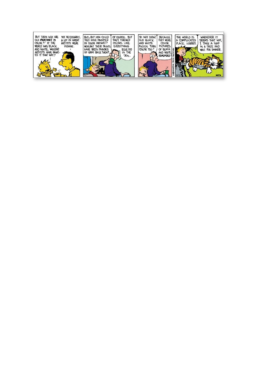


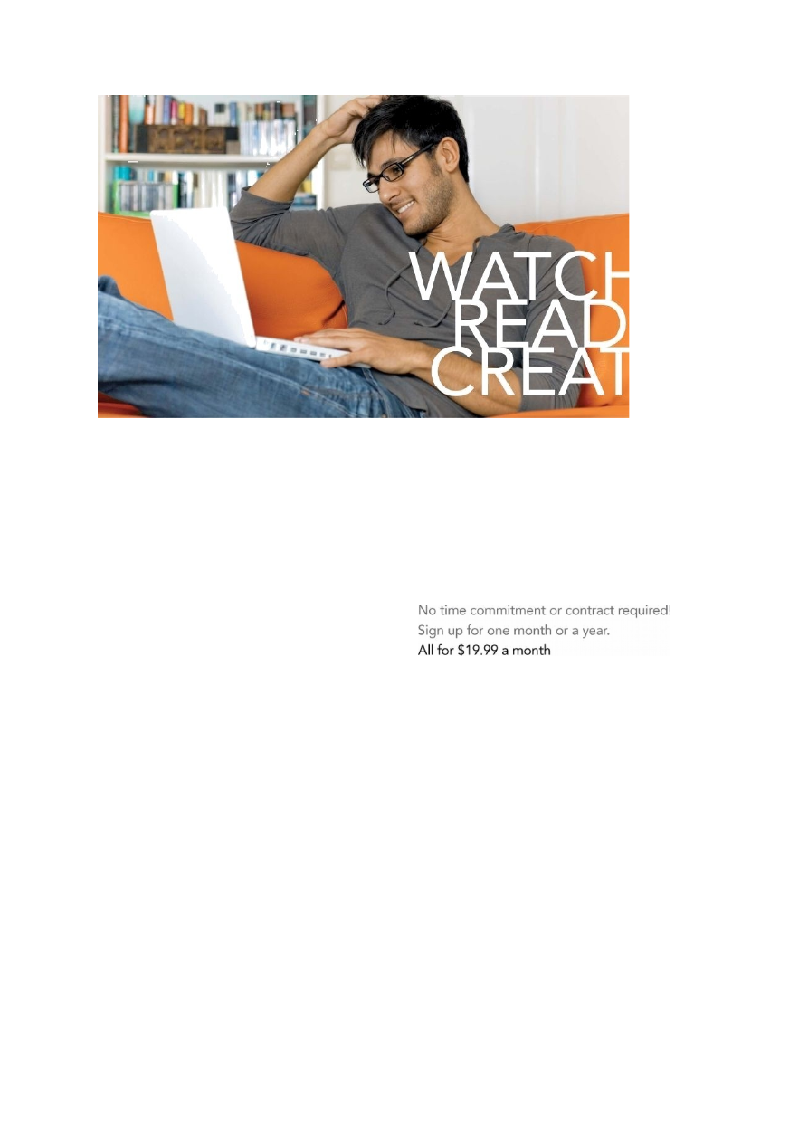


Kõik kommentaarid